

OBJECTIVE: To create a more “city right” concept using local signature icons.
HOW OBJECTIVE WAS ACCOMPLISHED: Whole Foods Market is about local, natural, and socially and environmentally responsible commerce. The Whole Foods Detroit city location lives up to these principles not only in what it purveys, or through the associates in the store, but as well with the environment and building in which it conducts its business. This footprint is more condensed and “city right” relative to the square footage, with its natural, yet “downtown” sensibility. Design partners, local artists and fabricators joined with the Whole Foods team to create a fusion of food and place through reclaiming, repurposing and even reimagining pieces of Detroit’s past into an expression of Detroit’s future.

The store features an expanded assortment of prepared and ready-toprepare foods, in conjunction with a broad assortment of fresh and specialty perishables that becomes the “city kitchen” for the young urban resident, neighborhood consumers, and the working population surrounding the store who see it as a place appropriate to their various daytime needs – whether for a healthy lunch, shopping for the evening’s dinner or the week’s groceries.
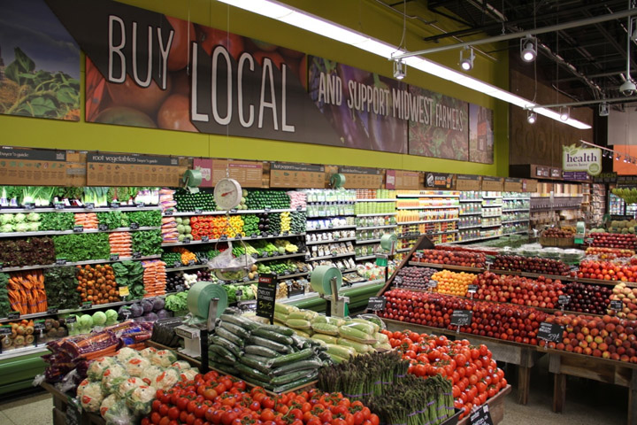
UNIQUE PROJECT CHARACTERISTICS: The environment has key feature areas with an expanded café. They also offer a series of specialty stalls focusing on dairy products and cheeses, produce and specialty foods, along with bakery products, as well as an aggregate area of prepared specialty foods with local-to-international focus. The character of the store creates an instant connection with the shopper in the neighborhood; a neighborhood that represents the past, present and future of urban Detroit and its eclectic, colorful and welcoming message to those looking to contribute to the future of the city.

The overall organizing background element used throughout the store is a unique street grid of Detroit influenced by the city’s French roots with radial streets, squares and avenues. This is used in terms of background graphics, cornice treatments, directional signage, etc.

Feature elements within the store include:
– Bristle wall “Cooking” graphic constructed of sculpted squares of repurposed broomstick material laser cut into a 3D sculpted graphic
– Specialty Foods features a large panel element with a patchwork of reclaimed signs ranging from street, business and institutions; rescued from the faded scrap to become a colorful, eclectic and locally relevant diary of the areas past.
– A series of metal conduits bent to create a bakery header reminiscent of tail pipes and Detroit’s namesake “The Motor City.”
– Motown 45-LP records become checkout lane markers, reflecting the company’s Motown heritage
– A corrugated metal background for the Cheese Department recognizes the creative and artistic nature of graffiti.
– A heritage timeline brings together highlights of both the city’s history as well as Detroit’s focus on popular culture, history and its ongoing reinvention.
– Reclaimed elements and furniture pieces from the city’s industrial heritage within the café element repurposed as tables, chairs and service elements.
Designed by JGA
Photography: Nicole Reedy and Jenn Hulbert


Add to collection

