

The design concept for the flagship store originates from both the brand and the floor layout. The spirit of Les Néréides is perfectly projected to consumers through the ambience and story behind the products.
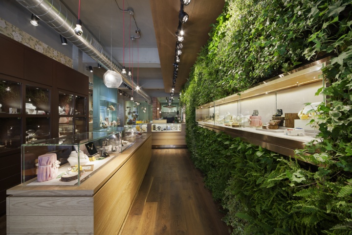
The style of Les Néréides carries the romantic feelings of a young French maiden and the unadulterated beauty of nature—one of the design concepts stems directly from this style. The selection of materials is the key to the brand. The main mediums are wood and enamel with a Southern French flare; elements of metal and marble are added, then each piece is finished off with the Les Néréides “natural” touch.
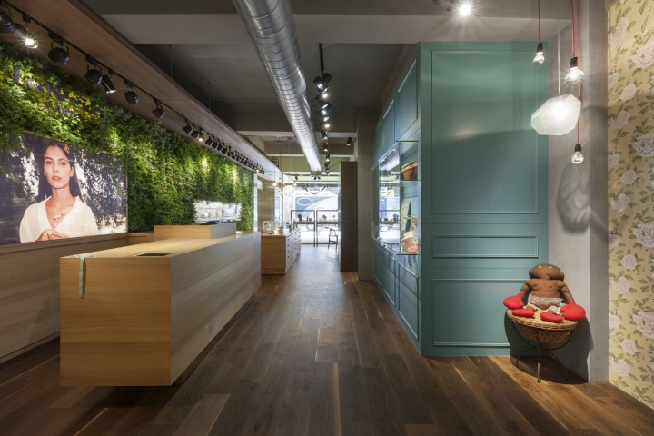
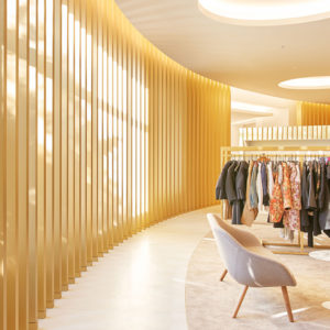
The second design concept, floor layout, is a major component of the flagship store. With a multitude of materials, the narrow display space proved to be a hurdle to conveying the full essence of Les Néréides; hence we utilized this special long and narrow space to create “purposive” and “free” traffic flow. Consumers can appreciate products while moving about freely to experience the beauty of Southern France.

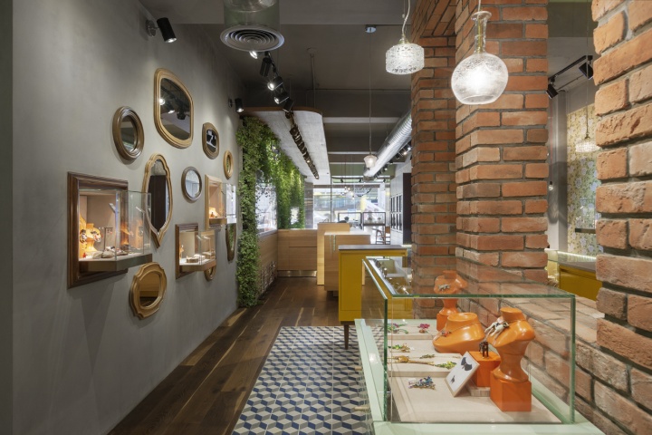
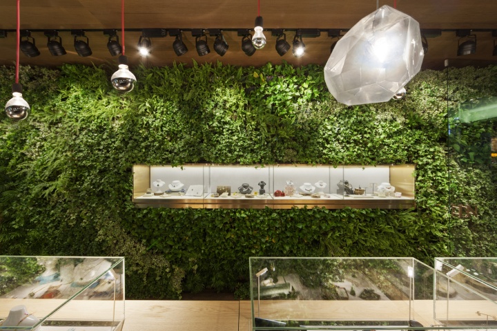
The interior design also echoes each Les Néréides series: the green wall at the entrance exhibits pieces which drew inspiration from flora; inside, the more expensive classic pieces are set against a more mature brown lacquer and oak embellished with metal; and the N2 line (a more youthful collection) uses bright colors and curving lines as the backdrop for a playful, mirrored wall to make consumers feel pampered.

The aesthetic of the Les Néréides flagship store is rooted in fully conveying the spirit of the brand. Each story told while meandering through the sections generates a deep connection between person, space, and product.
Designed by KC design studio




Add to collection

