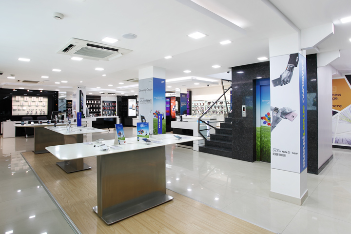

CLIENT & BRAND BRIEF: Channel 9 a very popular name in South Bangalore, had started as a DVD / CD rental hub 30 years back in Jayanagar, Bangalore. Gradually as the business progressed, and the time & technology improved they changed the business to selling mobiles from the year 2000 keeping DVD rental as a smaller part of the store. Years down the line, Channel 9 was a well known and popular destination for South Bangaloreans for all the Mobile and hand held devices, very well known for their range and also their customer service.

The brief was to expand from the existing Ground floor of the store to a 3 storey complete solutions store for Mobiles, smart phones, Tablets, hand held smart devices and also Personal computers & laptops and surely accessories. This would also include all brands from Apple, Samsung & all other brands giving the ever demanding customer a complete range with best of service.
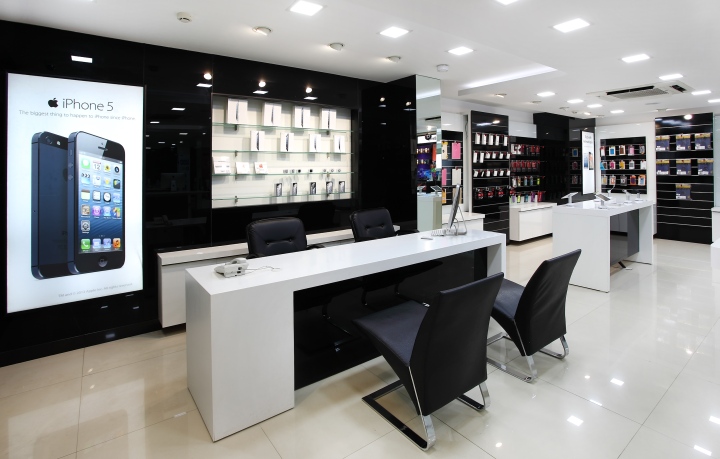
As per that store has been categorized,1st floor as mobile phones of some brands, one corner has DVD rental, first floor has been kept for brands apple, Samsung, Sony, blackberry, third floor totally becomes accessories zone related to mobile and gadgets.

DESIGN STRATEGY: As the store has been stretched to the three floors the challenge is to pull the customers to all the floors was a challenging work. Mobile as a product is highly accessible in all other stores, to make the customer buy from particularly this store is also a challenging. Keeping all these insights we decided to go with clean and contemporary with twist in the approach in the areas like staircase corridors, accessories zones to make it look young and colourful.

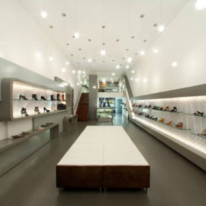
STORE DESIGN SIGNATURE: “Open and clean”, Product to be seen and accessible to the customer for easy browsing and understanding. White as the base for the interior with light oak finishes on the furniture’s brings warmth to the ambience.

STORE FRONT DESIGN: As the building is in the prime location of jayanagar 3rd block, Bangalore and almost being in the corner we treated all floors with open glass windows, to have the store completely visible from Outside and acts as a canvas for the changing visuals and graphics for the technology brands. Facade has been covered with white, silver, dark wood composite panels in a clear straight line.

Translucent graphics are planned on front glass to give the busy and retail feel. Main signage has been designed with bright red LED lit and chrome SS sides. This has been placed on spacers above the soffit to get the clear visibility from the road. Tri edged silver ACP box composition behind the signage is made to give the dynamism to the sign. Changing back lit graphics, vertical pylon with floor categories are also part of the façade communication.

STORE INTERIOR DESIGN: The Store Interiors has been kept as very contemporary and simple mostly going in line with the current trends globally. Most of the displays for the products are self browsing with clean neat furniture/fixtures for the display. The use of materials have been kept to minimalistic with high focus on functionality with clean aesthetics. Highlight zones in wach floor uplift certain areas/displays and differentiate the zones from rest of displays. Staircase area has been highlighted in a different way with a complete twist to the visual language used. This brings in a non-monotonous quotient and creates interest. Overall language of visuals and graphics has been contemporary, bold and with a twist to bring freshness and newness.

INNOVATION USE OF MATERIALS & FINISHES:
Types of material like, steel, acrylic, laminate acrylic solids have been used to bring the harmony in the whole interior.
Material has been used differently to get the surprise factor in the store.

LIGHTING:
Lighting has been handed carefully by keeping it simple and straight. Cove light as part of the store for lighting specific areas whether it be cash, centre islands. Over all light is white and subtle to high light the product in its best.
STORE ZONING &LAYOUT:
Ground Floor – Mobile Phone, Laptop, DVD rental
First Floor – Apple, Samsung, Blackberry, SONY shop in shops
Second Floor – Accessories
Third Floor – Channel 9 Office
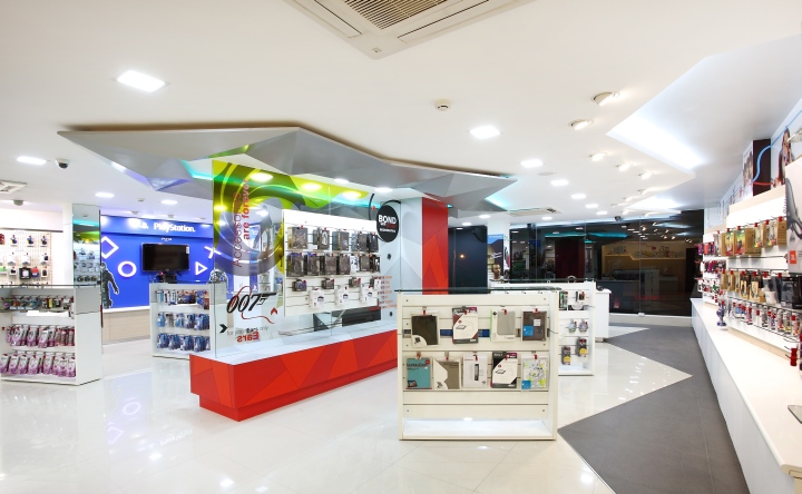
VISUAL MERCHANDISING & DISPLAY: Whole store has been designed with built in VM place and lot of opportunities in each category is given for flexible display system.
GRAPHICS & SIGNAGE: Clear communication through illustrative style of graphics has been used in the store. Some of attitude statement has been incorporated as part of the graphics to bring emotional content. Graphic has been carried out throughout the store to bring visual balance and customer interaction.
SHOP – FITTING DESIGN: Modularity system in fixtures has been achieved in clean and simple furniture.
Designed by Four Dimensions Retail Design


Add to collection
