Nescafe Red Cup Limited Edition packaging by Prompt Design
posted by retail design blog on 2014-01-06
Add to collection
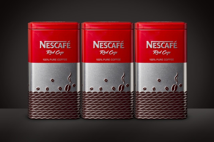

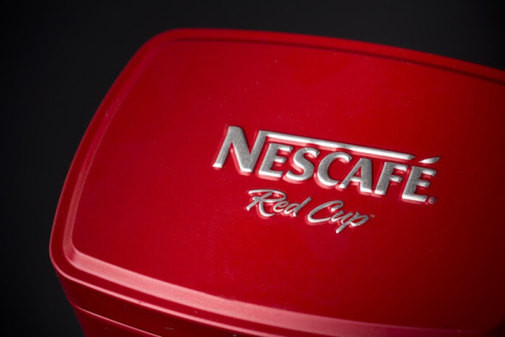
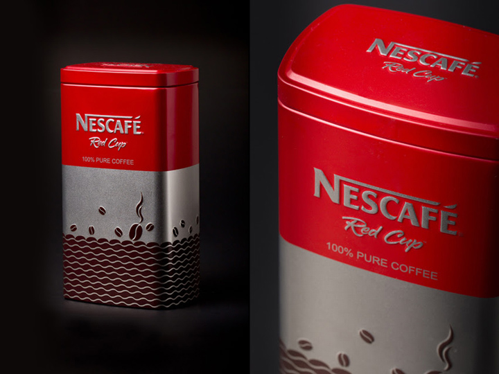
It is a Nescafe tin box. This year (2013) is the first time which Nestle created a limited edition tin box for Nescafe brand.
Challenge: To differentiate the product on the store shelf and to distinguish it from other coffee products.
Idea: We understood that the identity of Nescafe brand has to be different from others. As for the illustrations, we divided graphics into 3 parts:
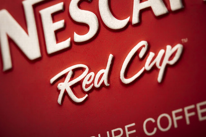
1. We used red colour to consistent with Nescafe brand.
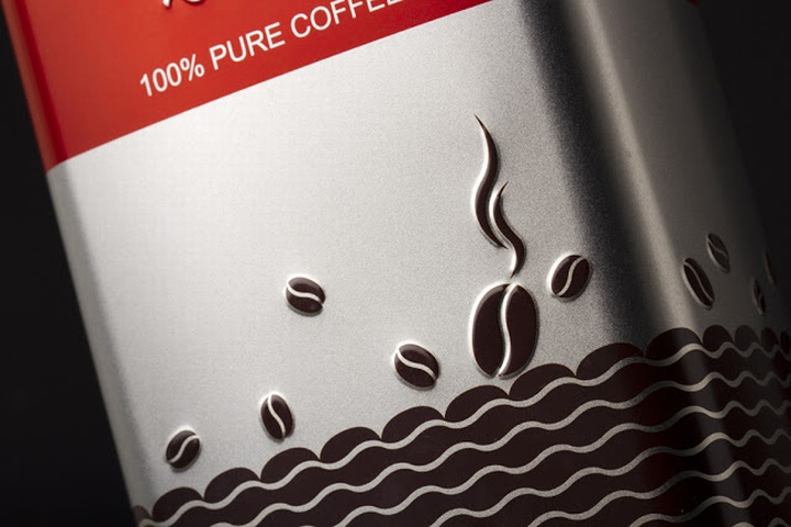
2. We used shiny silver tin box because any other brands in the market have not used this kind of box before. Using this tin box differentiates Nescafe from others.
3. We used coffee bean patterns – a coffee sea, where rich coffee molecules are well arranged. Also, we used jumping coffee beans elements to emphasise the coffee sea. Moreover, emboss printing techniques and simple design attract the targets and increase high impact on shelf.
Designed by Prompt Design, Thailand
Creative Director: Somchana Kangwanjit
Designer: Aor Orawan, Nantawat Rodchau, Nisachon Thanapatkraiporn
Photography: Saravut Khusrisuwan


Add to collection