
They didn’t really have any fixed ideas in terms of the project brief,” says Ramesh Subramaniam, who led M Moser’s Kuala Lumpur design team. “There was a need for a certain number of rooms for their managers and for some informal discussion areas, and they were interested in an open concept. But most of all, they wanted something in tune with current office design in the region.”
Fusing architecture to function & brand
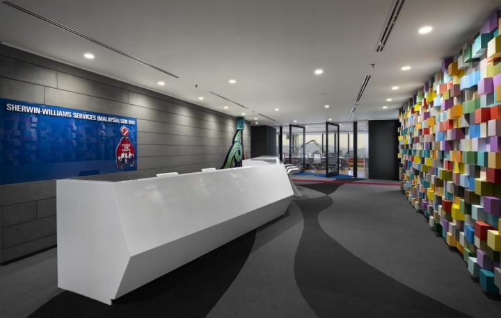
Despite the 11,500 sq-ft floor’s somewhat narrow proportions, the designers were able to create a layout that is anything but a numbingly linear succession of spaces. By necessity, the reception area is located at one end of the office, adjacent to the lifts in one of the building’s twin cores. But with no need for extensive seating, the space could be kept relatively compact, leaving room on either side of its long, V-shaped desk for a sizeable boardroom and staff lounge/pantry.
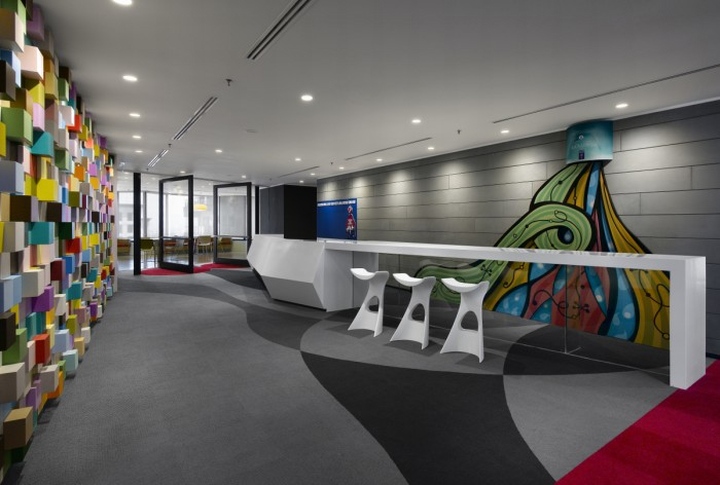
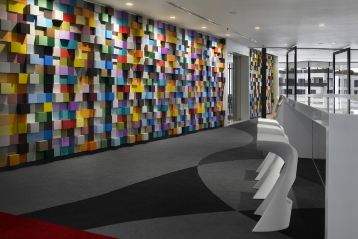
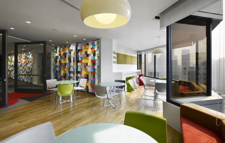
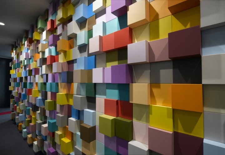
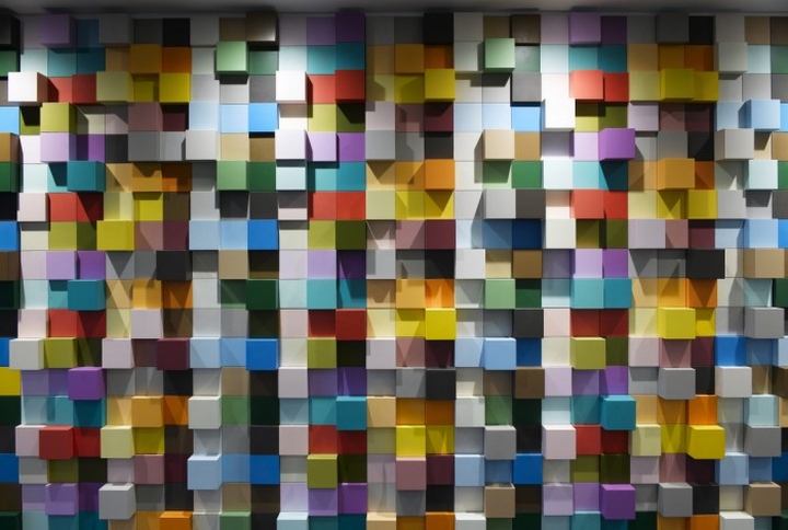
The view inside is electrifying, with streams of multicolored paint seeming to pour down the grey wall behind the reception desk. The opposite wall takes the form of an irregular cubist sculpture with each cube bearing a different color from the Sherwin-Williams paint palette. “The wall has 20 different colors – we deliberately used every major color group of paint Sherwin-Williams makes in the region,” Ramesh reveals.
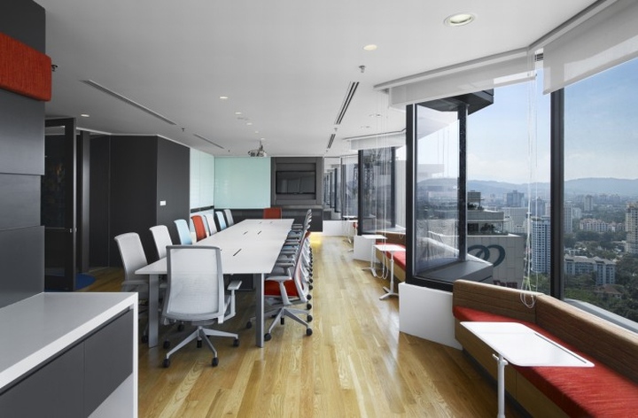
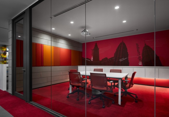
Progressing deeper into the office brings yet another vibrant punch in the form of a pair of glass-fronted meeting rooms located directly behind the reception desk, respectively decked out incorporate blue and red. In the boardroom nearby, the chairs repeat the same colors in four pastel shades, reinforcing brand identity while providing a note of visual cohesion amid the riotousness.
The work floor: Open & unexpected
A transparent glass door inset into a section of transparent glass wall separates the office’s ‘public’ areas from the main work floor. From the designers’ point of view, the latter was particularly challenging, requiring an open-plan area with enclosed manager’s offices and break-out zones to be somehow integrated into a space obstructed by columns.
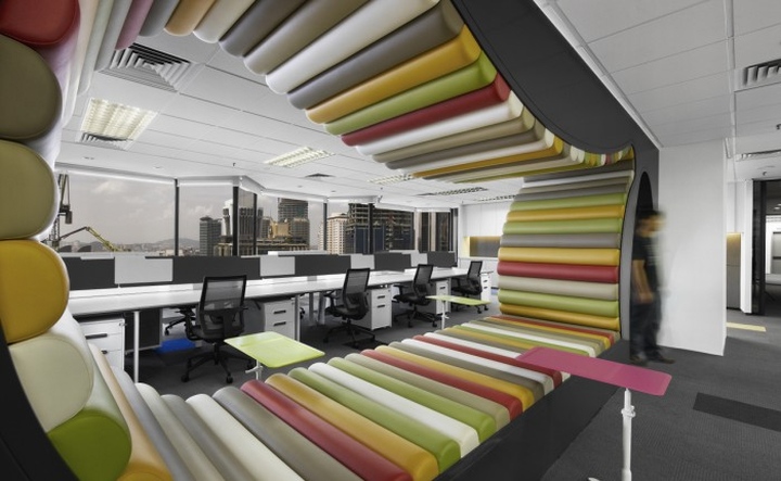
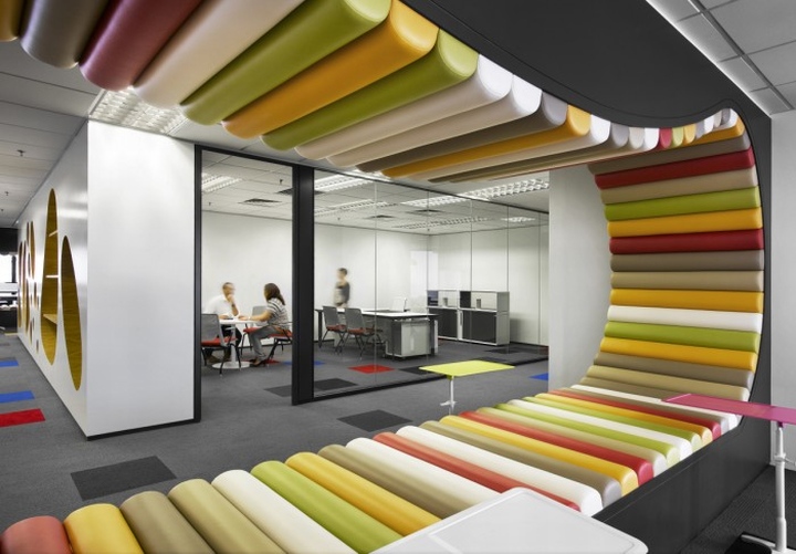
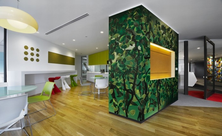
One part of the solution was to cluster all three of the manager’s offices near the center of the floor plate so that they adjoin the meeting rooms in the reception zone. By packing most of the enclosed spaces into tight ‘core’, the rest of the area could be kept relatively uncluttered, flowing and flexible. The intrusive columns were meanwhile either hidden (as in the pantry and boardroom), or transformed into decorative features with a wrap of graphics. Two more pairs of columns were transformed into eye-catching benches by filling the gap between them with an undulating floor-to-ceiling loop of multicolored upholstery.
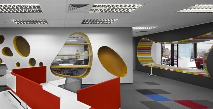
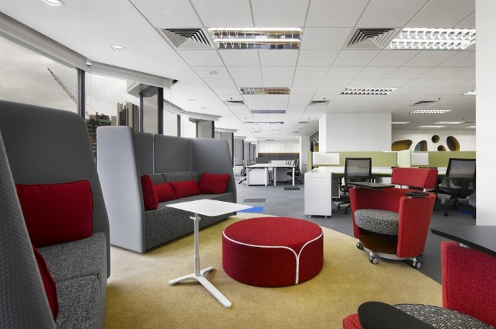
Adding to the dynamism of the space is the unconventional ‘flow’ imposed by the placement of its six workstation clusters. Says Ramesh: “Instead of arranging them in ranks or clustering them around the columns, we went a bit left-field and dispersed them at different angles”. Naturally, the workstations also add their own bit of color to the office’s spectrum. “The Haworth workstations were available in six different colors, so we used them all,” says designer Christine Teoh. “It worked out really well – each cluster is identified by a different color.”
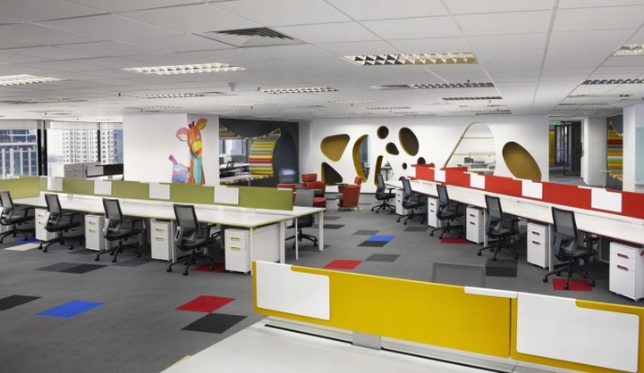
In most offices, color is merely an aesthetic component, added to complement the architecture of the space. Here, however, it is truly a defining element of the design, much as it is a defining element of Sherwin-Williams. One’s first impressions of this office are also the most lasting ones: of vibrant brightness, creativity, and diversity united to a single purpose.
http://officesnapshots.com/2014/01/15/inside-sherwin-williams-kuala-lumpur-offices/


Add to collection
