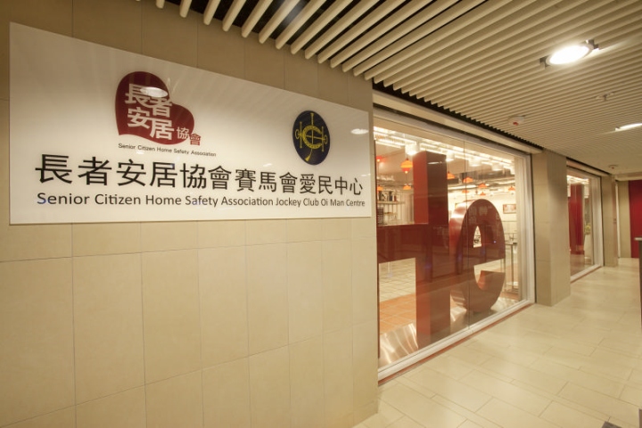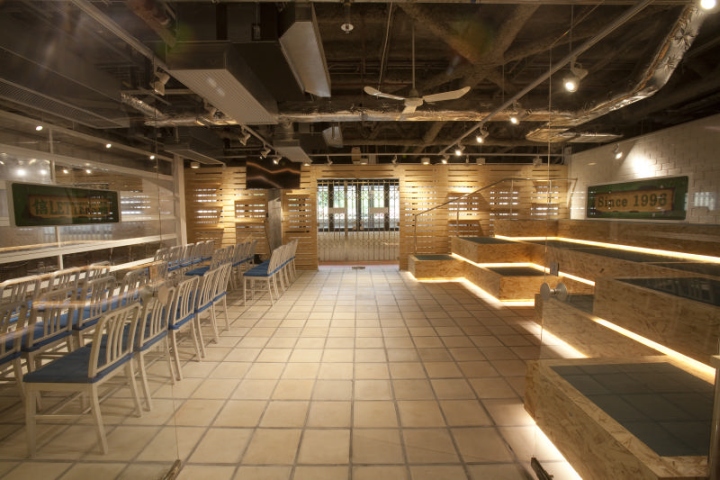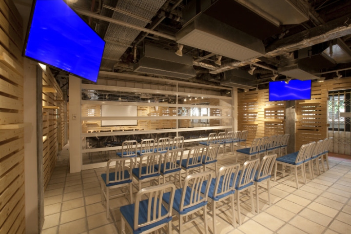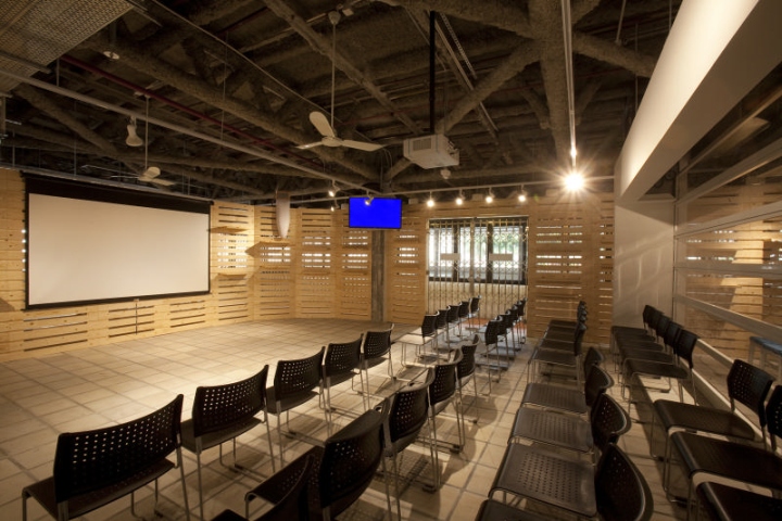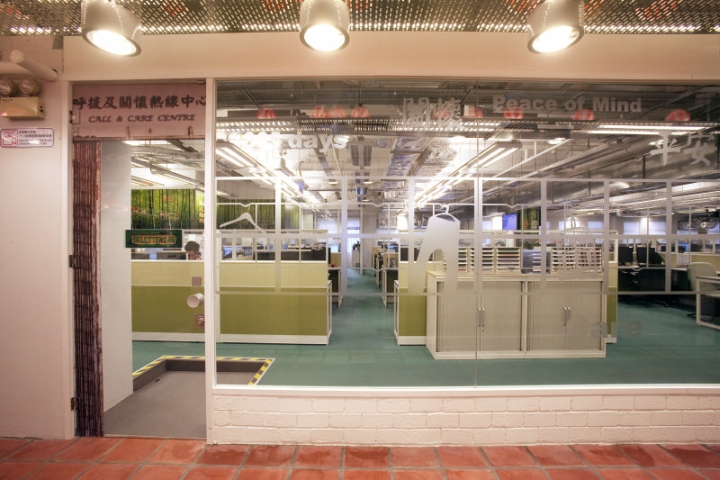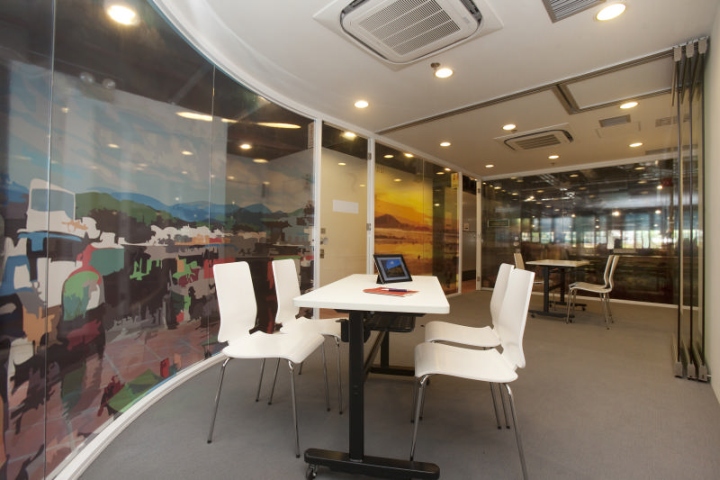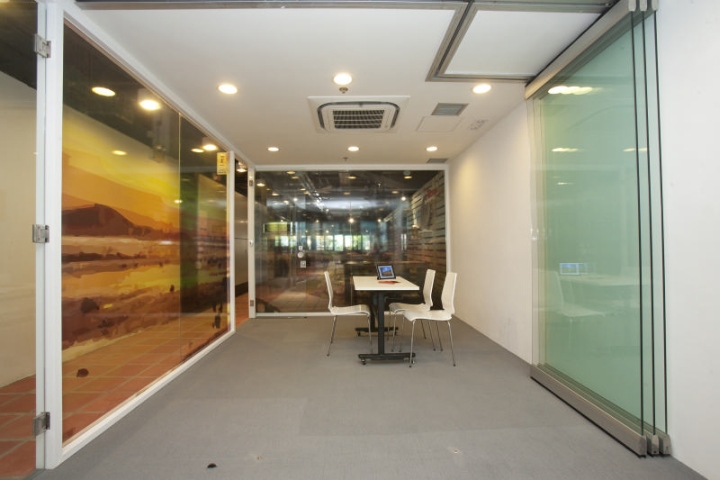

Veteran interior designer Clifton Leung takes pride to unveil the revolutionary design concept of the 40,000 sq. ft. Senior Citizen Home Safety Association Jockey Club Oi Man Centre. The new design of the 3-storey Senior Citizen Home Safety Association Jockey Club Oi Man Centre witnesses the ground-breaking transformation of the Senior Citizen Home Safety Association (SCHSA).

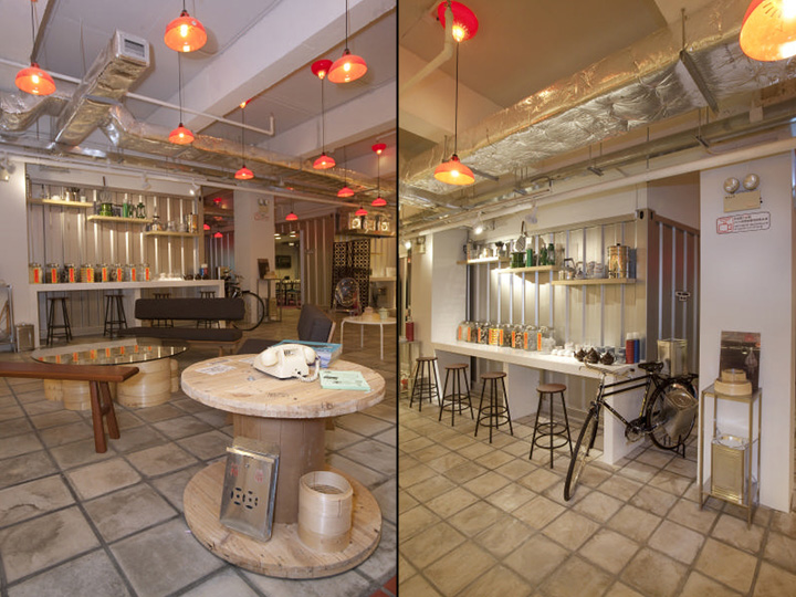
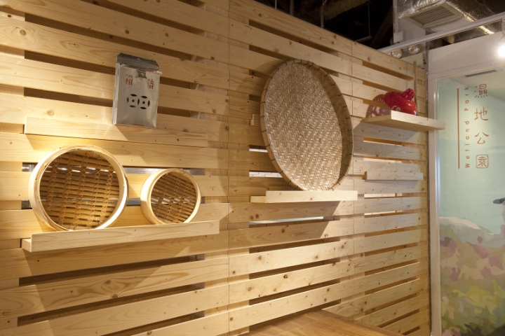
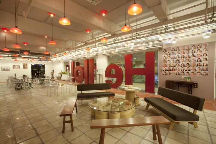
Inspired by the cherished memories of the old Hong Kong, the design of the ground floor and first floor rides on the creative concept of “Seeing the Beauty in the Old”, where the new centre is bringing back the culture of Hong Kong in the ‘50s to ‘80s, creating an ambience where visitors can relive the early days of the territory where we grew up. It exhibits a minimalistic design with rich cultural heritage and advanced innovation, the centre creates a space where the old meets the new in perfect harmony.

Headquarters 3F (Roof Top) – The Jockey Club Silver Age Centre
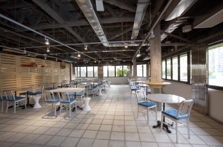
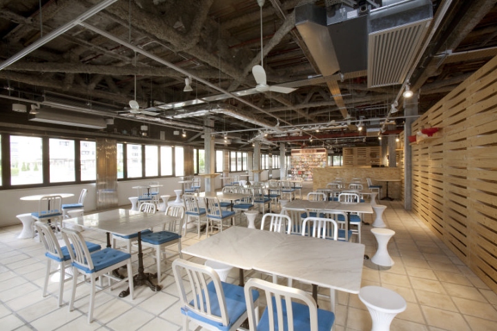
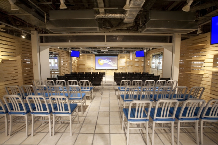
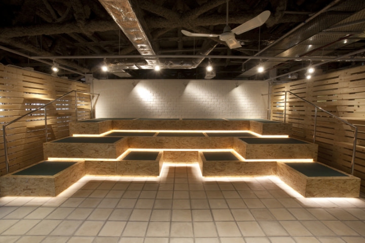
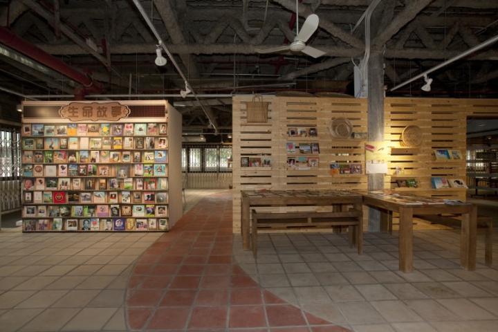
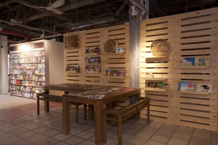
Named as Silver Age Center, this floor serves as the office and venue for volunteers, large-scale events and seminars. It is also a platform to induce cross-generation interaction. Active seniors could use the facilities, including mini studio and air-conditioned open area, to enjoy various kinds of activities. The to-be launched new service programs, “Life Journey Book Archive” (Personalized book printing service) and “A Message for My Beloved” (Audio message recording service), offer opportunities for the elderly to keep precious visual and audio memories for themselves as well as for their family.

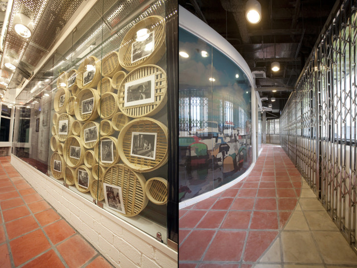
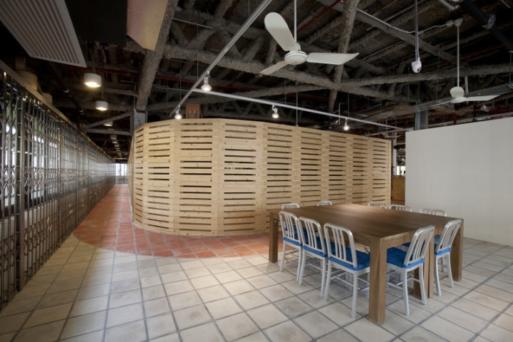
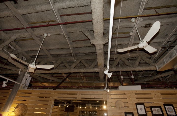
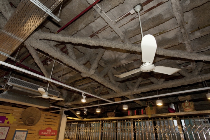
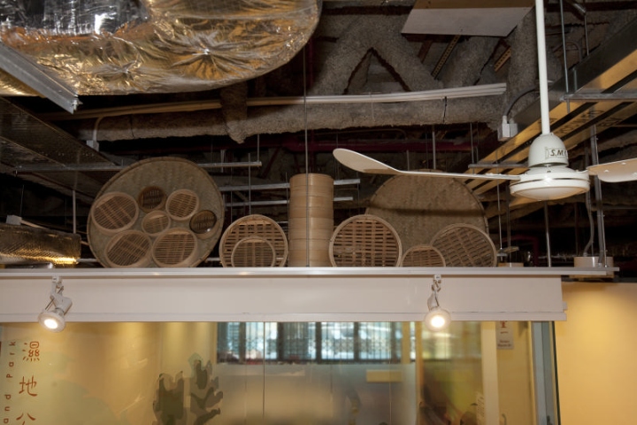
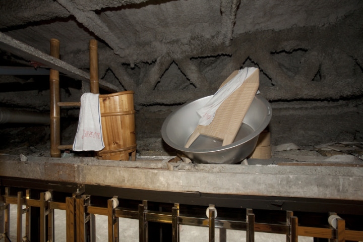
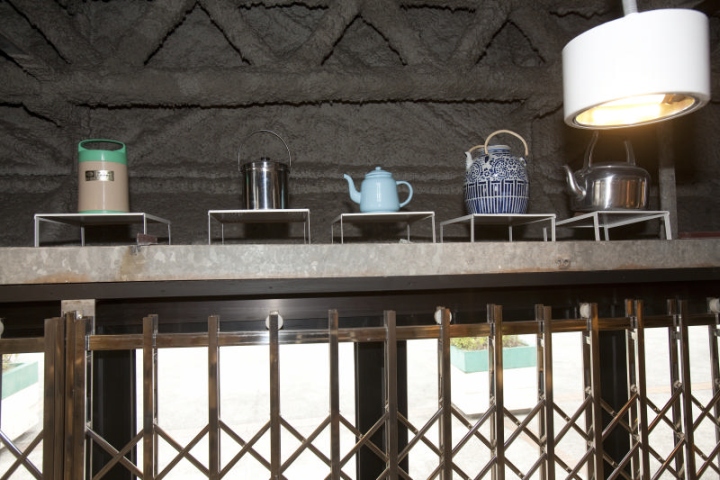
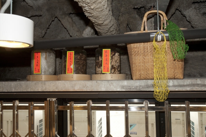
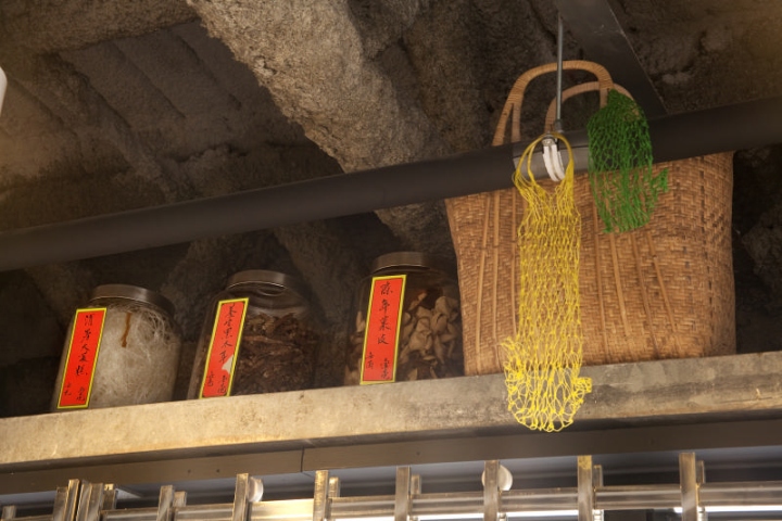
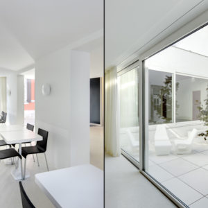
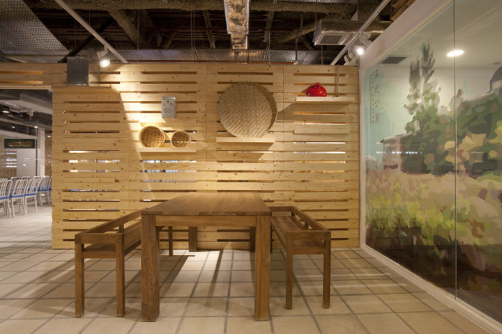
Due to its proximity to Oi Man Estate, the design aims at creating an inviting space to encourage participation of the residents nearby. Clifton creates a visually permeable venue by applying glass folding windows. The iconic sliding sliver gates, used in the old days in housing estates are installed in front of the window to infuse the beauty of this old element into the design. Vintage displays that represent old Hong Kong continue to be a major theme on this floor. Core materials including concrete flooring, recycled wood and glass are selected to create an eco-friendly and green design, to blend in with the idyllic outdoor ambience.

Headquarters 2F – SCHSA Head Office and 24 Hour Call & Care Centre
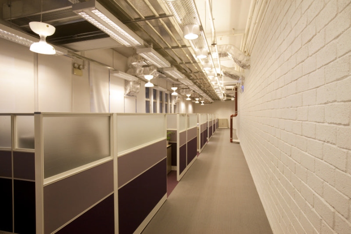
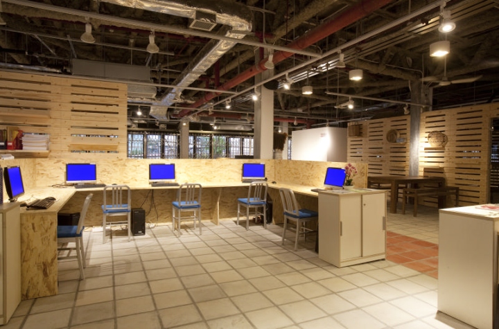
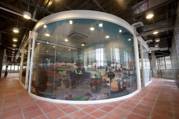
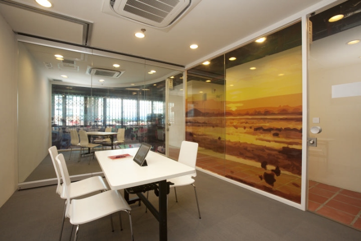
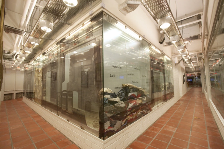
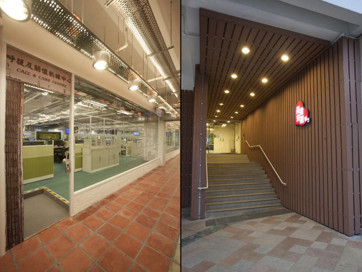
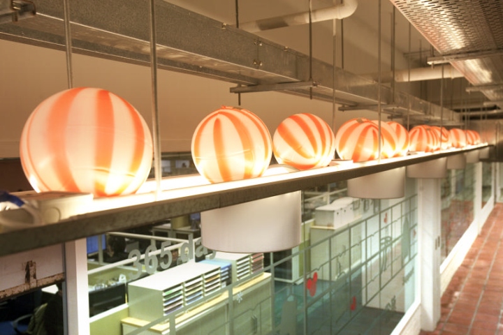
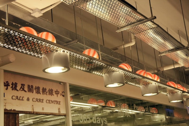
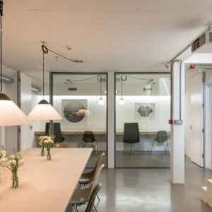
To enhance the visual space and create a more relaxed working ambience for 24-hour operating PE Link Call & Care Service Centre, designer Clifton Leung applies floor-to-ceiling glass wall to partition the space. Creative image of old-Hong Kong style window frames are applied onto the glass partition to enhance the design details. A huge mission statement wall with an idyllic bamboo forest image as background creates a soothing space for the staff amid the hectic work.

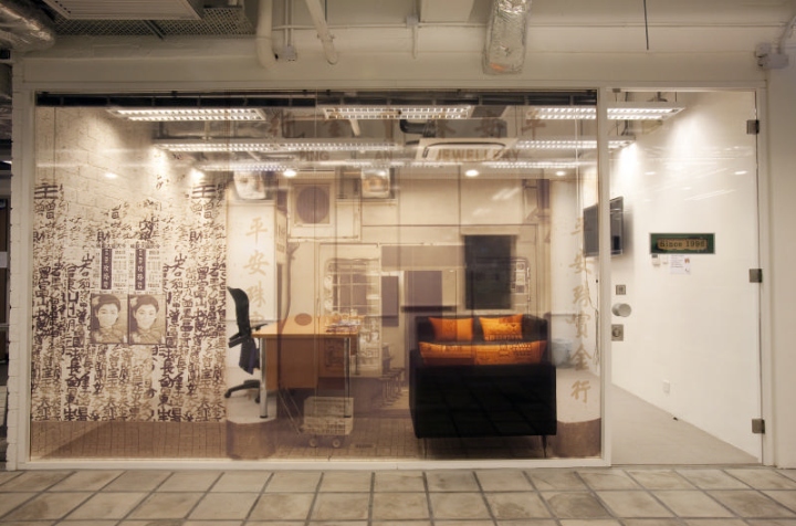
Partition walls of other departments are designed using shop images of traditional old Hong Kong shops, including goldsmith, rice store, grocery store etc.. Entering the space, visitors could imagine themselves strolling along an ancient street of Hong Kong in the old times. The overall design evokes a sense of nostalgic beauty.

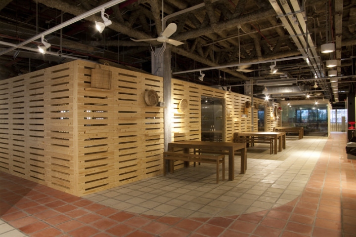
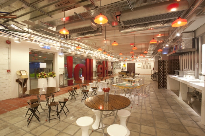
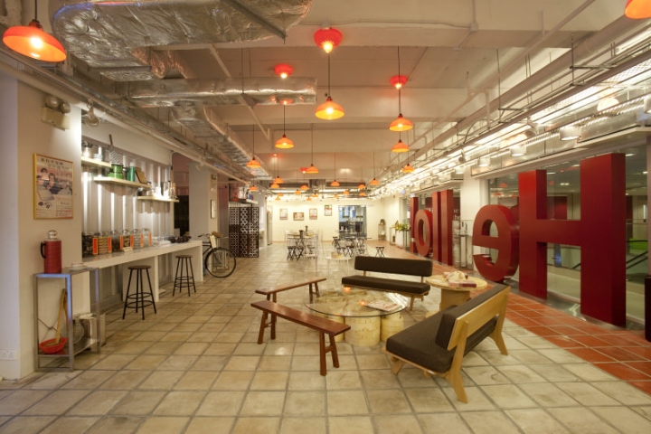
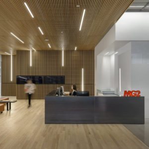
Step into the reception of the Headquarters on 2F, visitors will be amazed by the design and setting of an old-style Dai Pai Dong (side-walk snack booth 大牌檔), an authentically recreated scenes with meticulously selected vintage displays. The Dai Pai Dong, with foldable round tables from the old days, complemented by Majong tables, become the favorite spot for staff meeting and lunch gathering.

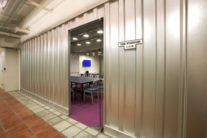
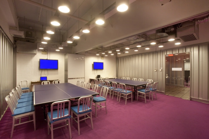
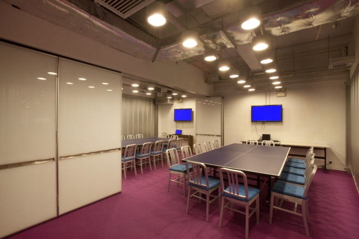
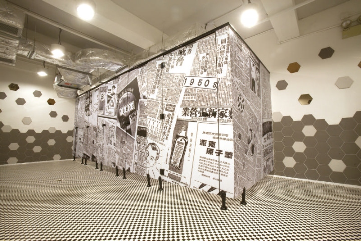
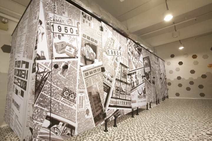
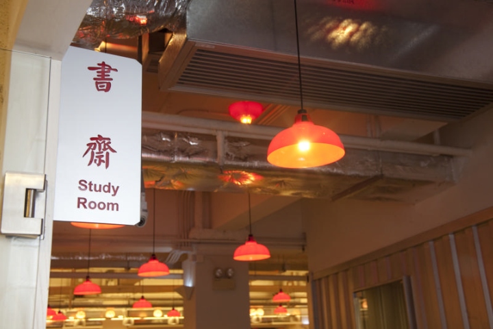
The silver cargo-container design of the main conference rooms, the ping-pong meeting tables and striking purple carpets bring vitality to the work environment. To keep the old and good memory alive, names of different rooms are created to highlight some of the collective memories of Hong Kong people, including “The Arena -新紅館”, “The Stadium-大球場” “The Piazza -大笪地” and “The Playground -遊樂場; storage rooms and washrooms are also named in the old Hong Kong way, injecting a sense of humor into the design. The washroom design features images of old newspapers ranging from the ‘50s to ‘80s, a surprise element that bring back the memories of life back then.
