
Hou de Sousa designed and contracted the 200 sq m space of Happy Panda, a restaurant located within the newly built Paseo San Francisco shopping center in Cumbaya, Ecuador. The existing site was a long and narrow shoe box shaped volume. Our analysis of the client’s needs revealed that in order to best serve different customer types, a private dining space was required in addition to a larger and more public dining area.

We split the dining space in two by placing the service areas in between. The private space was placed in the back, while the public dining area faces the entrance. This had the added benefit of improving the overall proportions and feel of the space, which otherwise would have been overly stretched and corridor-like. We also raised the kitchen onto a mezzanine level in order to free up more space for seating and a bar.
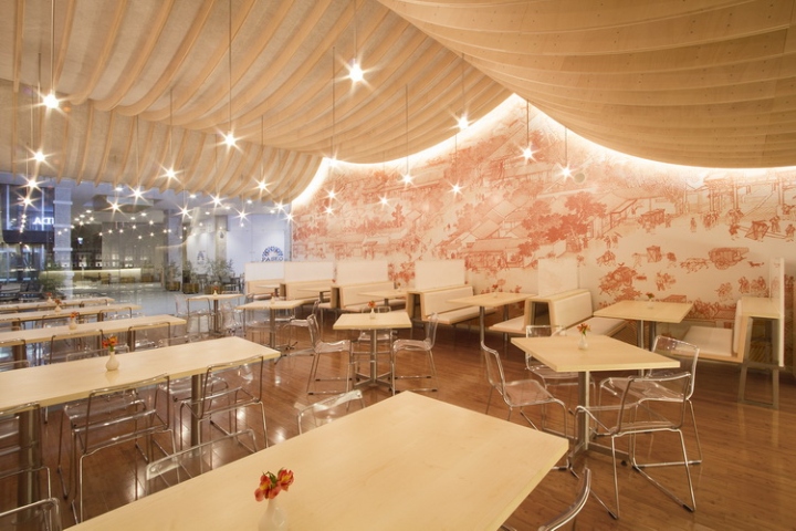
The project schedule was swift, and necessitated expedient methods of construction. While construction resources and materials are somewhat limited in Ecuador, the dramatic boom of the signage and billboard advertising industries there has led to a proliferation of CNC machines, laser cutters, and large scale printers. A key priority when designing the project was to make use of these technologies, so as to minimize the need for skilled labor and reduce construction time and cost.
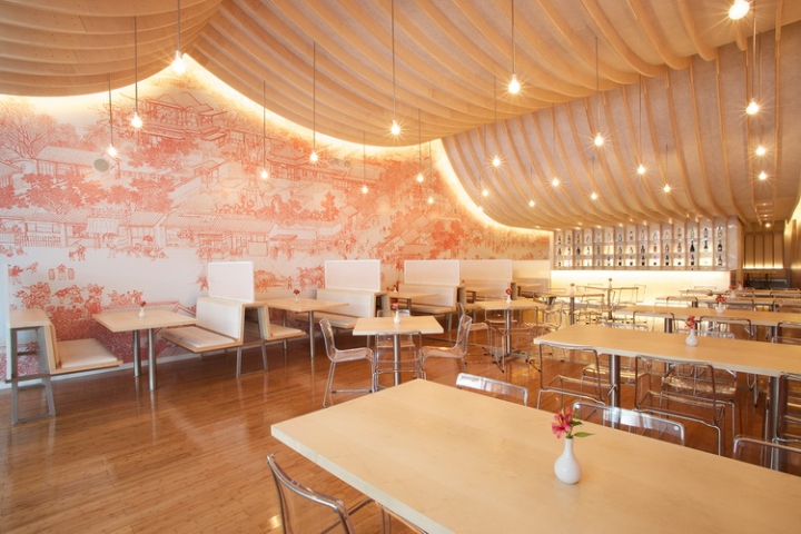
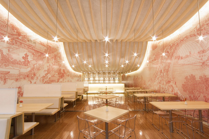
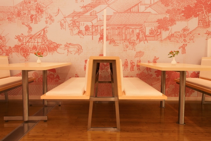
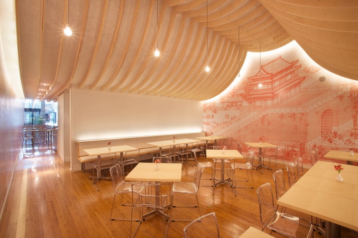
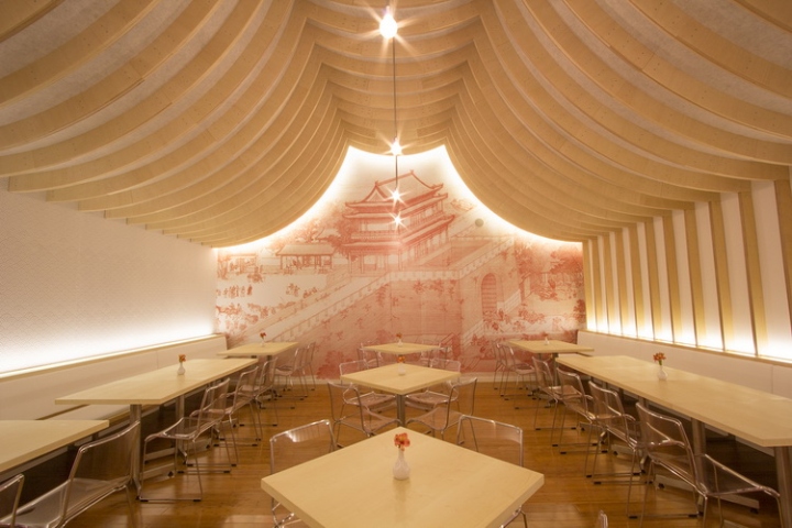
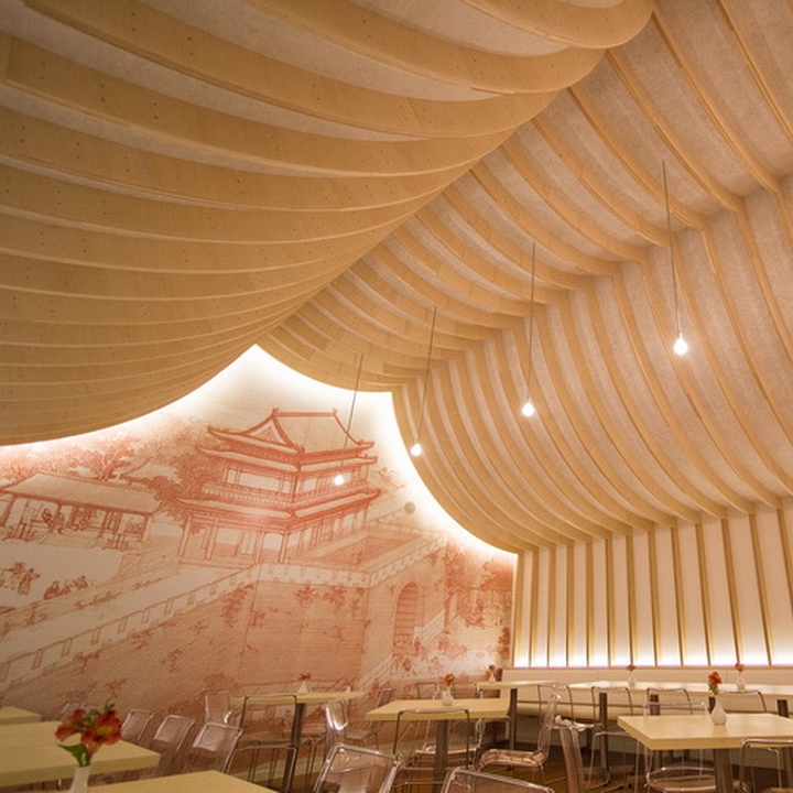
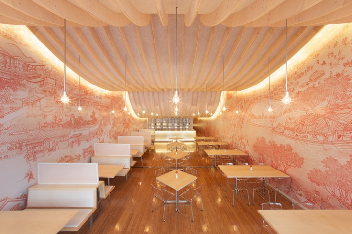
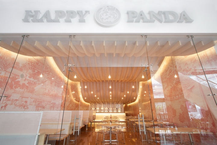
This strategy is most evident on the walls featuring the Chinese scroll painting, Qingming Shanghe Tu, or Along the River During the Qingming Festival. Originally painted by Zhang Zeduan during the Song Dynasty over 900 years ago, its acclaim led to many reinterpretations commissioned by subsequent dynasties. Our studio’s homage has been digitally altered, selectively cropped, blown up to the scale of wall paper, and then printed and installed by a billboard advertisement company.
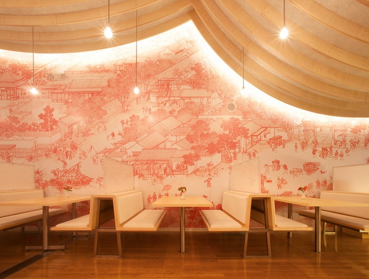
The ceiling is composed of CNC cut plywood and heavyweight interfacing (a fabric used to stiffen dresses and suits). The plywood was precisely cut to fit and suspend from a set of hidden steel trusses. The form of the ceiling and the spaces it creates was inspired by Chinese temples. We simplified and flattened the geometry of these temples into silhouettes, which were extruded and then subtracted from a mass.
Through this process, we reversed the condition of viewing a temple from its exterior as an object in space, to that of inhabiting a space defined by the mould or negative of a temple’s form. The ceiling is a continuous surface that smoothly transitions between the high dining room spaces and the low service area. This allows users to experience a fluid expansion and compression of space as they walk through the restaurant.
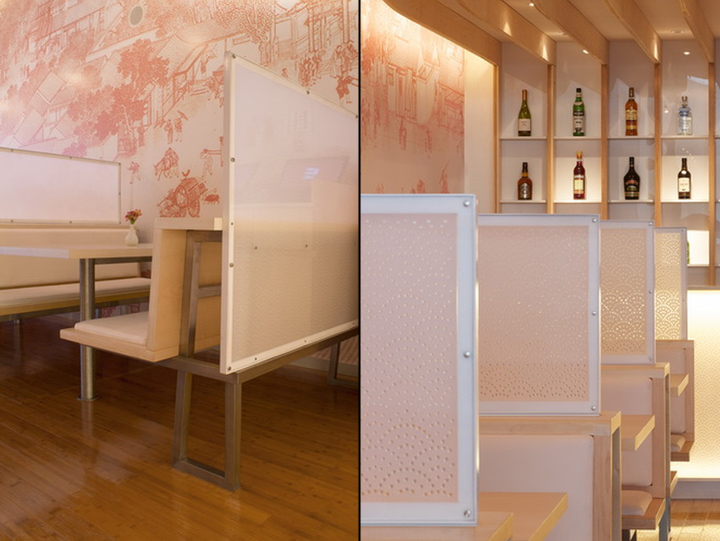
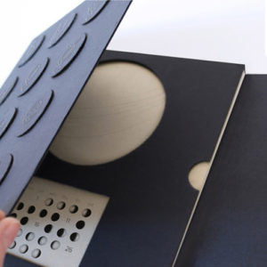
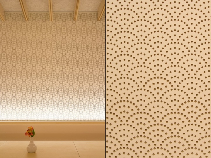
The influence of traditional Chinese design is also present at a much smaller scale. We modified a wave pattern, which is typically found on Chinese glazed pottery, into a polar array of dots. Making use of a variety of materials and techniques, the pattern was adapted to several purposes. Between booths, there are white acrylic privacy screens with the dots laser cut out of them.

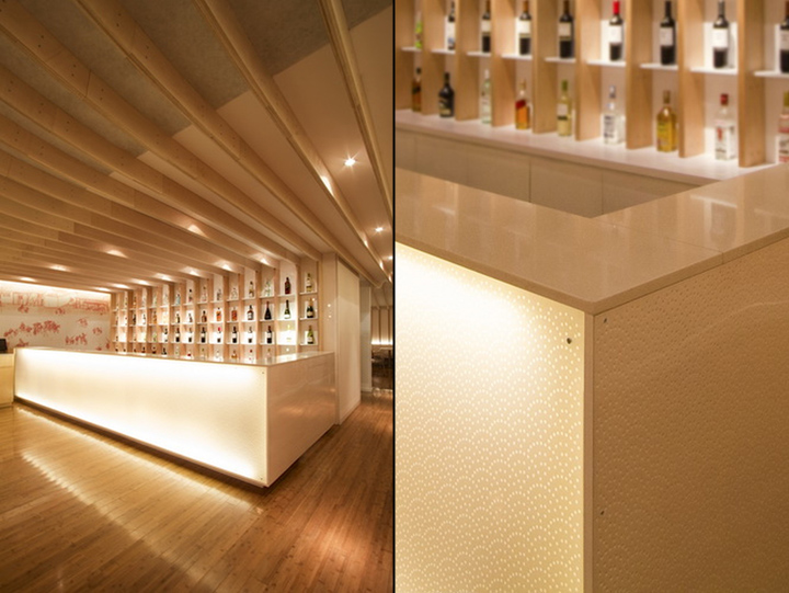
The holes are large enough that the figures of people on the other side of a screen are noticeable but small enough that their features and identities are obscured. On the glowing surface of the bar, the dot pattern provides a tonal contrast and casts faint shadows. In the private room, a wall is lined with MDF panels that were perforated with a CNC router over 50,000 times to carve a graphic pattern with depth and texture.
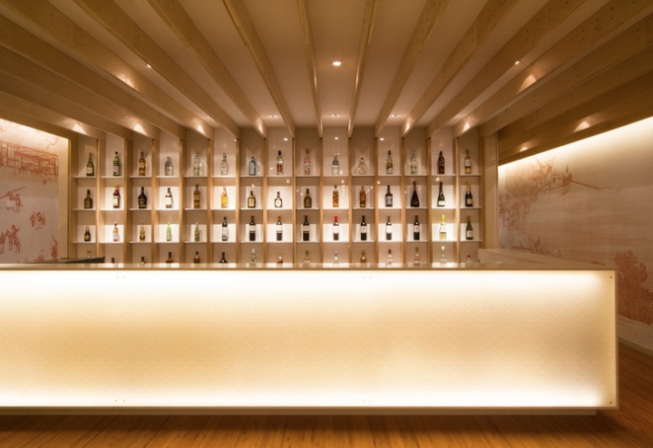
Our objective was for the restaurant to feel warm, inviting, and in a sense, weightless. LEDs were used along the edges of the ceiling to visually detach it from the walls. The steel trusses that suspend the ceiling below it, as well as the kitchen duct work, is completely hidden above the ceiling. The intention was for the ceiling to appear as light as a sheet of fabric that has been pinched upwards to create a space below it. A point grid of custom lighting fixtures floats below the ceiling on chrome pipes. The built in booths and tables are detailed so that they appear to hover off the floor.
Photographs by Hou de Sousa and Jay Vandermeer




Add to collection
