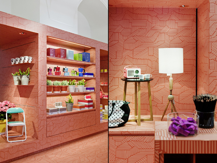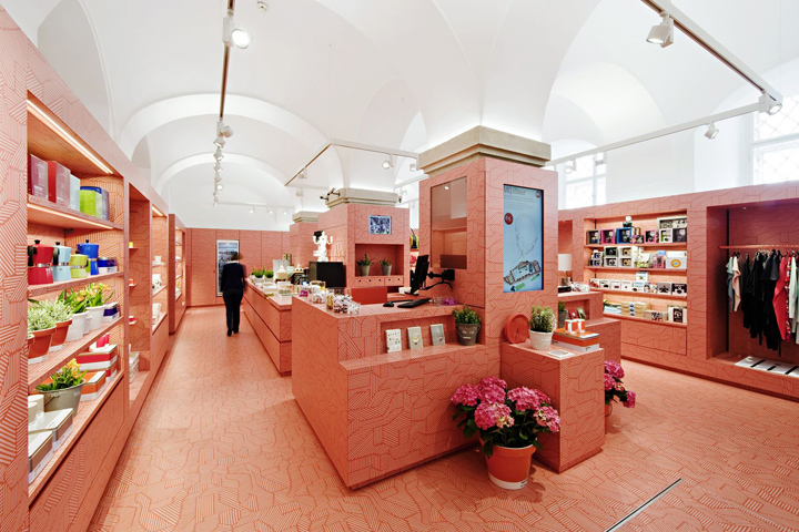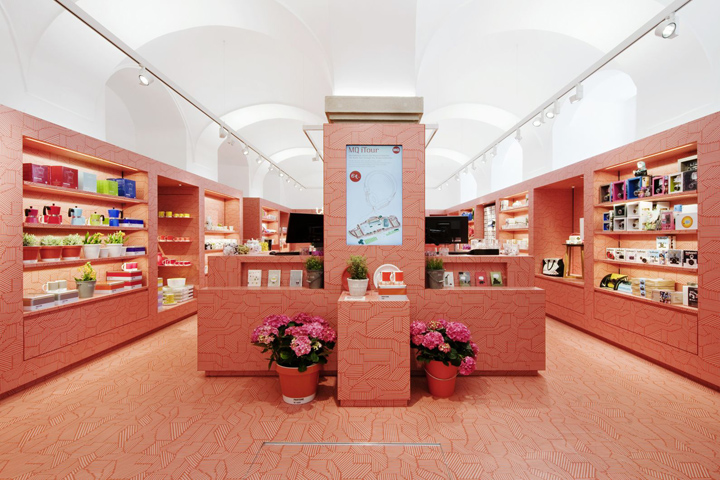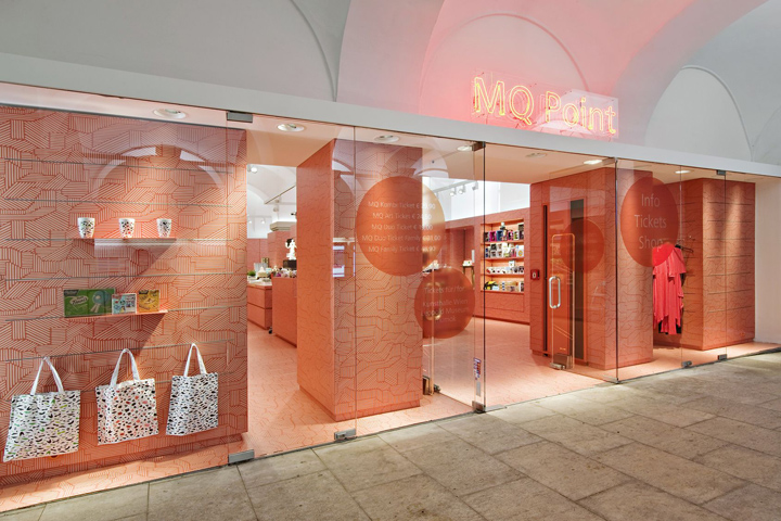
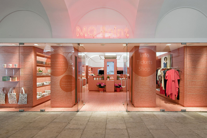

In a very communicating, extremely alive cultural complex a relatively small room with defensive appearance to the public needs strong gestures. The new MQ Point places its attention on one strong and clearly pointed design concept:
“1 material + 1 colour + 1 pattern = 1 shop”

The pattern´s symbolism/ symbolic character, which is a kind of constantly changing “digital brushstroke” over flooring, furniture and walls, speaks the same “artificial” language like the “loud” red orange CI colour of MQ Point. A kind of “overpainting” of the functional contents of a classic point of sale/ shop, a change of viewing habits, a little irritation. In order to support this concept of independence and recognition, the shop pushes itself into the existent building structure. The shop stands out clearly against it. The consistent, creative superelevation of the guiding principle and conscious contrast to the old building support the perception and branding of MQ Point at the same time – inside and outside of Museumsquartier.

Inside MQ Point an intelligent and clear orientation for customers and employees is created in a small space. The orientation within the shop is simple, the space and its range of products are perceived in their entirety. Despite all artistic overlaps, the shop remains a productive and functional sales machine. Diverse products are summarised under the formal patronage of the pattern and are still at the same time, as single objects or product groups, more visible than before.

The new MQ Point is more visible, the shop in its uniqueness more receivable, the products receive a strong frame. A sovereign, strong statement for a central issue, within a strong, lively and for the city important cultural complex.


design by BEHF Architects
Copyright Photos: MQ Point, MuseumsQuartier Wien © Hertha Hurnaus

