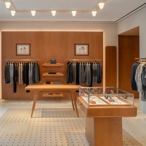
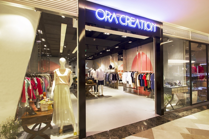

Ora Creation, a fashion company importing and selling limited European designer brands that offer customers a unique fashion identity, opened their doors on May 23, 2014 with the help of 5 Star Plus Retail Design. The new Ora store in Beijing’s Solana mall was to be a multi-brand store selling a number of European niche brands, which are not available anywhere else in China. The brief required an elegant, playful and neat store design where the brand could express its personality and provide customers with a design-oriented, yet dynamic European lifestyle. Because of 5 Star Plus Retail Design, Ora now has a fully designed retail store in Solana mall in Beijing that successfully reflects their sophisticated, yet modernistic brand.
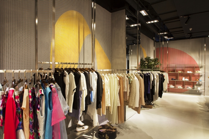
Ora, like its unique fashion, needed to stand out among its surroundings, and considering its location was in a quiet area of the mall, designing with a very limited construction budget was the main challenge. Asking for a flexible space with a dedicated focal area for two key brands and adjustable sections for the remaining fashion brands, Ora also wanted a warm color scheme and dynamic concept with some energy and contrast.
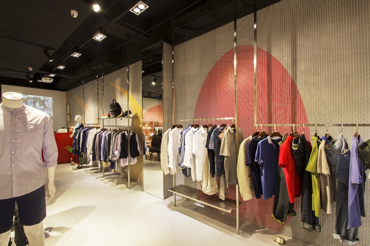
5 Star Plus Retail Design answered with a creative, fresh store design that fulfilled all of that. Obtaining materials that were available at a limited cost, were flexible enough to be sculpted into dynamic shapes and that added some structural strength was a task in itself. Inspiration for such materials were taken from existing designs in nature and the human environment, such as spider webs, fishing nets, woven elements and metal mesh used for fencing.
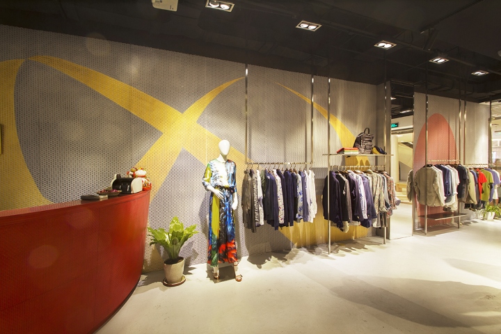
The overall design features a black shiny entrance with “ORA Creation” illuminating above in LED light to give a bold contrast to the more neutral shades behind the logo. On the left of the entrance is a diagonal, vertical wall where a panel is fixed, which outlines the various designer brands sold there. All of the fixtures along the left wall were hung with an angle to offer a dynamic energy in the space.

Enticing customers from afar, the wall decoration was the key design element of the store. The effect was actually created with two layers—a grey wall with sporadically flowing shapes painted in red and gold, and in front is the second layer made of a natural white metal mesh. This creates a sense of depth and movement when the customer walks through the store. To draw customers to the back the store design implemented an accessory display shelf and a curved counter painted in a vibrant red. Not far from the counter and toward the fitting rooms is a mirror wall, created with triangular mirror tiles. The mirror wall and fitting room paralleled with each other offer a balance between modernity and traditionalism, once more underlining the unique luxuriousness of Ora.

Showing the true beauty of the European garments, we utilized natural white light to focus on the display areas. Despite the cool lighting color, a sense of comfort was still created through the warmly colored surface materials on the wall. Overall, 5 Star Plus Retail Design took Ora’s brand, along with the store’s location and space challenges and successfully created a design that reflected Ora’s elegance, modernity, Europeanism, and energy, but also what would appeal to Ora’s key customers.


Add to collection

