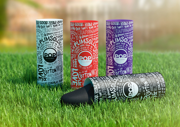

POP Village plimsolls make debut at summer music festivals. Global brand design consultancy Elmwood have worked with new footwear company POP Village to create the brand identity and packaging for their cool range of plimsolls. The collection will launch across a series of music festivals this summer, after having debuted at Global Gathering at the weekend. Created by childhood friends Andrew Turner and Mario Campagna, POP Village’s light weight plimsolls are set to capture the attention of a hip, young audience of festival goers with their lively, palette, fun branding and unique packaging. With an authentic European feel, the shoes are hand stitched by skilled craftspeople in the La Rioja wine region of Spain and made from ethically sourced cotton and natural rubber. The plimsolls come in one simple style with a range of cool colour options, and adding a playful twist, each one also has its own scent, including raspberry, rose, cherry and vanilla. To launch the footwear range, POP Village enlisted the help of Elmwood to conceive the brand concept, including logo, colour ways, packaging and festival stand.

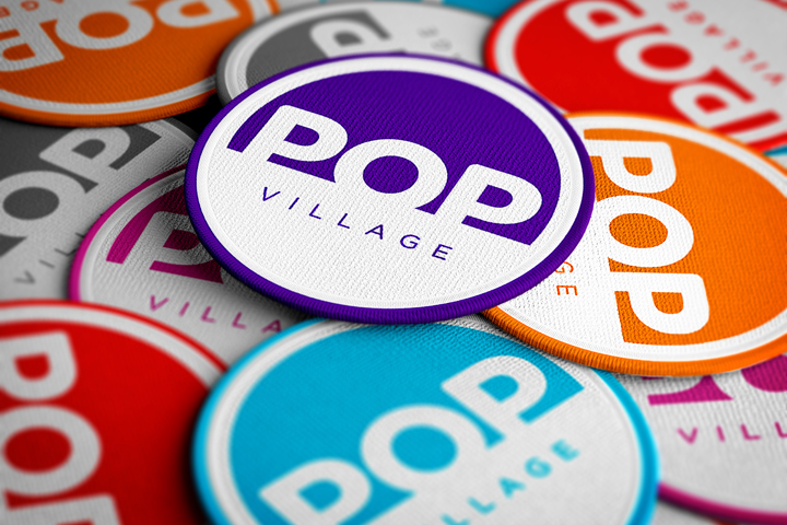
Capturing the youthful spirit of the product, Elmwood created a bold and distinctive logo, featuring the brand name ‘POP Village’ inside a circle, which features on the heel of each plimsoll. Circular business cards were also produced, designed to feel like fabric patches. Elmwood also devised a fun and unique packaging concept for POP. Each pair is merchandised inside a striking cardboard tube with a pop-top. The tubes features hand written-style text, communicating messages about the brand’s ethos, including ‘Ethically sourced’, ‘Made in Spain’, ‘Light and durable’ and ‘Feel good and do good’. Elmwood’s aim was for POP to have iconic ownership of a packaging concept that is not only engaging to customers but works well in a festival environment. Aiming to appeal to a wide audience and giving the products real standout, Elmwood used a palette of on-trend shades for the logo and packaging, including cherry red, denim blue, candy pink and navy. Abi Turner, Designer at Elmwood said: “POP was a really exciting project to work on because we had the fortune of building the visual identity for the brand from the ground-up. Our aim was to appeal to a fun, young audience by capturing the playful, vibrant feel of the products. A bold versatile logo was especially important in setting the tone and the unique tube packaging and bright colour palette brought it all together into a strong highly ownable brand concept. We’re thrilled with the results and cannot wait to see POP Village hit festivals this summer.”

Andrew Turner, Co-founder of POP said: “The contribution Elmwood has given to our brand is impossible to underestimate. As a start-up, trying to establish and communicate an identity is not easy, and something that comes with time. Having people who understand and show enthusiasm in what you are trying to do is what gets you through the hard times. The quality of Elmwood’s work has been an incredible asset in presenting our brand to potential customers and other businesses. I can’t speak highly enough of what they have done for our company.”
Branding by Elmwood
