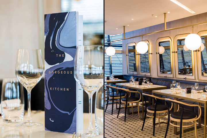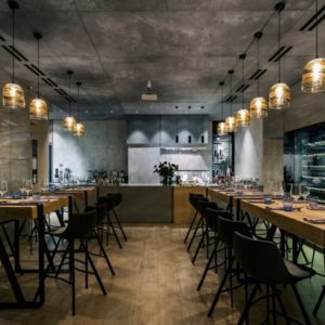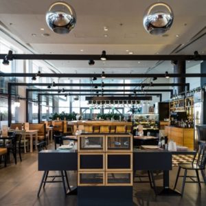


The restaurant’s interior is designed to delight guests, with spectacular views of both the departures lounges and runway, a perception of flying is offered before they ever take off. The design evokes feelings of tranquility, peace and calm, an escape within an escape. Unlike many other airport eateries, The Gorgeous Kitchen offers nourishment for the mind, body and soul.

The brand identity is immediately visible from the exterior of the restaurant, drawing guests into the space where they are immediately given a view into the partly open kitchen. This kitchen acts as the main stage for the chefs to interact with their guests. The rest of the kitchen, partly hidden by screens, allows the guest to see only the movement of the chefs at work, adding intrigue and mystery to experience. The entrance also provides a retail opportunity for each chef’s individual products, allowing their personalities to be present within the space.

The layout of the restaurant itself is based on natural organisation and freedom of form. Taking inspiration from the formation of a rockpool, the team’s approach meant the seating arrangements provide an unhindered space, giving an overall feeling of tranquility to the restaurant. Delicate copper vinaigrettes connect the spaces from a central point, creating pockets of natural rest for guests as well as adding a degree of intrigue to the space. Antique Murano glass shades appear to float effortlessly, adding a certain ethereal quality.

The two worlds connect throughout the journey to create a holistic experience. Through the use of intrinsic materials such as marble and copper, colours and patterns, the brand identity and interior design blend as one. The entire effect allows guests to detach themselves from the hustle and bustle of the typical airport environment, drawing them into the world of quiet luxury that is The Gorgeous Kitchen.
Design by Blacksheep


http://blacksheep.uk.com/project/The_Gorgeous_Kitchen


