Add to collection


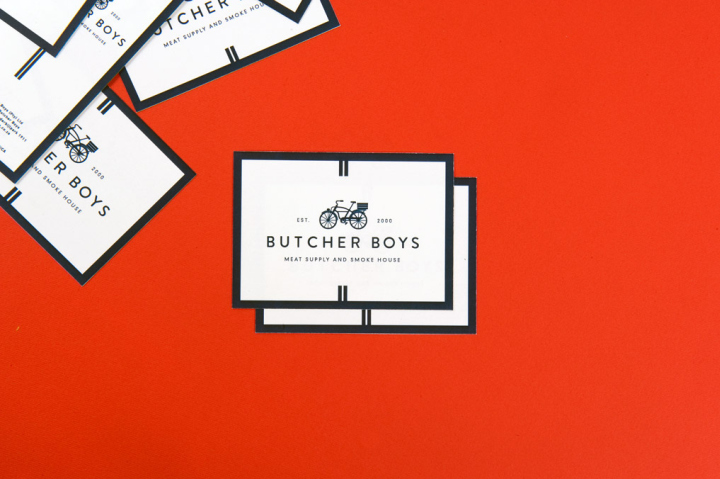
Vanderbijlpark has long since been home to the Butcher Boys Meat Supply & Smoke House, a store filled with old world charm, the personal familiarity of your local butchery and value prices. The inspiration for the Butcher Boys logo was touched off by an old Schwinn bicycle that had inhabited the store for years. As an emblem for a butchery, the bicycle is an unusual choice, but therein lies its effectiveness and beauty. The more obvious accouterments of the trade – knives, steer silhouettes, aprons, meat – do not necessarily impart a sense of the time-worn processes and values embodied by a butchery such as Butcher Boys.
The bicycle, on the other hand, hearkens back to a time when butcheries delivered meat parcels to customers on creaking one-speeds. Graphically, we simplified the old Schwinn to create a logo that is as unpretentious, orderly and steeped in heritage as the business it represents. The primary colour, Stamp Blue, was inspired by the edible dye health inspectors use to mark meat with.
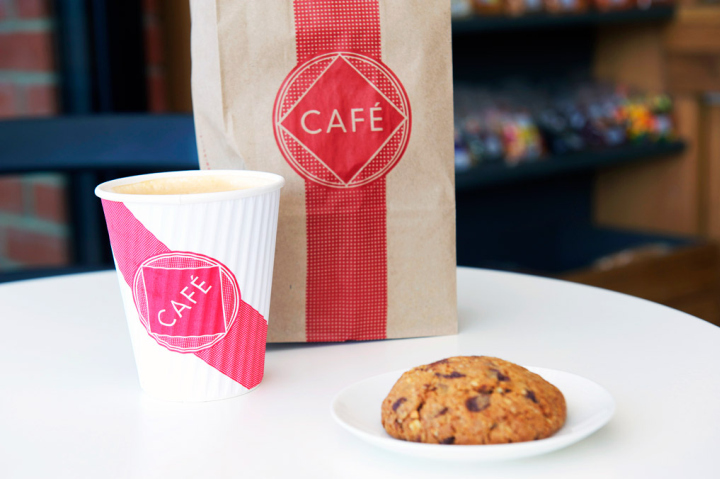
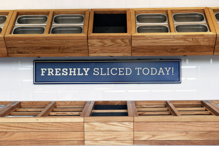
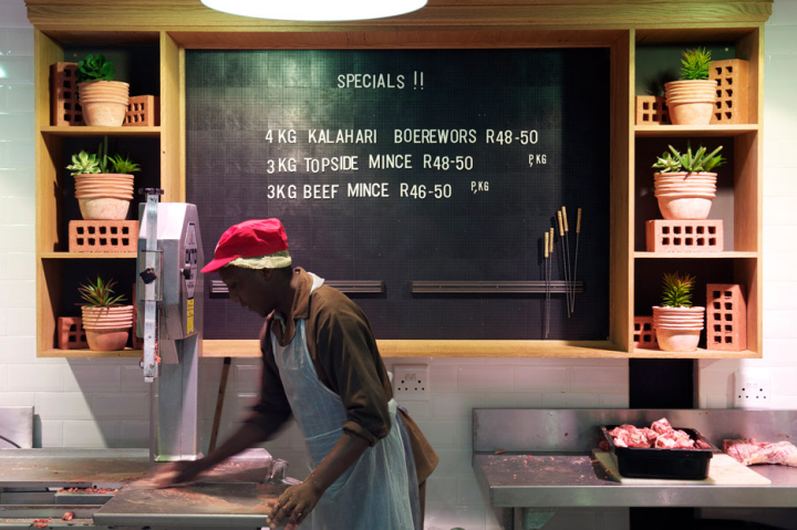
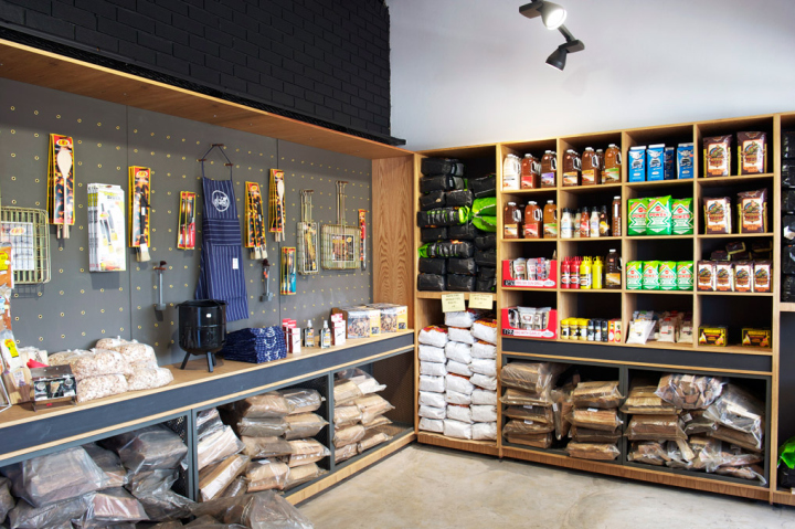
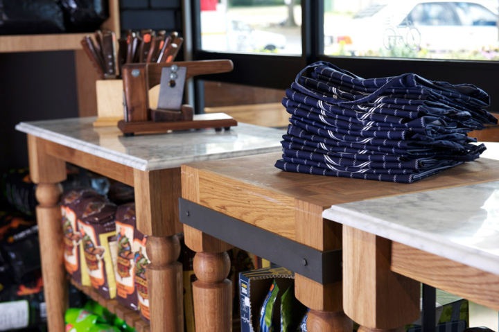
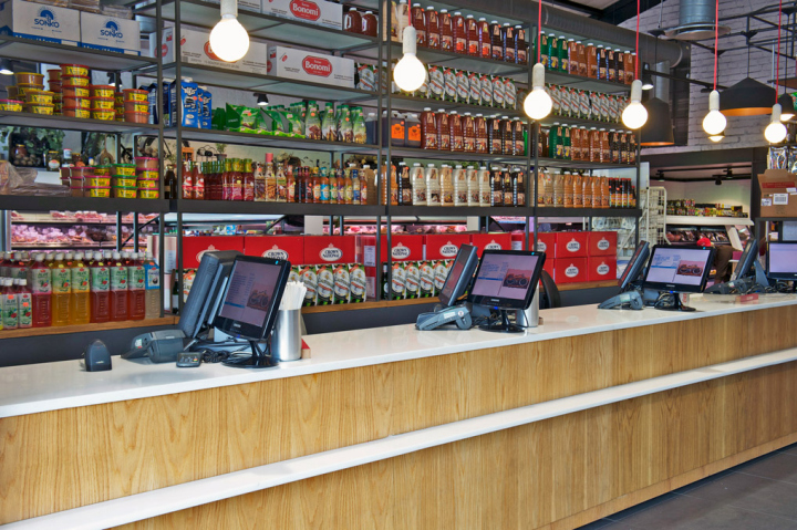
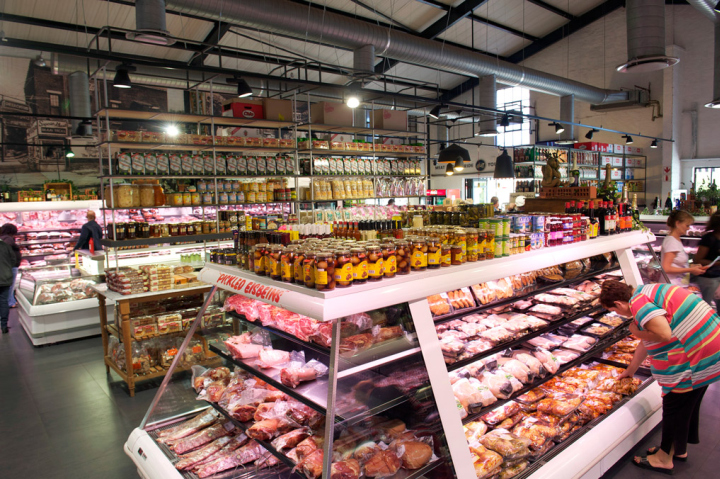
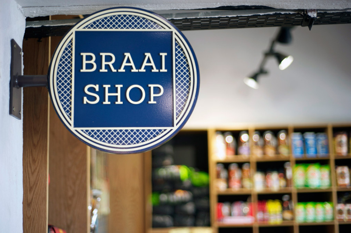
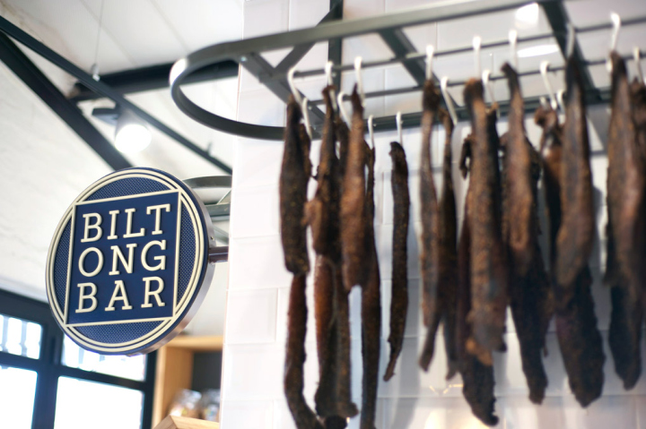
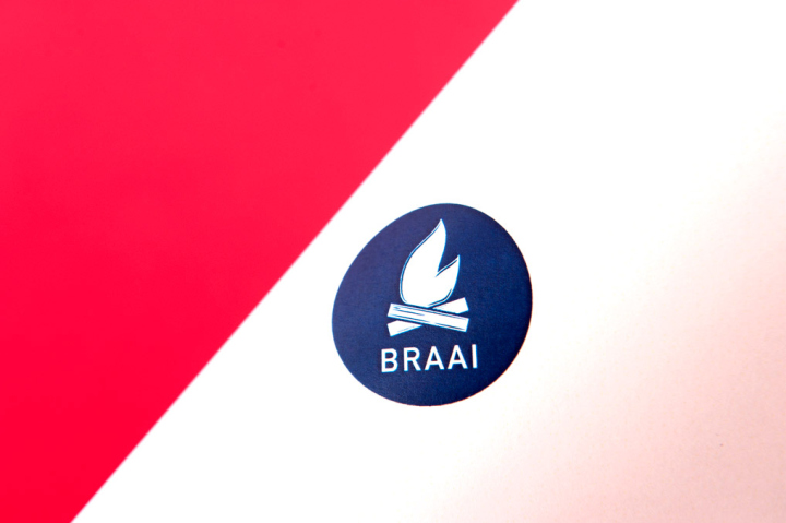
The Butcher Boys wanted to complement the South African tradition of biltong and braai culture. The Braai Store was created to offer all the essentials to mastering the perfect flame, with a range of branded lifestyle accessories, whilst the Biltong Bar offers a wide array of signature spices and flavors of self-service biltong. Catering for hungry shoppers, the Café has a growing offering from coffee, to gourmet hotdogs. A table and suspended shelving runs down the center of the store, stocked to capacity with quality goods to complement your meaty purchase. Amid the shoppable pantry display hangs a cluster of black pendant lights with a brass interior, emitting a warm glow at the heart of the store.
There is a sense of nostalgia to the design, with large-scale black and white charcoal illustrations by renowned local artist Dean Simon that speak of a time since past. This nostalgic spirit is echoed in the materials used throughout the space, with the use of subway tiles, fair-faced brickwork; butcher’s blocks and solid oak tables topped with marble. The gabled brick façade of the store has black and white awnings stretching the length of the veranda beneath them. Edged with timber clad planter boxes, this space forms a sociable entrance to the store.
Reflecting on the heart of the Butcher Boys brand and their value of quality provision, the serviced deli counter at the back of the store features a mural of the iconic butcher boys Schwinn delivery bike. We also created a range of icons to delineate product specifications and offerings. Distinct patterns and lines of differing thickness were used to illustrate the characteristics of each product.
For example, thick lines were used to indicate powerful spicing, thin lines to denote mildness and zigzagging lines to flag a tangy, lemon flavor. This graphic language enables customers to identify and make sense of the products at a glance without having to read the fine print on the back. The Berman brothers, the men behind the Butcher Boys name, have an innate warmth which permeates the store culture, and in-turn the shopping experience of each customer. On Saturdays streams of customers enjoy the calm bustle of the large inviting space, eager to enjoy their spoils straight off the flames.
Designer: Olivia Train / TDC&Co.
Creative Director: Neville Wills
Photographer: Mareli Esterhuizen
Graphic Identity by CLRS&Co. part of TDC&Co.
Creative Director: Marcii Goosen
Art Directors: Dale Lawrence, Franco Fernandes Claire Johnson
Copywriter: Ethne Mudge


Add to collection