Add to collection

Design and construction of the new offices in Chile for the Amsterdam based online booking accommodations company, Booking.com, located in the 5th floor of the CCU Builiding in Santiago. The design contemplates office space for 33 people, including meeting rooms, breakout lounge, restrooms, service areas and storage rooms, and several different scenarios.
The challenge demanded to pursue the international design standards established by the brand, incorporating elements that reflect local (Chilean) identity inside the office.
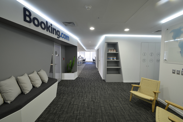
As the first interaction point between the visitor and the brand, the entrance to Booking.com is a crucial place to implement the brand’s identity. In a radical approach that SienteCinco sought for the interior design, the logo is placed on an elongated structure which breaks diagonally from the wall plane to face the visitor, allowing its view from the elevator hall to lead visitors into the office. Conceptually, the interior design responds to the logic of a shell. The closed programs are developed as volumes immersed in a void. When an aperture is needed, the envelope opens breaking the shell to show its interior defined by a grey color. Embracing this motif, the geometries of the walls seamlessly integrate several decorative and functional items to the structure, like the built in waiting bench and indoor garden found in the entrance hall suggesting a way of organizing space. The bench is complemented with neutral colored cushions, matching the armchairs on the opposite side of the waiting area.

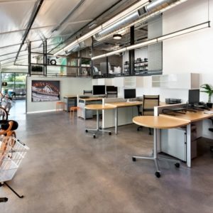
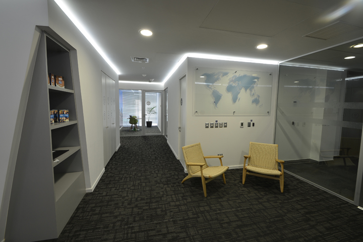
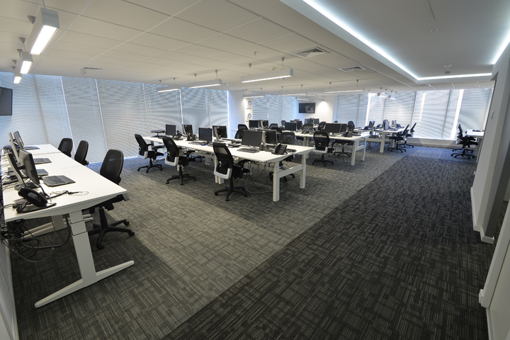
The plastic language used for this project works with diagonals intersecting the main volumes to amplify the dynamic feeling in the interior. Following this internal logic, the cuts reveal the service area, restroom entrance, breakout lounge, and shelves inserted in the wall to exhibit POP material. To complement the access hall, a world map which highlights the countries where Booking.com is physically present was placed in one of the walls. The map was also designed in house by SienteCinco. The interior design responds to habits, expectations and requirements, resulting in a facility that’s as practical as aesthetically pleasing. Booking.com’s design policy requires a layout with open workspaces and interchangeable work stations. In a strategic manoeuvre with multiple practical advantages the interior was aimed to minimize eventual distractions, while creating a seamless spatial connection between work and cozy relax-zones through architecture.

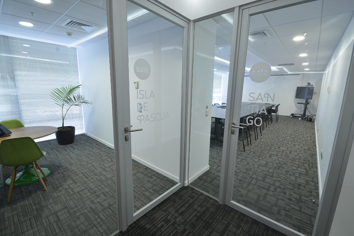
The team created a circular pathway to divide flow between employees and visitors, separating groups of users with different needs. This was achieved by arranging the meeting rooms in one sector with a direct connection to the main entry, avoiding the need of crossing by the open work area to access meeting rooms or move through the office. Thus, there are quiet spaces for those who want no distractions and stress-free zones for guests, or groups who want to have informal meetings. In order to highlight the boundary between working space and transit areas the ceiling indicates transit areas with perimeter LED lighting, while on the floor, carpet tiles change in color to further denote the walkway. Regarding colors, the open workspace was rendered in neutral colors to minimize visual interferences, using white and shades of grey. Splashes of color, and wooden furniture were reserved for enclosed meeting rooms and relaxation zones to elude a monotonous interior space, and embedding the brand’s spirit by providing a warmer, more informal feeling which contributes to provide comfort.

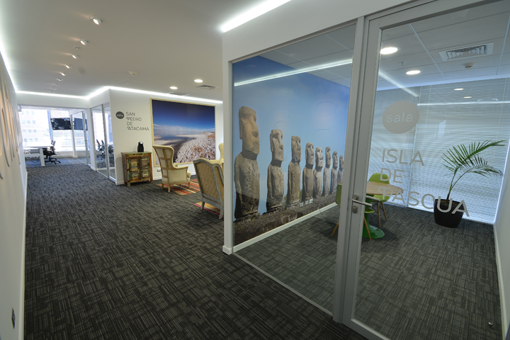
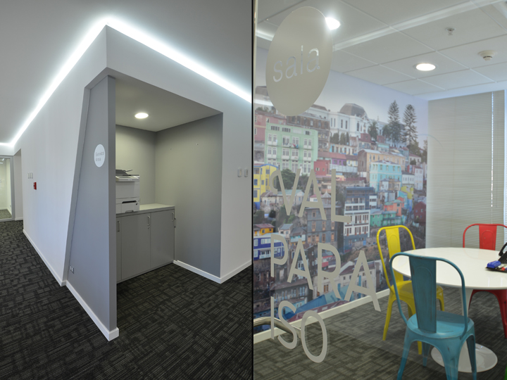
Each one of these rooms is identified with a relevant tourist location in the country to display the diversity of landscapes found in Chile, ranging from the driest desert to glaciers. For this reason, the sceneries of the Torres del Paine National Park, San Pedro de Atacama, Easter Island, and the cities of Valparaiso and Santiago were chosen as the themes for different areas to generate a variety of impressions. Each room was decorated in a particular way to complement the theme’s character. Large scale photographs were applied to the walls of these rooms, while particular furniture was carefully chosen following the tone set by each specific touristic location.
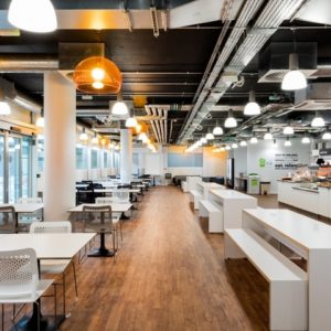
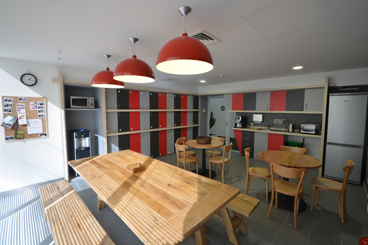
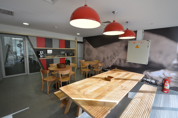
San Pedro de Atacama was influenced by the earth colors of the desert, while Valparaiso was highlighted by the intense and highly saturated colors that recall its architecture. The dinning and kitchen room, also known as breakout lounge, was designed to create a more intimate experience while applying details that relate the room with the local identity. A giant picture of a typical Chilean food was applied to the wall, while shades of grey and red were used to resemble the colors used by the Mapuche indian tribe in their fabrics. Contributing with the relaxed atmosphere in this area, a big rustic finished Evergreen Oak dining table was included along with benches instead of chairs to increase interaction between people.

Graphic applications in the project were also designed by SienteCinco. Responding to the international spirit of the company, the use of icons was preferred instead of words, appealing to a universal communication language. The icons itself were designed with an informal and humorous character to contribute in creating a closer and friendlier environment. These were applied in different places around the office, to signal meeting rooms, closets, and restrooms while delivering the booking.com spirit on every single detail.
Design by SienteCinco


Add to collection