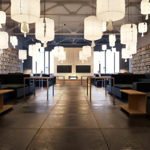
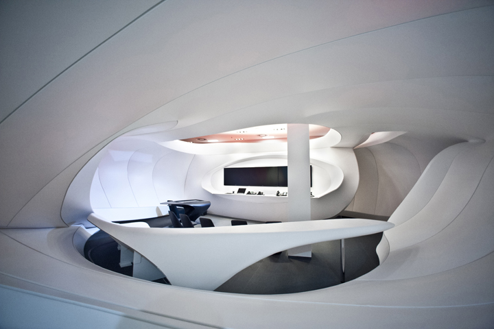

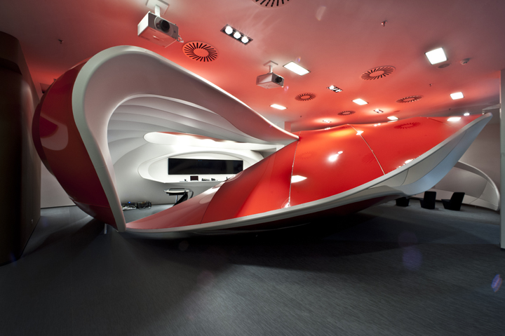
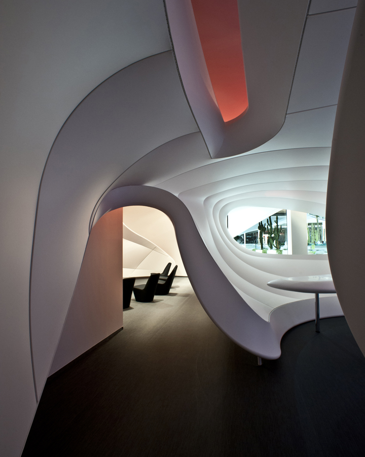
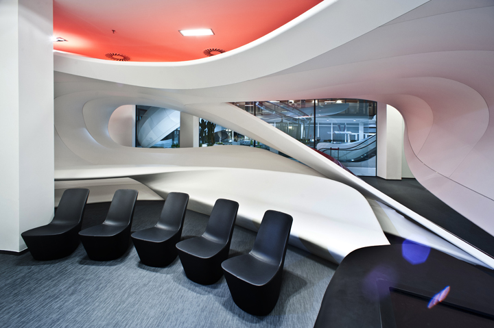
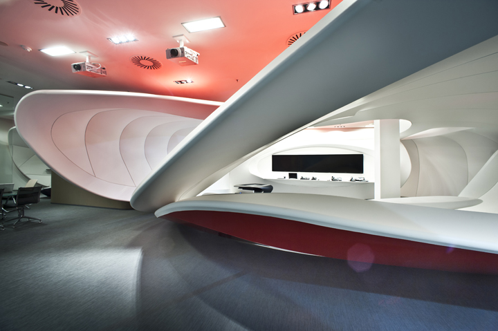
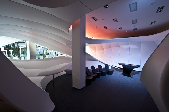
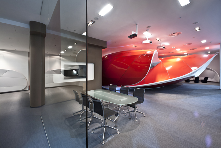
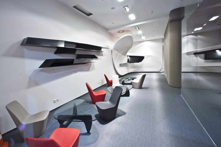
The interior design of the Customer Experience Center was created for the product presentation purposes to the Vodafone clients. The created platform allows the company’s clients to get a personalised and tailored tour which reflects their individual needs and provides them with a ‘know how’ portfolio of the telecomunication technology and services. The showroom area has a familiar feel but yet boasts the most advanced technologies which presents to customer wide range of services and products. This arrangement of space which leads into the customer’s tour firstly brings a relaxation zone from where the individual is intuitively lured pass the „organic walls“ towards the entrance welcome zone. The main part of the presentation occurs at the central – „Onenet“ object which leads from the back section via a narrow corridor and offer to every customer slow transition between the real world and the reality created by Vodafone. From there customers continue to another two, separated and differently shaped, parts where the tour comes to an end.
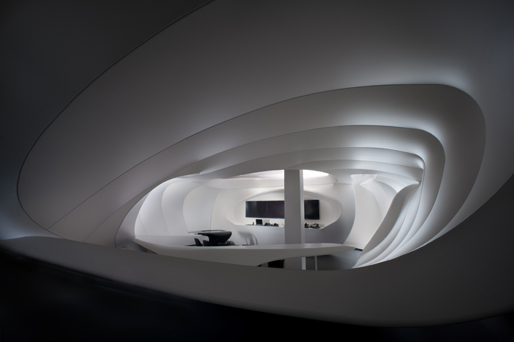
An exciting oppurtunity was creating a space on the ground floor of the Vodafone CR headquarters in direct connection with the Fuel Cafe, which we realized in 2007. The spaces are separated by a glass wall and thus in direct visual contact.Therefore the central object is designed with the main compositional accent directed at and in the plain sight of Fuel. Optically opened by two holes which are simultaneoulsy the main conceptual elements of artistic intetion and provide an interesting throughview back. The inside building solution gives the customer an unique space expericence, evocative and touching on cyberspace. This feel is increased by the original and very atypically designed tailored furniture. This object due to the constructional design has a relatively large size and is close to the size of a larger garden summer house or small building. This is why it is classified into this category of architecture. This is what we hope will become an example of an office space.
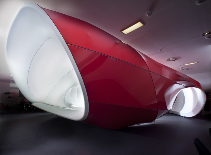
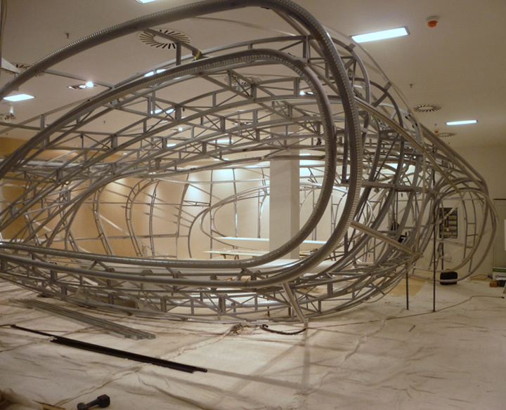
Vodafone plans to move its offices into newly built administration complex in other part of Prague, so we were requested by Vodafone that this Customer Centre object must be portable. That is why the whole design module is mobile. All construction is designed in a way, that it can be transferred within 5 working days. A few interesting construction technologies were used in this specific building space. These spatial objects were created on a complicated-shaped steel carrier construction. We firstly composed them in relation to their size in the factory hall and then had to fit them together piece by piece in the final location.
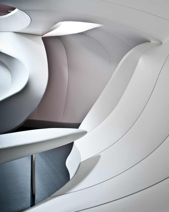
For the peripheral shape we choose a steel tube with a 60mm diametral, the rest of the ribs were created with a steel jackel 25x25mm. Subsequently the shape was divided into segments using aluminum moldings used for the stretching of Barrisol foil. We used the combination of red and white foil to create Vodafone branding color pattern. Award: National Architecture Award Czech Republic, Category: Best interior of the year 2012. Another inventive production process was that we had to produce our own custom made furniture for this space.
Photography: Alexander Dobrovodský
Design by Ing.arch Luka Križek, Ing. Radek Bláha at IO Studio


Add to collection
