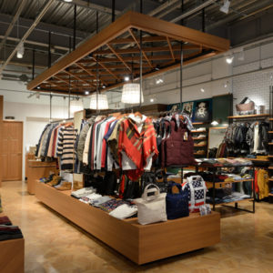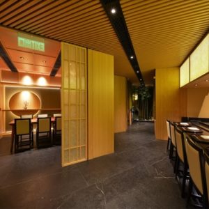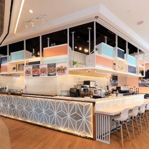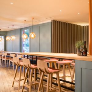
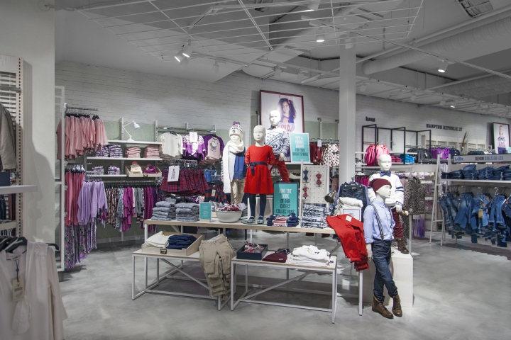

The second installment of our “For You” store concept for Nordic fashion retailer KappAhl has arrived in Gothenburg, offering female shoppers aged 35+ a more inspiring, accessible and easily navigable retail experience. Following in the footsteps of the Oslo flagship launched in May 2014, the Gothenburg store responds to what women in this often overlooked demographic said they wanted from the shopping experience. The concept also includes kidswear, men’s, baby and a standout lingerie offer.
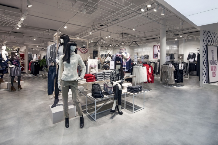
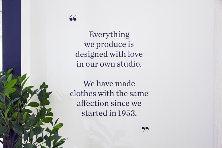
Communicating in a language they identify with and understand is at the heart of the concept – hence the “For You” motto – so we devised a friendlier, more informative tone of voice that has been applied throughout the store. Manifesto messages on the shop floor convey the brand ethos directly to consumers, while large-scale fashion images (always featuring the whole silhouette in order to illustrate how products can be worn) deliver styling advice and clearly signpost different departments. Overall, there is a major key change in signage from promotional to inspirational.

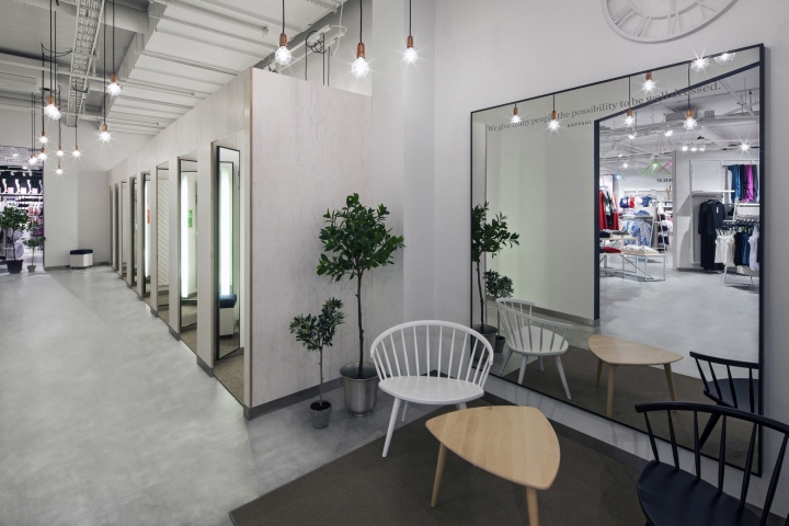
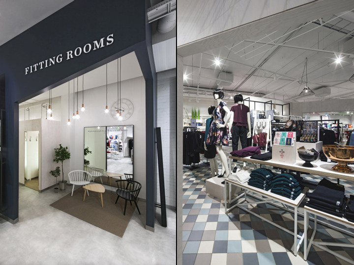
KappAhl’s Concept Manager, Camilla Wernlund, said: “At the top of our customers’ wish lists was a desire for it to be easy to shop. So we have focused on helping our typical customer to find her way around our stores more easily and guiding her to find styles that will suit her.” The flagship’s interior is kept true to its shell, a neutral setting in which KappAhl’s stable of own and sub-brands can shine equally. Angular partition walls loosely structure the space and create the sense of a journey through the store, with different ‘rooms’ discovered in sequence.

Our holistic approach saw the complete transformation of store environment, branding, navigation and communications; an overhaul not only of aesthetics, but also of brand perception and customer engagement. Other highlights in our recent work for KappAhl include:
• A new triangular pattern based on the brand’s ‘K’ initial, which gives an immediately recognisable and ownable identity. This was applied across packaging, gift cards and more.
• Design of launch materials displayed around Oslo to promote the flagship’s launch from canvas bags to bus-stop billboards.
• Redesigning the KappAhl Life and Style Membership Club.
• Redesigning the brand’s Sustainability Manifesto (Kappahl is renowned for its eco credentials).
• Lighter, streamlined styling of the KappAhl logo.
• A standalone store concept for Newbie in Stockholm – a development of the baby and newborn sub-brand.
Design: Dalziel+Pow



Add to collection

