
IndiHANDS is a gifting brand, whose proposition is based on making calibrated design interventions in existing Indian crafts. Over the years, the indiHANDS team has worked with craftsmen from various backgrounds. In the process, they have internalized the craftsman’s attitude towards materials, their techniques & most importantly the power of putting ‘spirit-into-matter’. Objective of sustainability initiative: touch the earth lightly. Sustainability is intrinsic to the countryside & by extension traditional crafts. Limited natural resources & simple hand-crafted techniques have implied that the choices are made judiciously. Crafts generously borrow three things from nature: material, form & expression. The word ‘borrow’ is significant for crafts. What is taken is taken without creating imbalance. At the end of the usage cycle, whatever is returned, gets seamlessly integrated (read disintegrated) into nature.
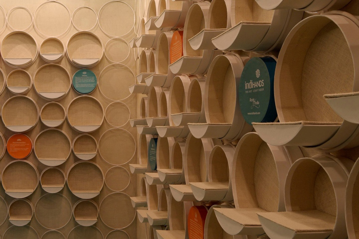
Design strategy: contemporariness & human scale. The design strategy was built around relevance of crafts in contemporary life. The design team interacted with craftsmen working with indiHANDS. The objective of these interactions was: familiarizing with tools, internalizing processes & analyzing products. One of the tools employed in traditional crafts is an embroidery-hoop. The humble hoop is a human-scale object which allows the craftsman to interweave patterns within the existing warp & weft of the fabric. While the hoop became the leitmotif, the interlocking mechanism of the hoop became the generic detail in the project. The store is located in a busy shopping arcade of a prominent IT park. Access was retained on both sides of the corner site. Fabric-clad folding shutters enforce context-immersion at first-sight. From afar, the store appears like a lantern.
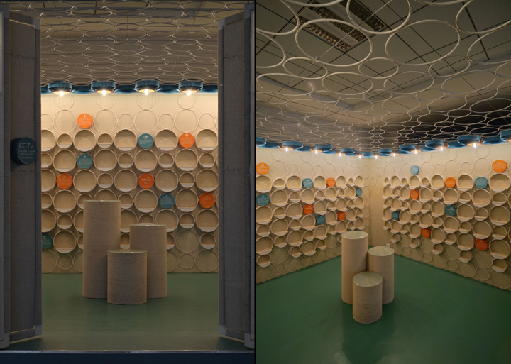
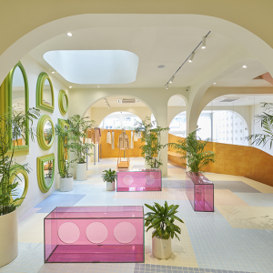
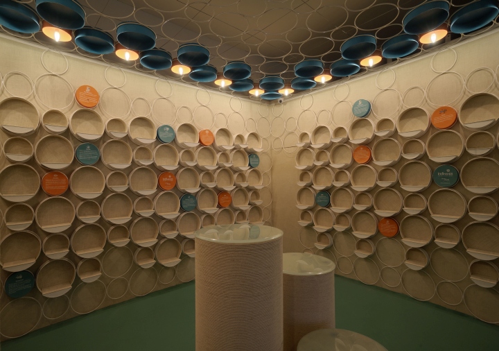
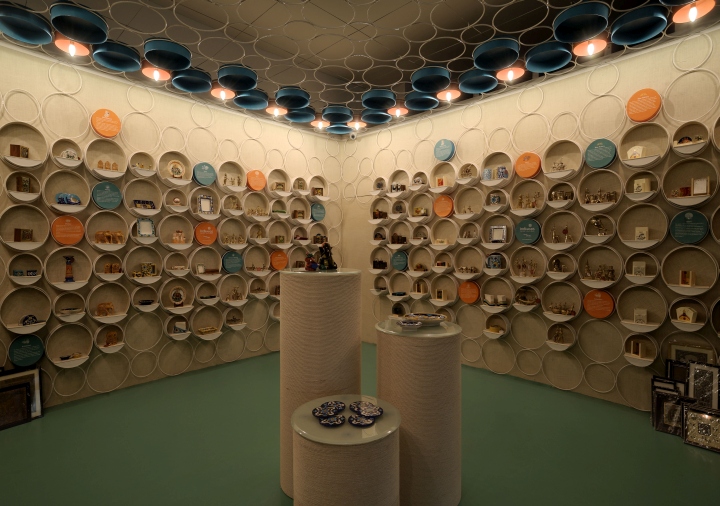
The merchandise reveals itself as the clients approach the store. Three pods at the center of the store, announce new-arrivals or limited-edition products. The planning is browsing centric; where people can browse through products in a gallery set-up. However, unlike an art gallery, products are displayed in an informal way. Paintings are deliberately kept along the floor, so as to make them accessible. The size of the hand, power of the arm & height of a person are the determinants in any craft-based product. The store needed to live the human scale. The existing ceiling height & finish was incongruent with the intimate-scale experience that the format demanded. To keep the site preparation & demolition to the minimum, a structural screen comprising of 6mm metal rods was designed. The screen forms the two walls & spreads across the ceiling. The wall-screen has circles of two sizes, designed to house two sizes of display shelves. The display shelves are made out of handmade paper, whose sizes are in response to the size of the products. For still smaller products, three to four products are displayed together to ensure visibility.
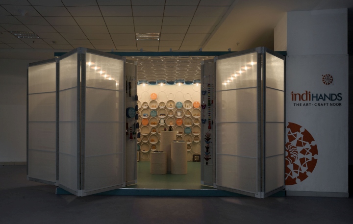
The circles in the ceiling house lights. To bring out the best in peripheral planning, peripheral lighting was employed. Lights were designed as inverted diyas & were crafted out of handmade paper. A colour temperature of 2700K was consistently maintained to ensure that the products appear warm & personal. A nature-derived palette, comprising of white (representing light), orange (earth) & teal (aqua) was chosen. At one end, this palette renders a contemporary feel to the store. On the other hand, the nature-derived colours subtly contrast the natural hues of the product; thereby highlighting the products. The tying concept was ‘Hand-led by Craft’. Vertical & Horizontal planograms segregate products in category & price. Embroidery loop inspired a structural system for walls and ceiling. Universal paper box displays slotted into this grid. The fabric wings on the store-front, flaps out to welcome guest in the day and closes down to become a lantern at night.
Design: Figments Inc. / Harsh Manrao
Photography: Hemant Patil


Add to collection

