
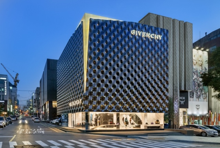
Recently opened in the heart of the Gangnam-Gu shopping district, the building features a optical facade that becomes urban landmark.
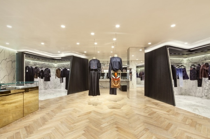
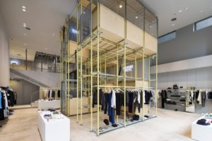
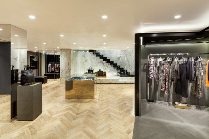
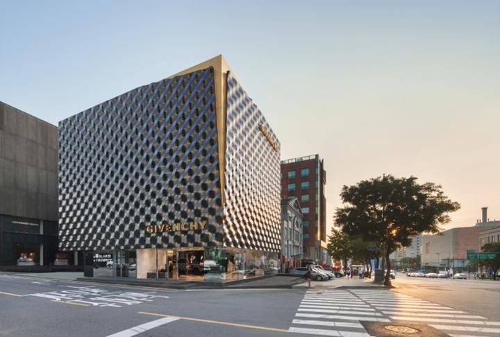
The Milanese studio Piuarch realizes the new Givenchy flagship store in Seoul (South Korea), in close collaboration with the art director of the Maison, Riccardo Tisci. The store is housed in a building located in the thriving shopping district of Gangnam-Gu. The boutique has an area of about 400 square meters on three levels and offers an exhibition of women’s fashion, accessories, and men’s fashion: a unique vision of luxury ready-to-wear, both urban and couture. The building features a peculiar graphic facade, with a hyper-minimalist interior that reflects the themes and the allure of the brand.
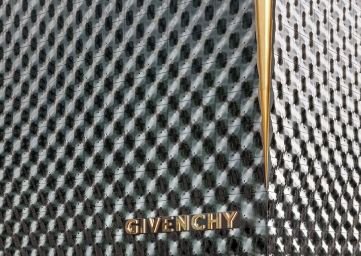
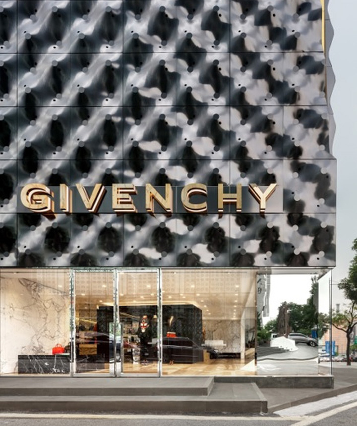
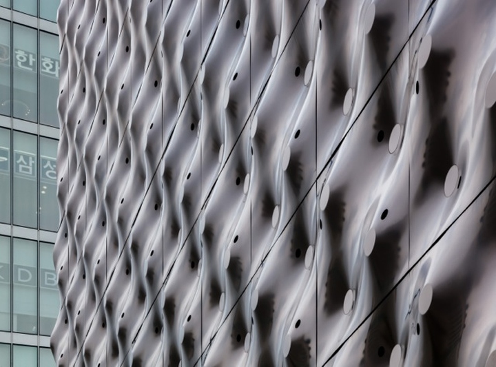
Designed as a sort of enclosure – a second embossed skin as an expression of a urban identity – the façade is meant to evoke the distinctive tailoring “T cut” that characterizes the style of the French brand. The ashlar surface made of electropolished steel plates creates reflection effects that change depending on the light and interact with the surrounding landscape. This peculiar skin is inspired by the Optical Art and by the characteristic use of fabrics that Givenchy made in the latest collections. Inside the cut, at the upper corner of the building, it appears a surface of satin brass which becomes an urban element for those who follow the great way of Cheongdam.
At the same time it evokes the brand since it is a direct reference to the famous T cut style of Givenchy. The corrugated iron has irregular holes that in the evening light interact to continuously modify the image of the building, generating kinetic effects that makes the whole building a dynamic structure and street landmark. Piuarch searched for reference on the Italian art movements of the 60s: Lucio Fontana and Enrico Castellani above the others. The point of contact between Italian optical art and the Givenchy is in the work of Riccardo Tisci, whose work is pervaded by continual reference to the artistic movements.
Piuarch wanted to match an urban approach to what is a tailoring use of materials. The result is a glossy black cube resting on a ground floor fully glazed.
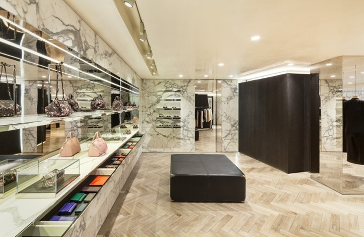
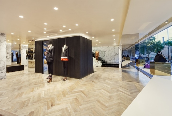
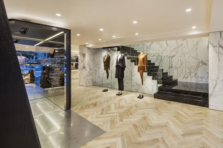
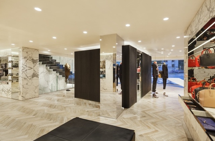
The general concept of the interior design is expressed through a unique research materials: marble calacatta, salanoir, stone Basalt, which are side by side in the different elements to create a spirit elegant, yet contemporary. Particular importance is given to the internal staircase lined with marble Sahara noir, off the wall with ramps that go in different directions.
Design: Piuarch
Photography: Shin Kyungsub


Add to collection
