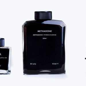


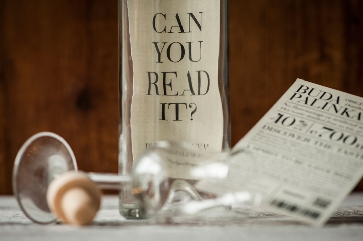
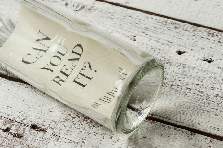
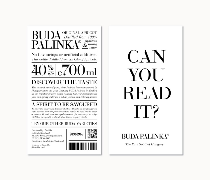
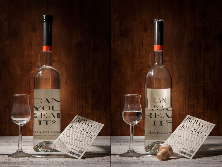
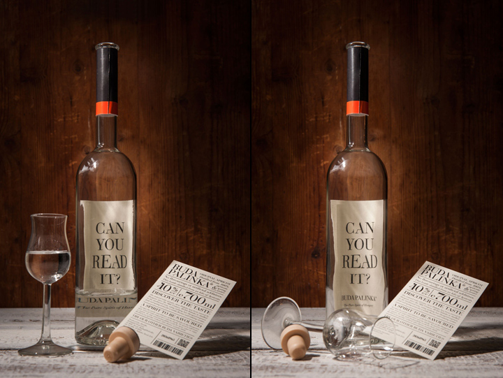
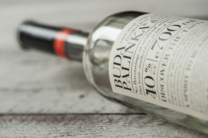
This is only a concept so far. I was asked to create a branding and packaging design for a pálinka (it is a hungarian spirit) to be distributed in England. I wanted to create something that has a serious look but have a bit of humour in it. Usually the back of packaging designs are quite simple. My intention was to create something that is eye-catching from the back as well, could also be mistaken for its’ front side. However, on the front side there is a text – Can you read it? As long as the pálinka bottle is full, the text is hard to read but as the bottle is getting empty it is becoming more and more visible. This is a playful game about the impact of alcohols too.
Design: Miklós Kiss
Photography: Bálint Jaksa




Add to collection


