
Flask and The Press is an unconventional duo that upends the traditional speakeasy concept: an intimate contemporary lounge concealed behind the facade of a cheery, sandwich shop. Together, they’re a juxtaposition of light and dark, elegance and funkyness, personal and playful. Aiming to launch a speakeasy in the heart of Shanghai’s former French Concession, renown mixologists & their passionate partners commissioned the development of the concept, location scouting and its space design. Considering that Shanghai has already seen its fair share of hidden speakeasy-themed bars and lounges we decided to build suspense and break it in an entirely unexpected fashion. In order to maximise impact, we would need to execute the project in a fundamentally different, distinct way, building expectations and genuine surprise by creating contradictory, anachronistic aesthetics.

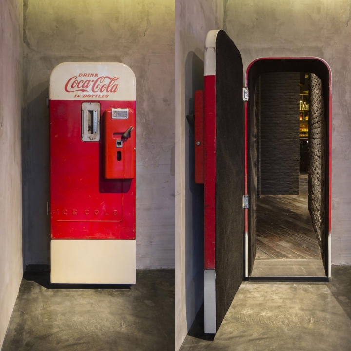
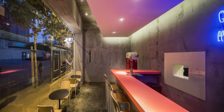
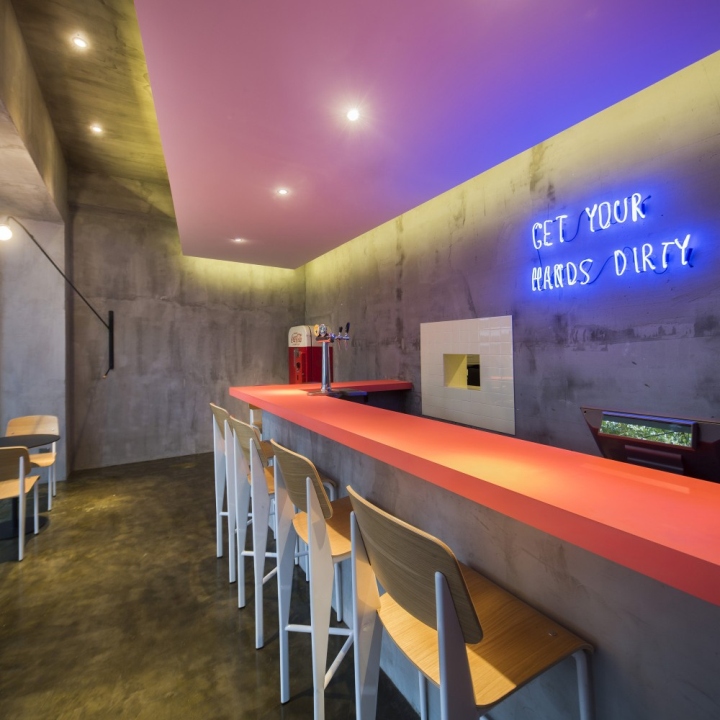
As a result, we created The Press, a colourful sandwich shop. At first glance, The traditional diner setting of The Press looks immediately familiar to passerby, but a number of edgier, more contemporary details call for a second look: the smooth, finished countertops in colourful shades, neon lighting strips and polished minimalism of the furnishings set against unfinished walls, rough concrete walls and floors, plus a dramatic, asymmetrical drop ceiling create an unconventional scene that inspires curiosity in the space. The centrepiece of the room is a vintage Coca-Cola vending machine, which is split vertically to swing open and reveal the entrance to Flask. Stepping into the tunnel between The Press and Flask, the visitor experiences an extreme contrast in environment. The fun, lighthearted feel, the bright colours and lighting—within a few steps, these elements segue into a mysterious space with warm, muted lighting and the murmurs of bar patrons to invite further curiosity.
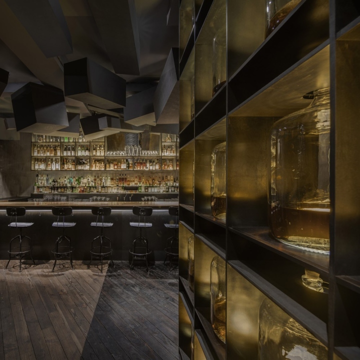
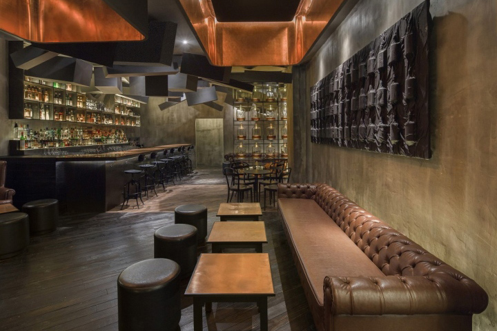
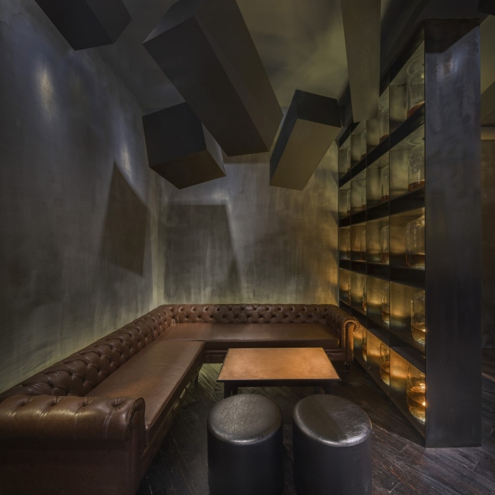
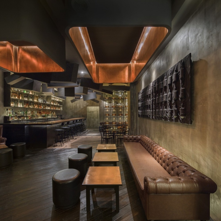
Following the camouflage door, the patron is presented with more visual cues of the traditional speakeasy: elaborate displays of bottles of liquor, a blend of dark and dim, plus a motley crew of furniture pieces that hints at the evanescence of these establishments as they were in the past. Continuing the play on eras and expectations, we integrated a number of contemporary intrusions throughout Flask. The first of these is a striking drop ceiling: an array of angular cubes cascading towards the entrance creates a mysterious allure for guests to further explore the space. We also created two installations featuring bottles of liquor. The first is a floor-to-ceiling shelving unit standing right next to the entrance, with 25 litre whiskey bottles that has a built-in spotlight on each bottle to illuminate the amber glow of the liquid inside. The second is a wall installation featuring rows of flasks that are hidden behind a mysterious layer—like the speakeasy itself, the surfaces of these flasks are hidden, with only the outline of their shapes to give the viewer an idea of what lies beneath.
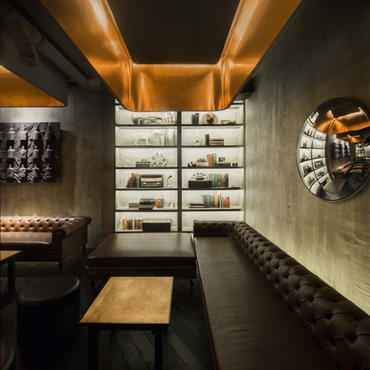
The rest of the space is designed to feel private and personal. Lighting is kept minimal and muted, with several base points throughout the venue each emitting a warm glow of light that bounces off one another. The most prominent of these is the copper lighting arrangement in the inside of the drop ceiling, which diffuses subtle amber light from the overhead. This light reflects off of the cascading cubes on the other end of Flask, creating an overall glowing effect that lifts the conventionally imposing feeling of low ceilings. Led lights against the mirrored backdrop of the bar counter reflect the bottles on display back to the patrons, creating an illusion of depth that makes the wall seem to disappear.
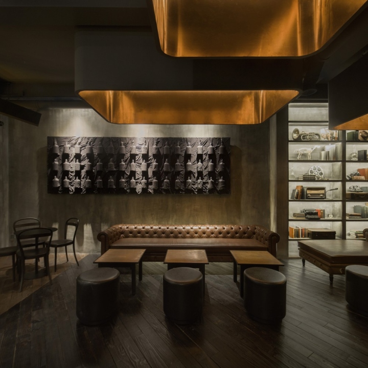
This slanted mirror also faces the entrance so that visitors looking straight ahead will see the flow of overhead cubes wrapping around his of her head, giving another subtle visual pull into the bar. On the far side of the venue, a large convex mirror reflects the entire bar back onto itself. To add to the warm, cozy feel of the venue, we created partitions in the seating area that transition with natural ease. Looking from the right side to the left of the venue, the heights of the seats and table surfaces are lowered, raised, and lowered again in increments to create a dynamic landscape within a compact, enclosed space. Similarly, the wooden floorboards parallel this fluid movement by going from dark, to light and back to darker wood.
Design: Alberto Caiola
Photography: Shen Zhonghai


via Archdaily


Add to collection
