
Background
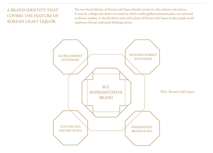
Shinsegae Traditional Liquor Design Renewal is a design talent donation project of Shinsegae department store to flourish the traditional liquor market in Korea. Korean traditional liquor contains different ingredients of various tastes and smells from various regions. However, its identity was not as much recognized as wine or Japanese sake. The overall design was renewed to maintain the tradition and features of liquor and to build up a single representative identity.
Strategy
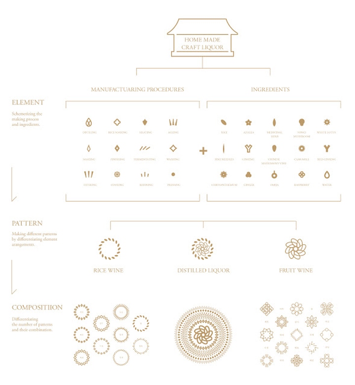
Korean traditional liquor can be classified into three main categories: fruit-based liquor, rice wine and distilled liquor. A design that unifies the three categories together as a single look and at the same time distinguishes each of their endemic features was desperate. The design concept based on the history of Korean traditional liquor was mainly focused on taste, smell and the impression each color delivers. For the project, three main design keywords were deducted. Consistency that fully represents Korean traditional liquor, differentiation that distinguishes fruit-based liquor, rice wine and distilled liquor based on its manufacturing procedures and flexibility to reflect distinctive features the three, made of different ingredients from various regions through unique processes, has.
Design
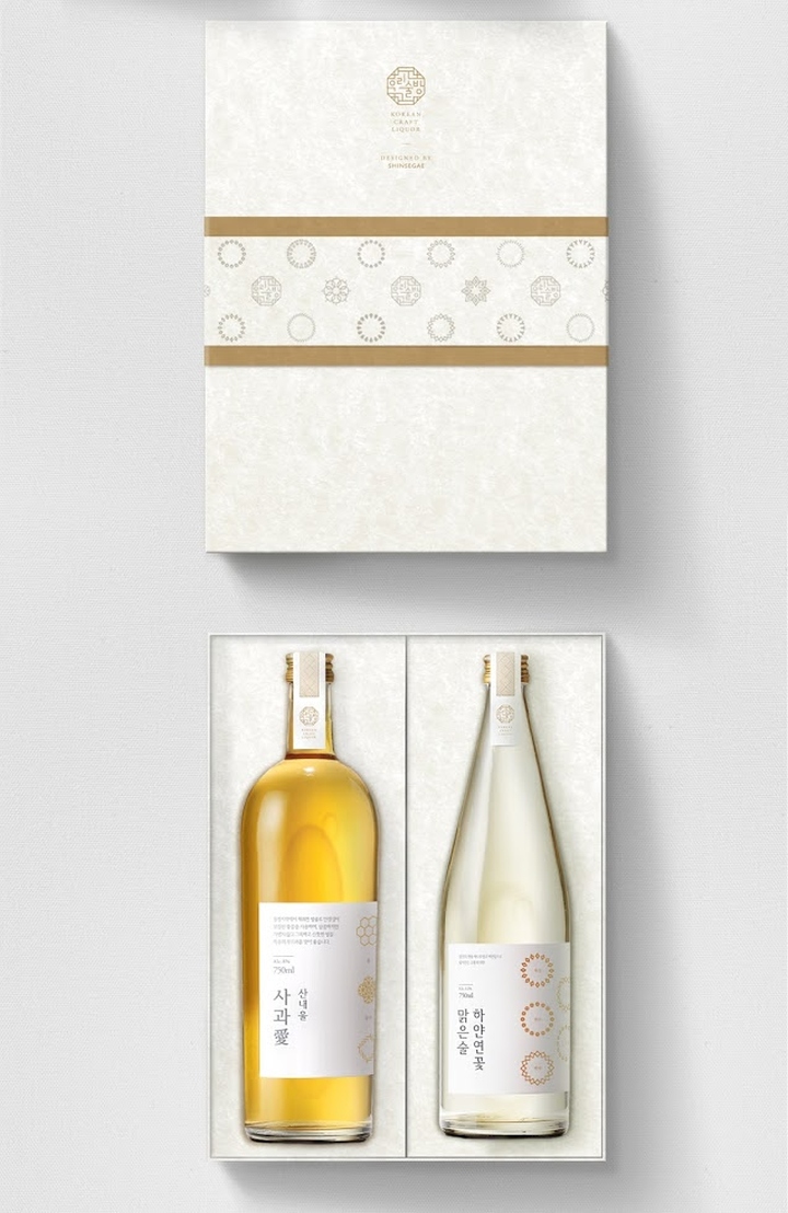
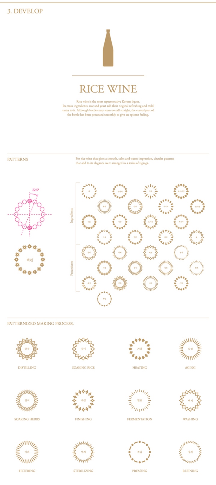
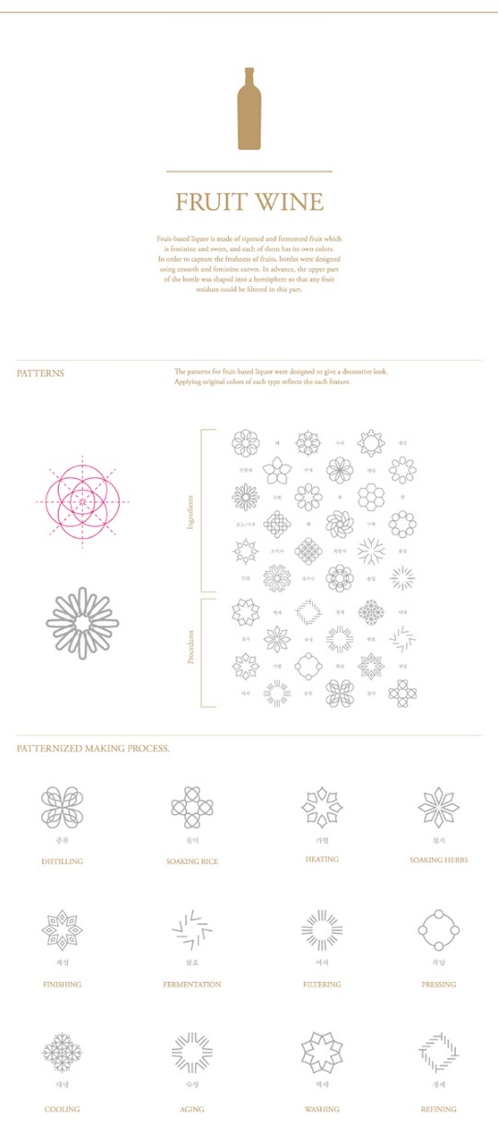
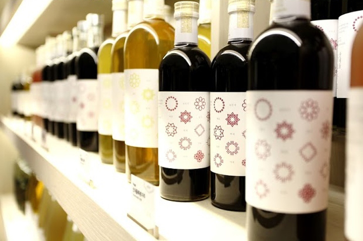
Three sets of icons were made for each category to represent the used ingredients and unique manufacturing process that they went through. These icons were arranged into peculiar patterns for each category. The three sets were differentiated by its combination but unified by identically using line drawing method. The will to preserve our tradition was conceptualized through the shape of the bottles. Based on this background, the bottles were formed of joined straight lines to visualize our progressive spirit.

Rice wine
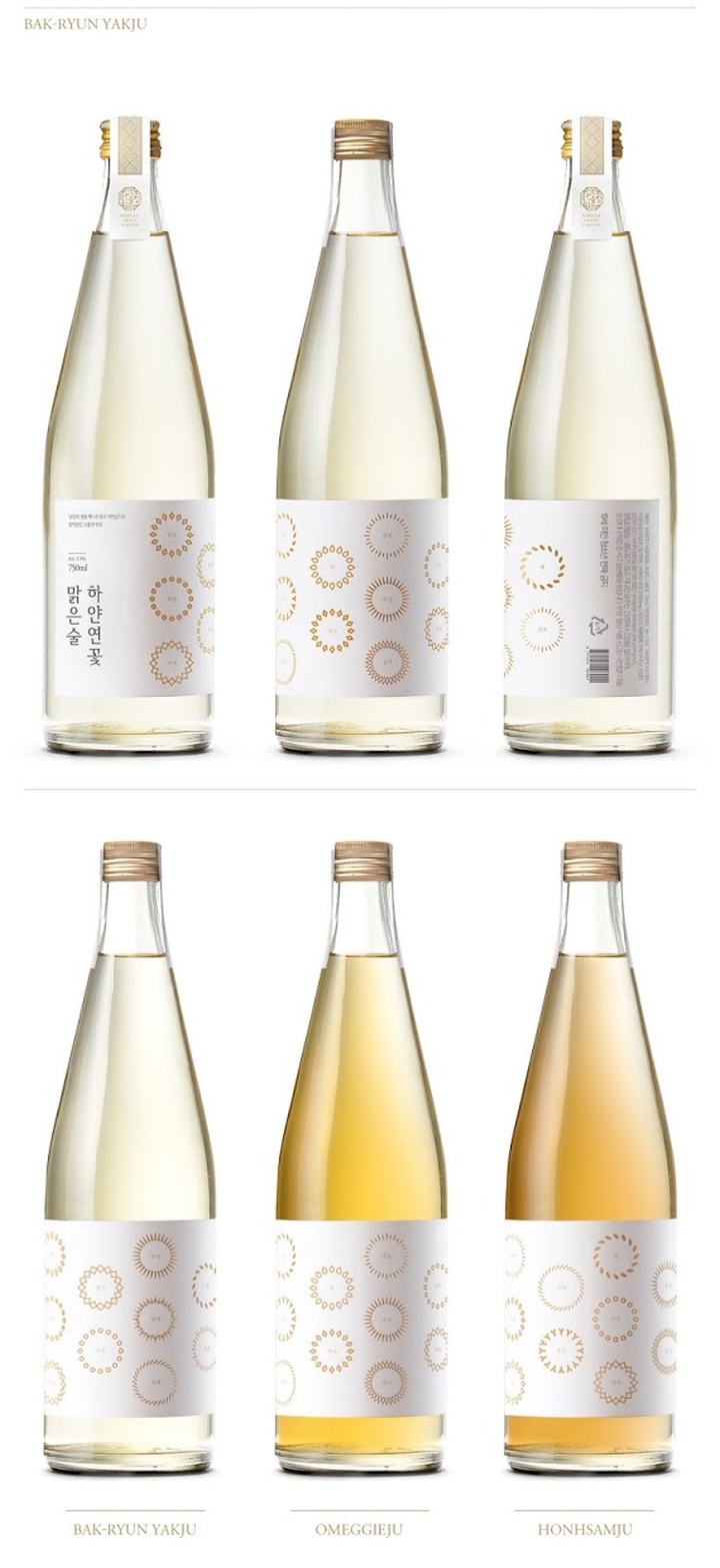
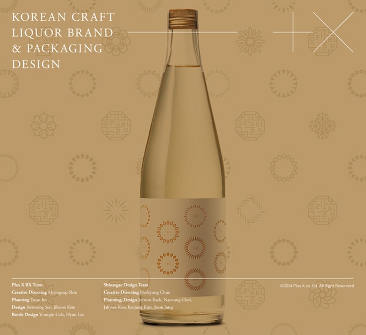
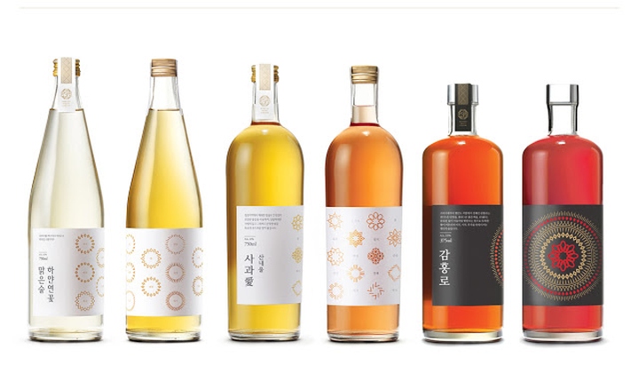
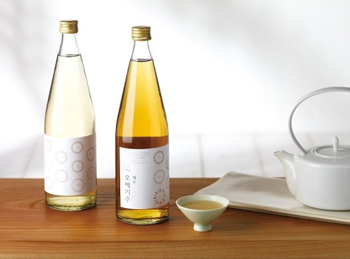
Firstly, rice wine is the representative of Korean traditional liquor. Its main ingredient, rice adds its unique refreshing and mild taste to it. Curved and circular patterns were used to give an elegant impression. The part where straight lines meet to form the bottle was smoothly curved to represent conservation of tradition. Modern emotional aspect of traditional liquor was reflected through minimally designed aluminum cap.
Fruit-based liquor
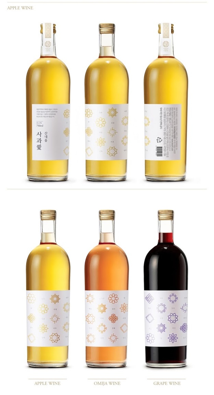
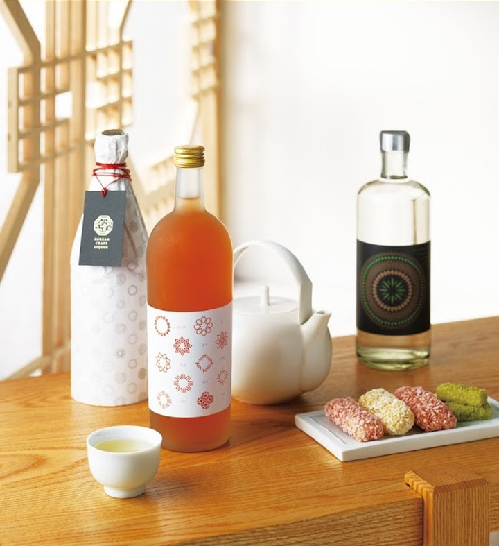
Fruit-based liquor is feminine and sweet, and each of them has its own colors. It was designed to deliver a decorative look and identically display the color of the icons to match the color of each flavor. The smooth curve from the bottle neck to the body was designed to visualize freshness of fruits.
Distilled liquor
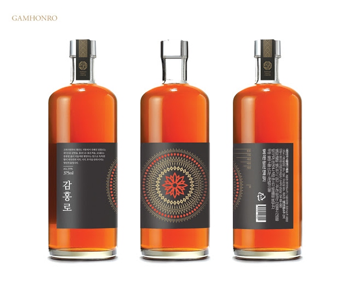
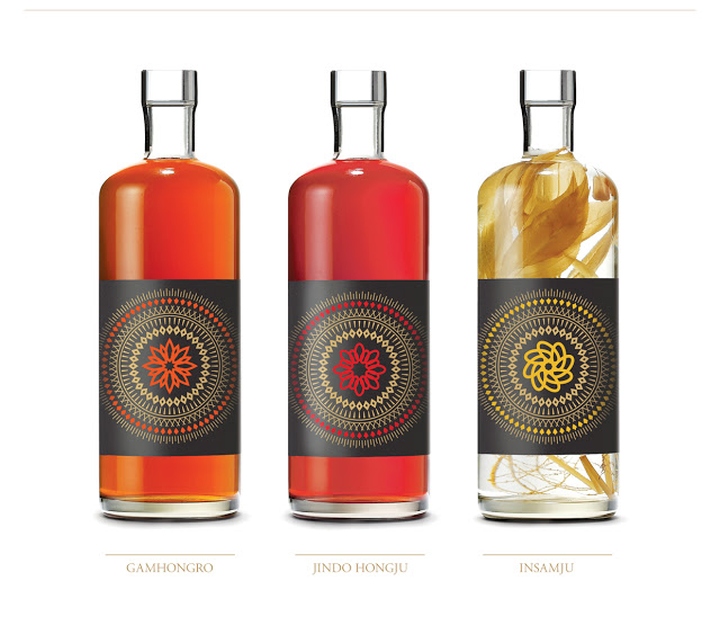
Last, the most refined alcohol beverage, distilled liquor is most heavy-bodied. It was identified as the most high-class liquor type throughout the history as the manufacturing process required most time among the rest. In order to deliver such features, symbolic circular patterns in gold on black background were used to add luxury. The outer pattern was illustrated to represent the producing process. The icon placed on the center of the pattern was formed to symbolize ingredients and distinct distillation procedures that different alcoholic drinks went through to produce various flavors.
The bottles were shaped to give an overall condensed impression to reflect high percentage of alcohol distilled liquor contains. Its large width and short height in terms of dimension compared to other bottles, reminds of masculinity and the thickness of the bottom part shows its heaviness.

Brand Mark
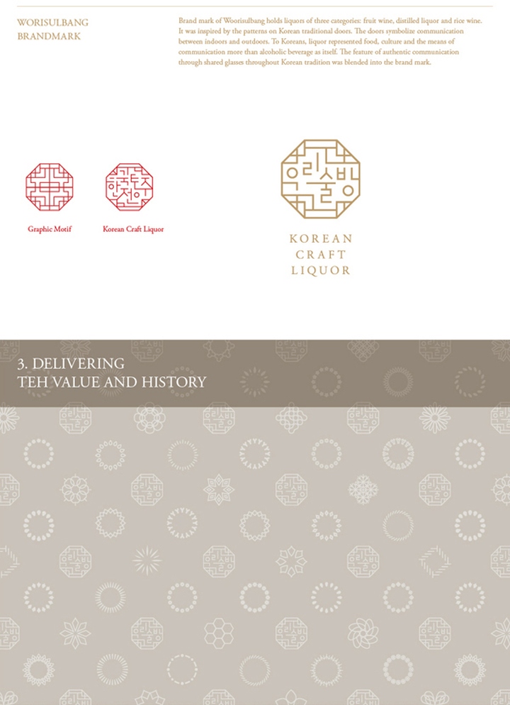
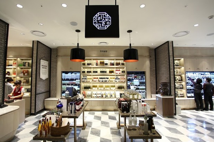
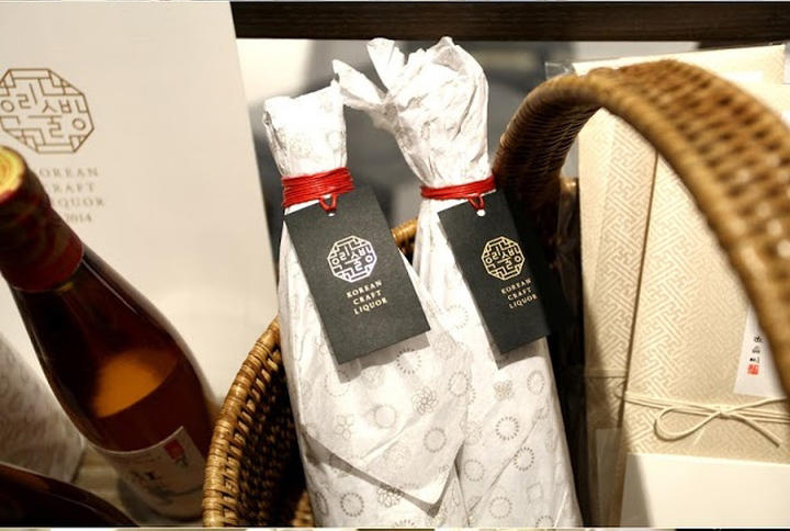
‘Woorisulbang’ is a space for selling traditional liquor of Korea in Shinsegae Department Store, Korea. Brand mark of Woorisulbang holds liquors of three categories: fruit-based liquor, distilled liquor and rice wine. It was inspired by the patterns on Korean traditional doors. The doors symbolize communication between indoors and outdoors. To Koreans, liquor represented food, culture and the means of communication more than alcoholic beverage as itself. The feature of authentic communication through shared glasses throughout Korean tradition was blended into the brand mark.
Design: Plus X BX // Shinsaegae


Add to collection


