
Ted Moudis Associates have designed the new offices of Initiative Media in New York City.
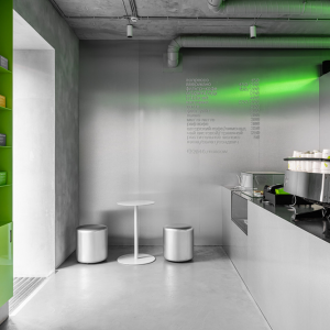
Most New York construction stories are all about the real estate; in particular most corporate headquarter moves are about reducing costs and increasing efficiency. However, for Initiative that is only part of the story. Theirs is a story of branding and the re-imagination of how their physical space could reflect their energetic corporate culture. Yes, Initiative did need to move out of their old, tired space on the quiet Upper East Side. They relocated to bustling Herald Square to be in the same building as their sister IPG companies. And although each company operates independently and maintains their own sense of identity and individuality, Ted Moudis Associates (TMA) proposed a strategy of creating shared amenities in order to encourage staff from different floors to interact; thus creating a vertical campus. A coffee bar in Initiative’s reception area creates this opportunity. “I don’t care if there are long lines for coffee”, said the CEO. “I want people to mingle and talk to each other”.

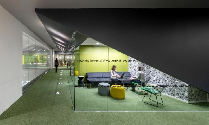
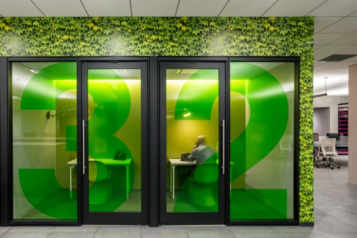
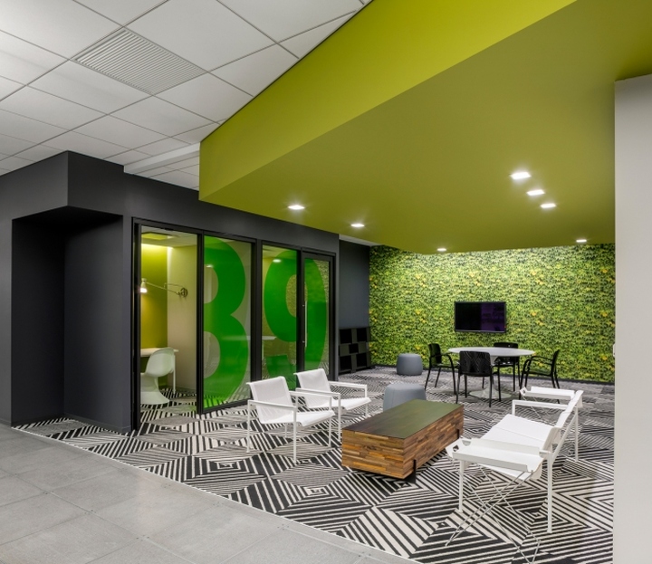
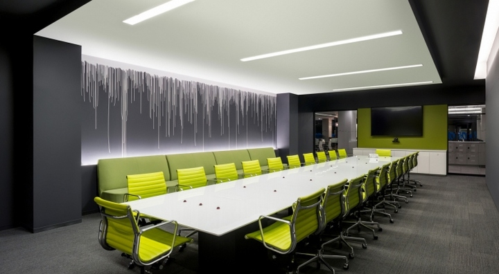
The innovative, new CEO was set on creating something new. TMA worked with Initiative to upend their current office space model. An unassigned desk policy was implemented and TMA used this as an opportunity to create a wide variety of work settings throughout the space. Staff could choose to work at a desk within their “neighborhood”, or take their laptop and move to a huddle room, open team area, private phone booth, or communal quiet room. As a result of this, TMA significantly increased the capacity on the floor, which allowed for the creation of many amenity spaces. These spaces too could be used as opportunities for both teamwork and individual focus work.
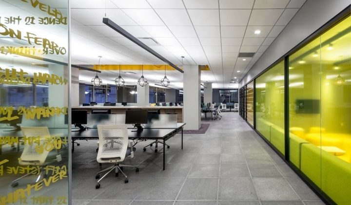
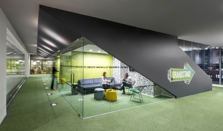
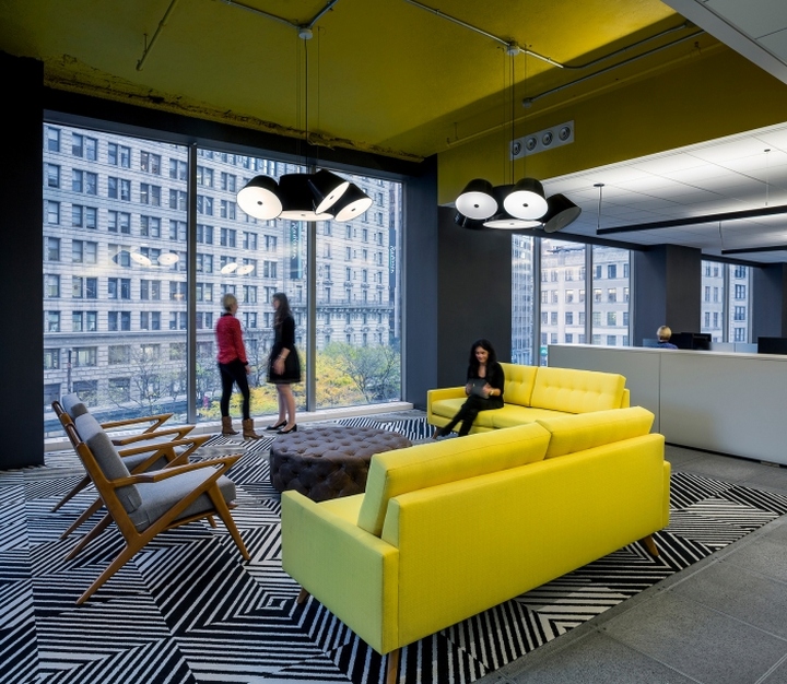
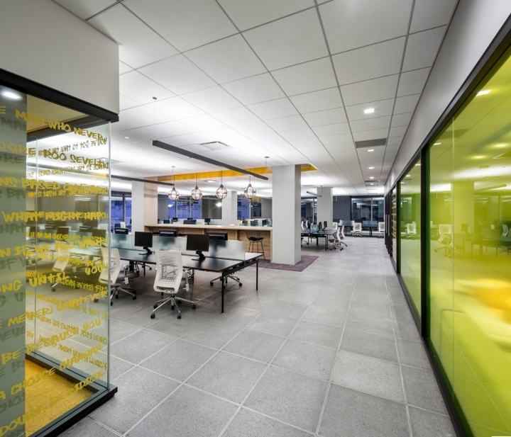
Although Initiative is a global, international media company, TMA chose New York City as its design inspiration for creating a new youthful and dynamic workplace that, like the city itself, buzzes with energy. Like the sidewalks outside, the constant flow of footsteps is heard on the concrete floors throughout the vast 90,000 sf space. And like a typical NY wardrobe, consisting of layers of black, this office is dressed in black desks, black walls, and a slick black bar. The space provides a marked contrast to the ubiquitous “clean”, white, minimal offices found throughout the city. Here, glass walls are covered with brightly colored graffiti and conference room signage is achieved by using US postal service stickers randomly adhered to the glass – similar to what is seen on every street corner lamppost and mailbox in the City.
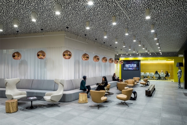
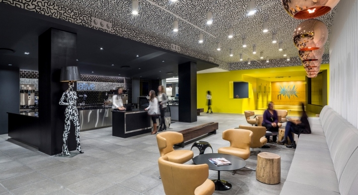
Stepping out of the elevator into the bright yellow lobby the energy is palpably demonstrated by the dynamic string art logo. Distraction marks on the glass front doors, using the traditional Greek diner coffee cup graphics, exclaim, “we are happy to serve you” and instantly convey a whimsical sense of humor. The predominant feature in the reception/coffee bar is the Keith Haring graffiti-like design that sprawls across the expansive ceiling and immediately affirms the bold tone of the agency. The sheer drapes, wrapping banquettes, sleek pendants and black glass combine to create a more club-like atmosphere for the mostly young staff members meeting in groups throughout. And the back drop to the entire bar is comprised of subway tiles where the Initiative logo is depicted in mosaic tiles indicative of New York’s iconic subway stops.
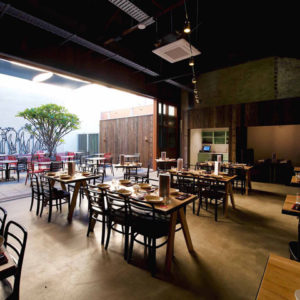
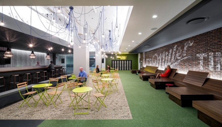
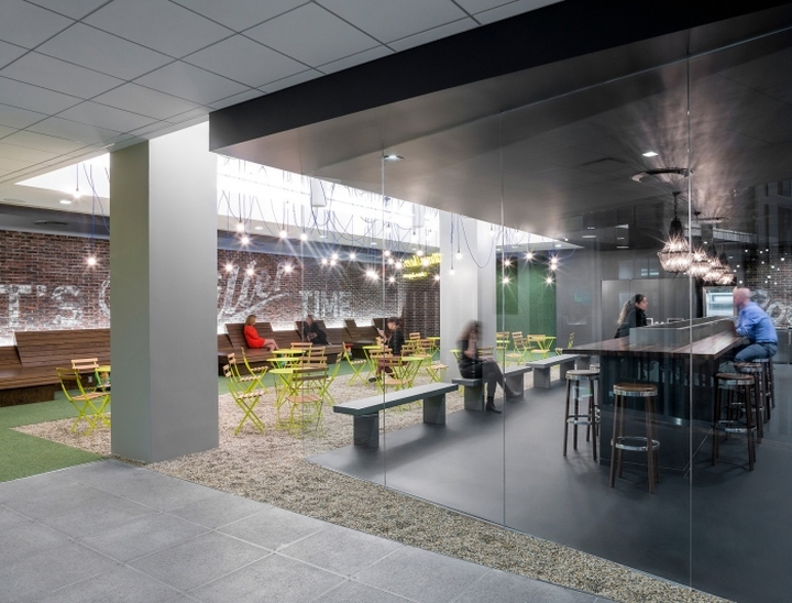
A neon sign exclaiming “Mmmm…beer” announces the Beer Garden, which, with its reclining wood benches inspired by the city’s stunning High Line park, offers a more relaxed work area. The exposed brick wall reminds staff that “its Miller time” (one of the firm’s key clients), and is reminiscent of the vintage ads found throughout the city. The pebble floor, garden tables/chairs, and string lights recall a park setting similar to the Herald Square park located outside, while the black chandeliers and butcher block counter create a more moody bar atmosphere. The bar is designed for staff to plug-in and work during office hours and grab a beer from the ice trough in the center.
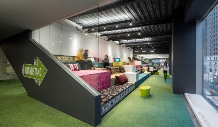
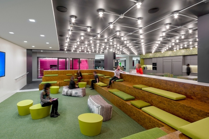
Inspired by the grandstands that line Herald Square during the Macy’s Thanksgiving Parade, (a New York institution), TMA created its own “Grandstand” with oversized tiered seating. The space overlooks Herald Square and is suitable for small group gatherings, individual quiet work, larger town hall type gatherings, and even musical performances. The random oriental rugs that wrap each seat recall the rugs used by nearby street vendors for their daily prayers as well as the many local carpet shops in the neighborhood. They also create a playful, bazaar-like atmosphere.
At the opposite end of the space is another communal area, “The Pit”, created primarily as a working lunch area. Half of the space is a sunken pit that results in an amphitheater-like setting. The various green hues of cushions, carpet, and garden seating, as well as the ivy wallpaper, create a park-like atmosphere. The exposed light bulbs, which span the space, recall the canopy of Broadway marquees. Staff can sit at tables or bars and grab a magazine from the “newsstands” that flank the pit.
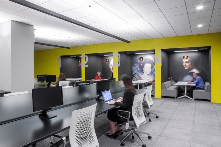
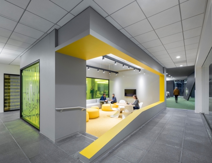
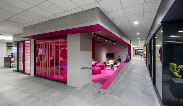
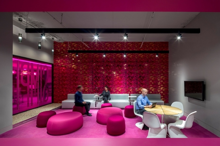
The large floor plate is divided into four distinct neighborhoods. TMA proposed utilizing the client’s four key marketing words, (fast, brave, decisive, simple), as wayfinding and identification devices for each zone. Like most New York neighborhoods, each zone has its own park, or in this case a team room equipped with pebbles and soft seating. The team room’s “billboard” announces the neighborhood’s name. To further enhance the color-coding of the neighborhood, the room is lined with bold camouflage wallpaper designed by New Yorker Andy Warhol. Each neighborhood is also punctuated with a bar work counter that has blackened wrought iron lanterns that recall the street lamps outside. Most of the enclosed meeting spaces are well appointed with a variety of eclectic furnishings, many of which are low cost retail pieces.
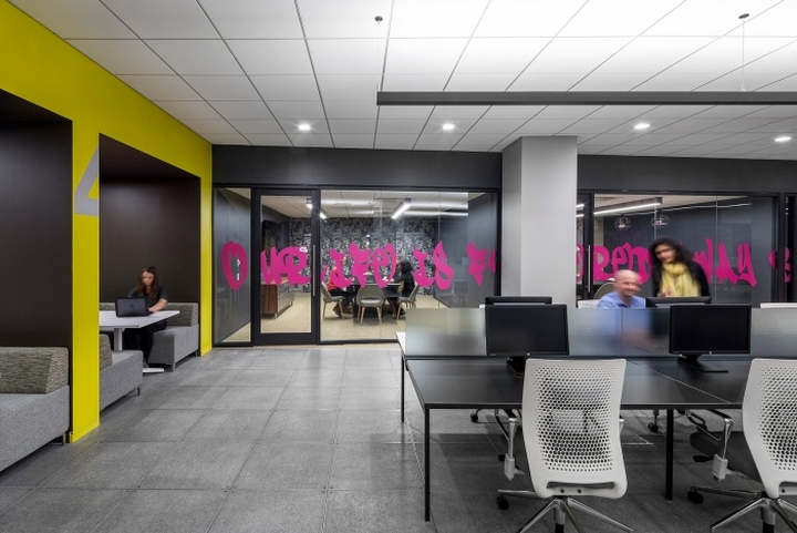
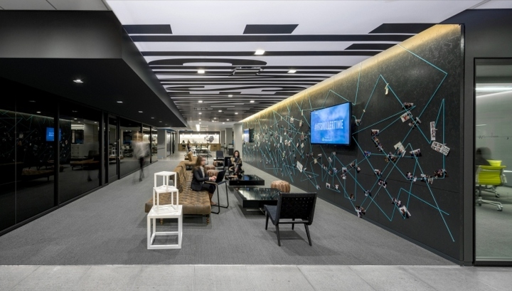
Linking the open neighborhoods is the Gallery. This open meeting space provides a place for the staff to display and share any personal effects with one another. Like city streets plastered with posters and flyers it is ever changing, dynamic, and interactive. The low tech, clothes pin design was created by the entire project team (architect, consultants, contractor), at the completion of the project. The ceiling over the gallery contains a large billboard with overscaled text displaying the company’s mantra.
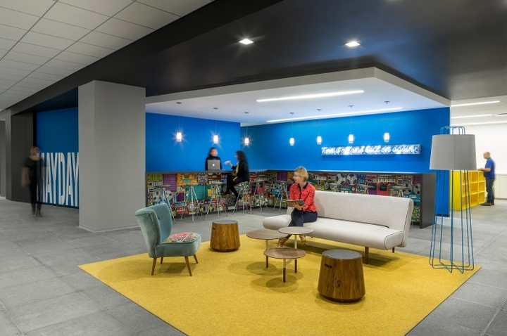
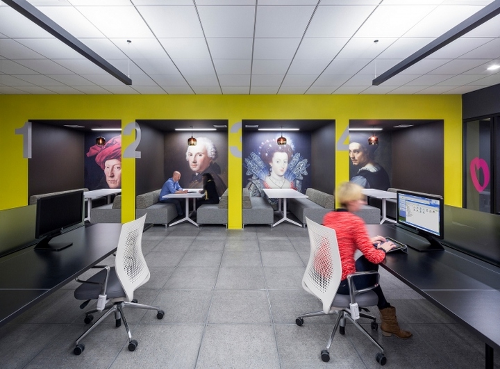
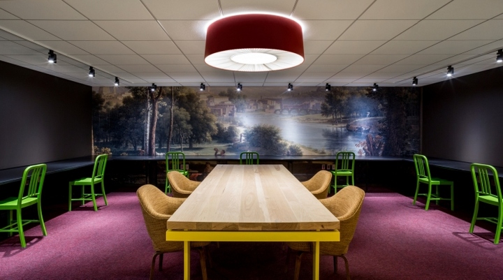
The ‘street aesthetic’ is further established through the unique boom box wallpaper in the staff genius bar and the original graffiti covered mannequin floor lamp in the reception area. Of course, for more highbrow art, one need only duck into the quiet diner booths to sit beside a Renaissance portrait. These booths provide a space for small group meetings and brainstorming sessions. And just like many New Yorkers who head to the Hamptons to get away from the busy city, TMA designed quiet library-like settings for staff. Here the walls are lined with landscaped murals of the Italian countryside to offer a contemplative respite from the buzz of the open work area.
Design: Ted Moudis Associates
Photography: Magda Biernat
via Office Snapshots


Add to collection
