
Add to collection
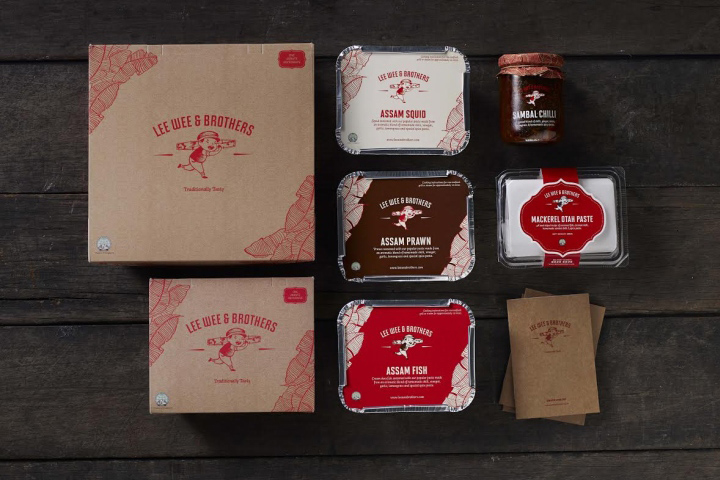

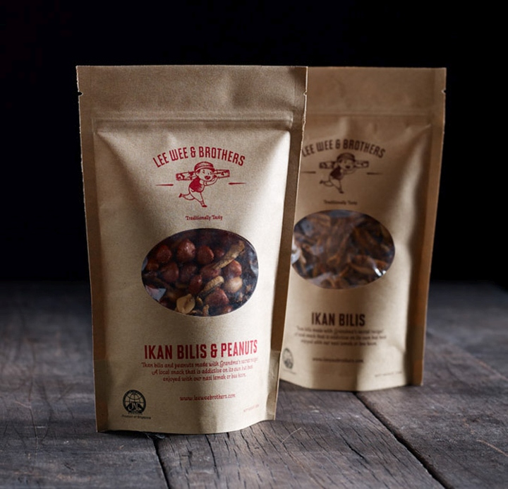
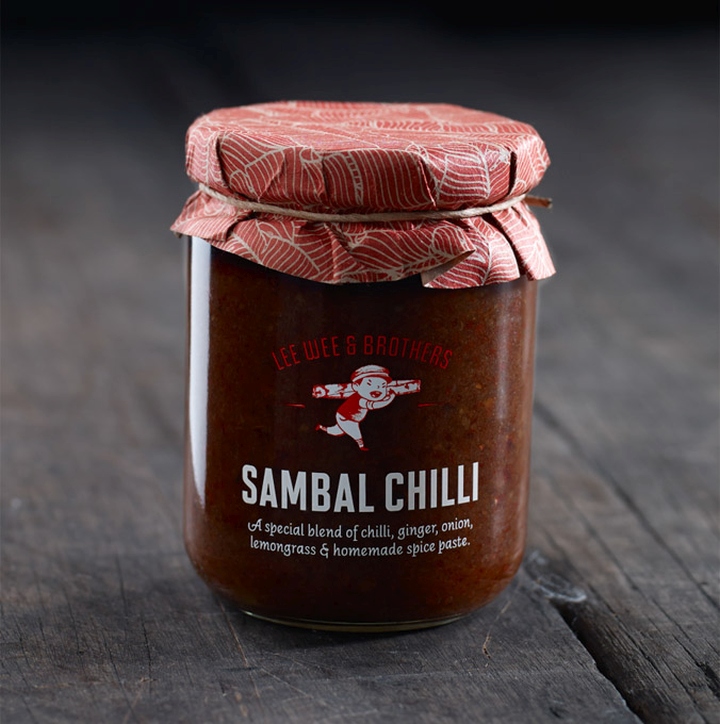
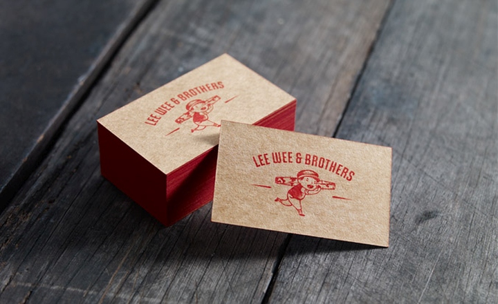
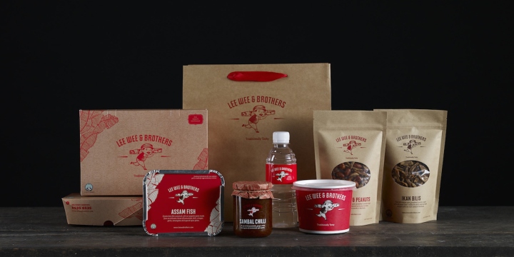
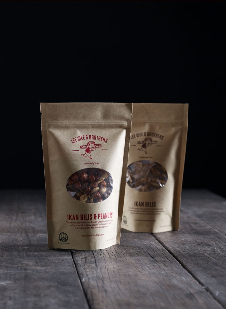
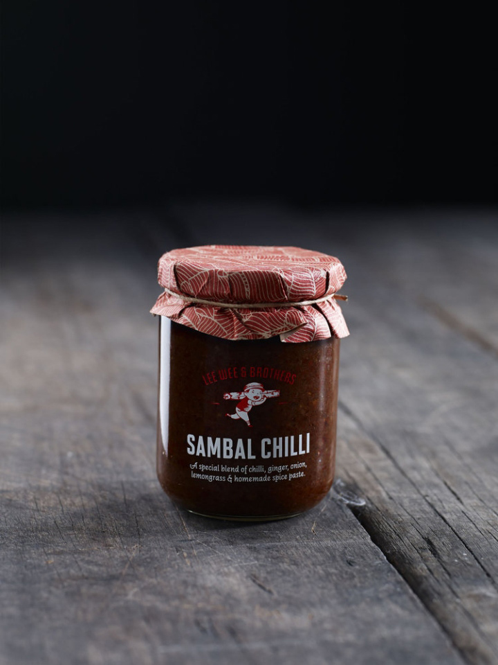
Simplicity sometimes walks a fine line between boring and intriguing, and Manic Design’s packaging for Lee Wee & Brothers foods is certainly the latter. Lee Wee & Brothers is proud to have a family-run business philosophy rooted deeply in tradition for both the recipes and methods. The packaging for their fish, nuts, chilli, and other items reflects that in a completely uncomplicated way.
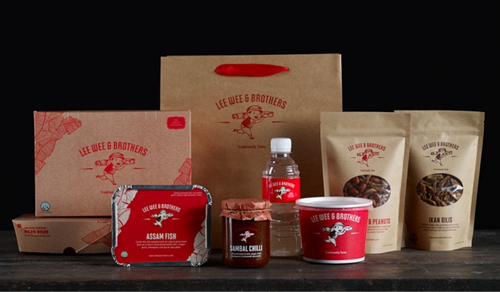
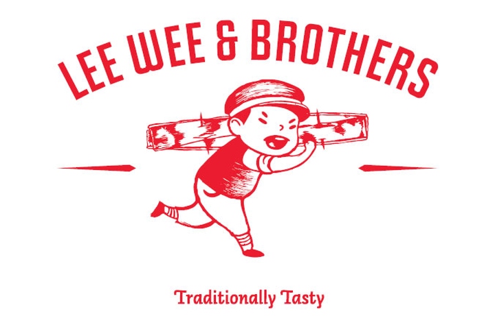
The logo features a young boy hard at work, and the packaging looks almost like a brown paper bag, giving a feel of the products you might pick up at a small corner deli. The family-run inspiration is strong throughout the packaging without featuring multiple graphics or unorganized information. The design is sweet, simple, and effective.
Design: Manic Design
via The Ddieline


Add to collection