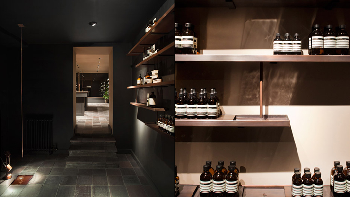


Shelves with running water line the walls of skincare brand Aesop‘s latest London store, designed by local studio JamesPlumb.

Aesop invited James Russell and Hannah Plumb to re-imagine the 86-square-metre space on the historic street in London’s Bloomsbury. The designers drew upon the history of the street, where in 1577 William Lamb founded a conduit in order to bring water to the area. “The conduit was brought to the street, and the residents would tap into it to bring water to their home,” Russell told Dezeen. “We found a description of a ‘quill of water’ and really loved that phrase. It became one of the key elements in our design process.”

Gently streaming from shelf to shelf via thin pipes, the sound of the babbling water is intended to create a calm atmosphere. The oxidised copper shelves are shaped like flat-bottomed troughs, with products supported on platforms above the water. Dark Staffordshire quarry tiles cover the entire floorspace creating an uneven finish, while copper is also used for the sinks and taps. Lights by PSLAB are carefully positioned to reflect on the water, projecting a dappled effect onto the walls. A small set of steps leads from the front retail space into a room that JamesPlumb describes as “almost sculptural”, which connects to a lounge area at the rear.

The dimly lit middle room has a single copper pipe suspended from the ceiling in one corner, from which water drips into a small copper reservoir in the floor. The copper sinks and taps within the retail space were designed and made by JamesPlumb. “The sinks are so crucial,” Russell told Dezeen. “We made the taps ourselves because we wanted to extend the control of water from the shelves. We deliberately placed one sink at the front of the store for regular customers who know that they’re allowed to come in and use it. The bigger sink at the back is for the staff when doing consultations.” The idea for the water system was developed from a fountain the designers saw while travelling in the south of France.

“We saw this amazing communal fountain that had an overflow to a sink, and then an overflow down the back to this cattle trough,” said Russell. “We couldn’t help but think of Aesop.” Described by Russell as the heart of the design, the water travels through a hand-made filtration system that is housed in the basement of the store. The analogue mechanism, designed in collaboration with sculptor William Waterhouse, controls the flow and speed at which the water moves. Russell explained that it was important to create a system that can be easily controlled by the staff on a daily basis. “We’ve carefully designed it to be very easy to switch on and off, as the staff have to come in every morning and work with it,” he said.


via Dezeen
