Add to collection
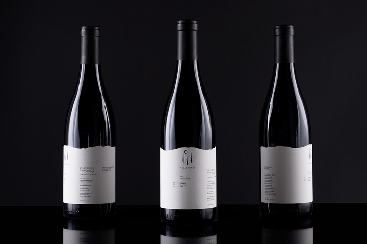

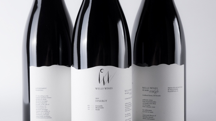
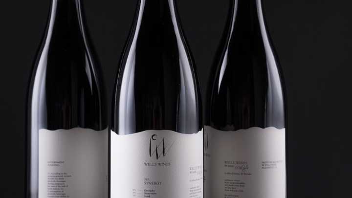
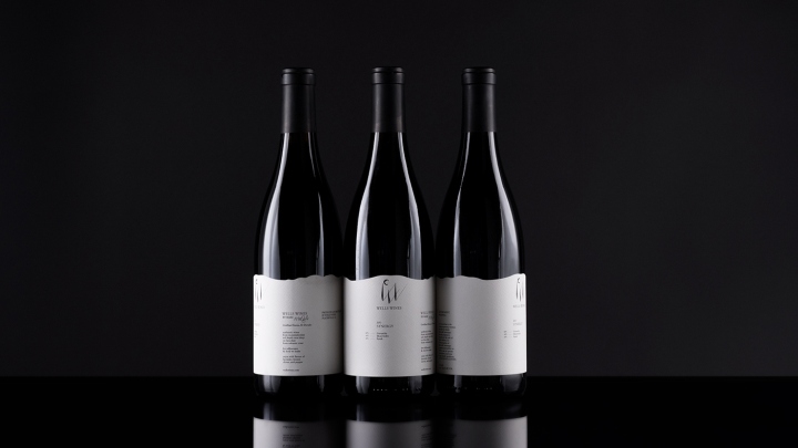
For the Wells Wines ‘Synergy’ label Grason Ratowsky of Ratowsky Creative and Mari Wells of Wells Wines came up with an elegant design solution that emotionally connects the viewer with the wine growing region.
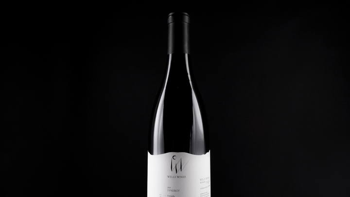
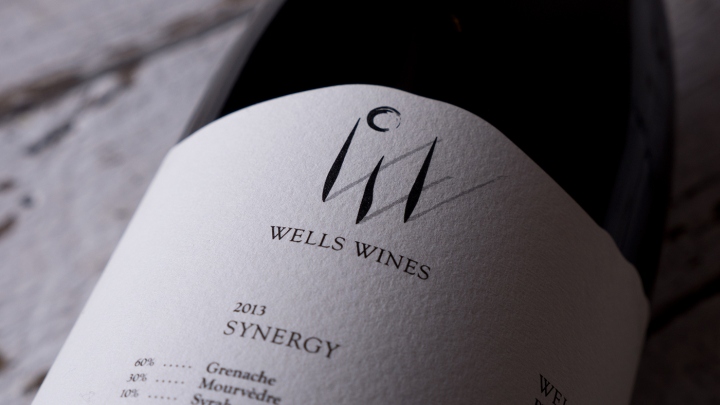
The decided upon logo option was specifically used to be the primary design focus.
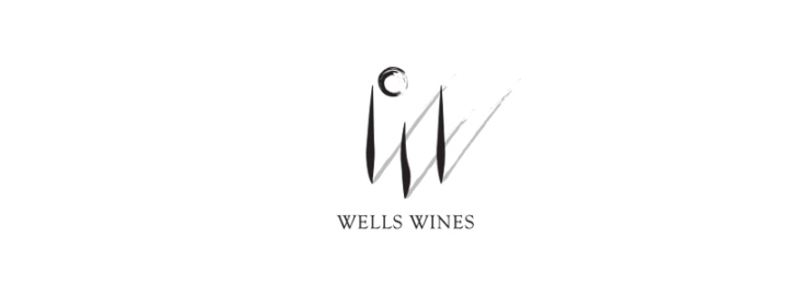
“Right off I knew that I wanted to make use of the double W in the name. The question was how do I incorporate a natural setting into a commonly corporate W.W.?”
“For this logo option I made the first W out of three posts, perhaps in the vineyard itself. The moonlight in the logo casts a shadow off the three posts, in turn creating the second W. This logo option creates a sense of ease, peace and freedom in the viewer while also maintaining its distinctive presence and individual nature.” -Grason Ratowsky
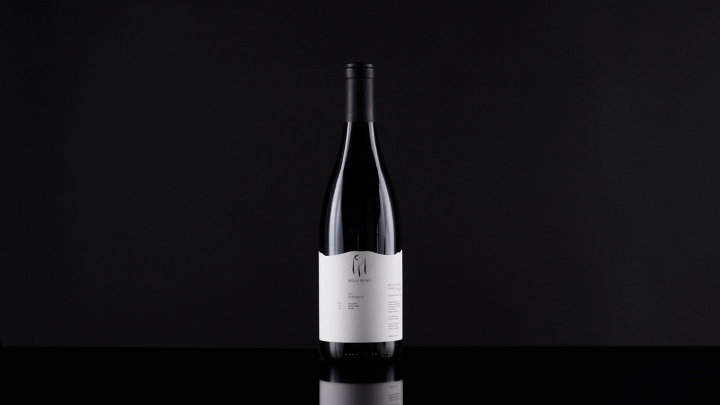
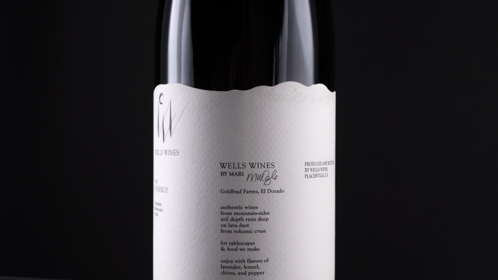
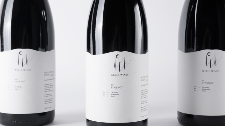
The label contains all pertinent information while still allowing aesthetic breathing room in a minimal, natural and elegant setting. The background die cut visually captures the essence of the rolling hills vineyard region. The label wraps around the bottle to mimic the vastness and continuousness of the land, offering an emotional connection to the viewer. Small additions like a poem by the founder Mari Wells as well as her signature portray a personal, small batch feel to match the care and attention that was put into making the wine itself.
Design: Ratowsky Creative / Grason Ratowsky


Add to collection