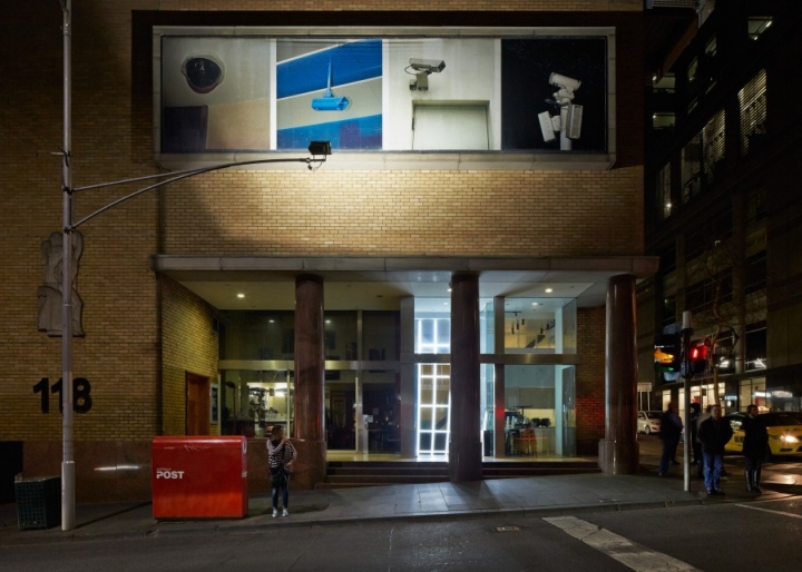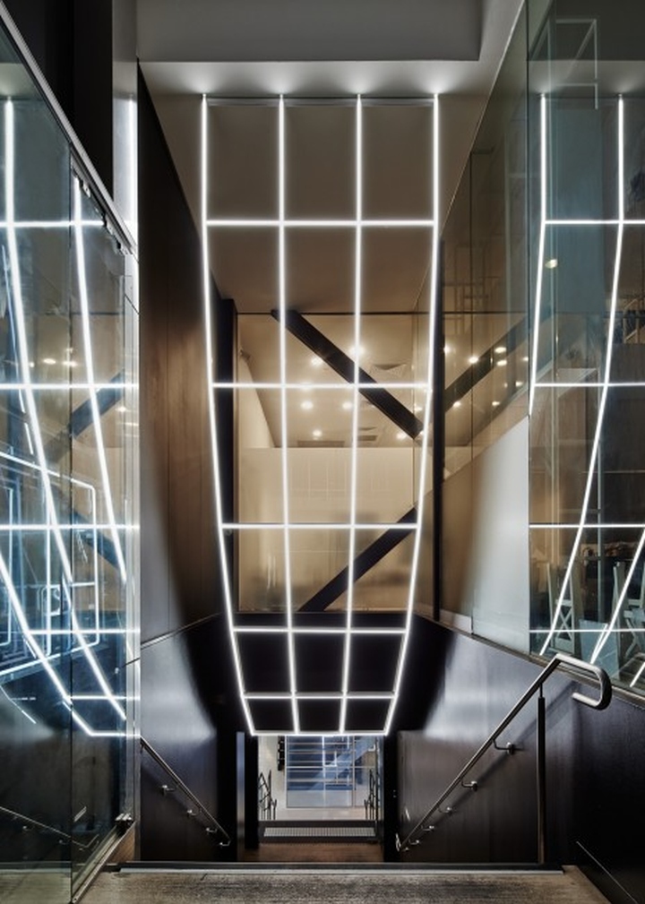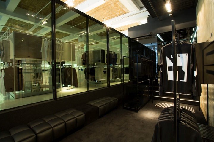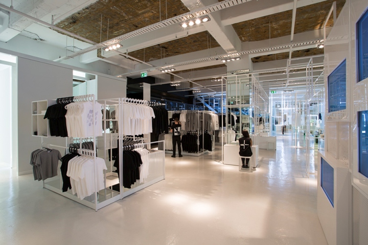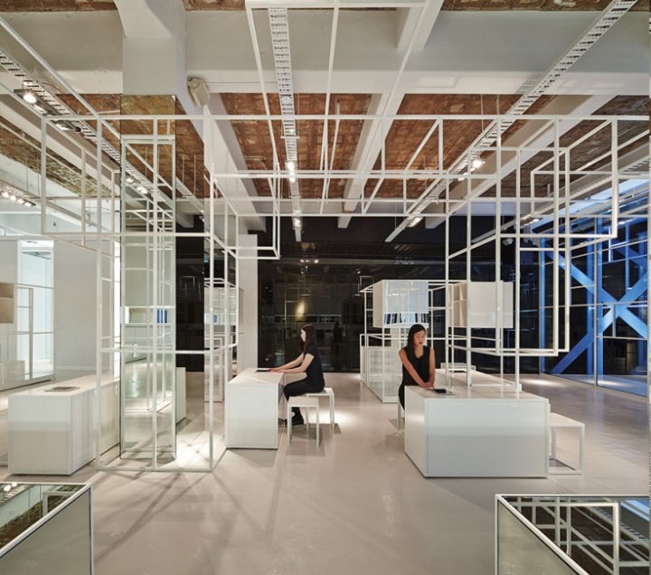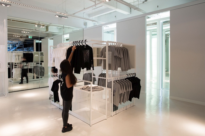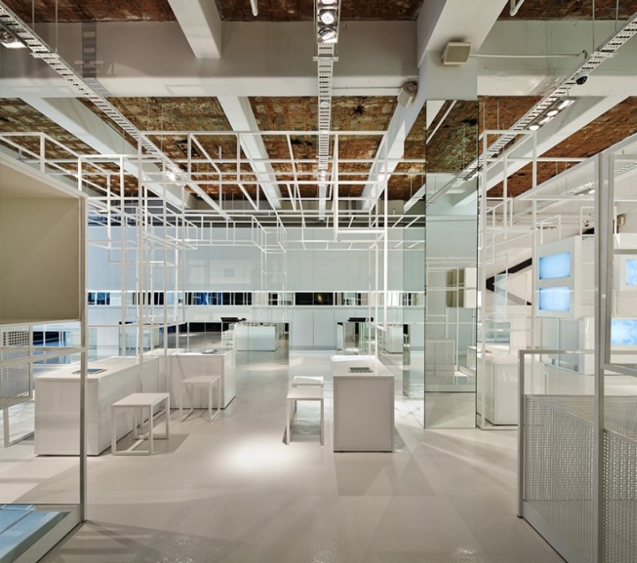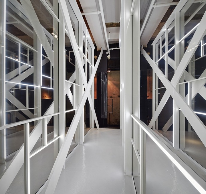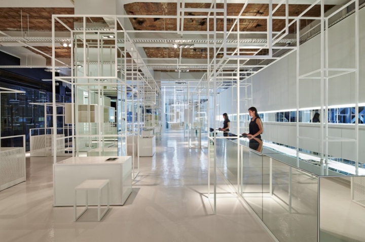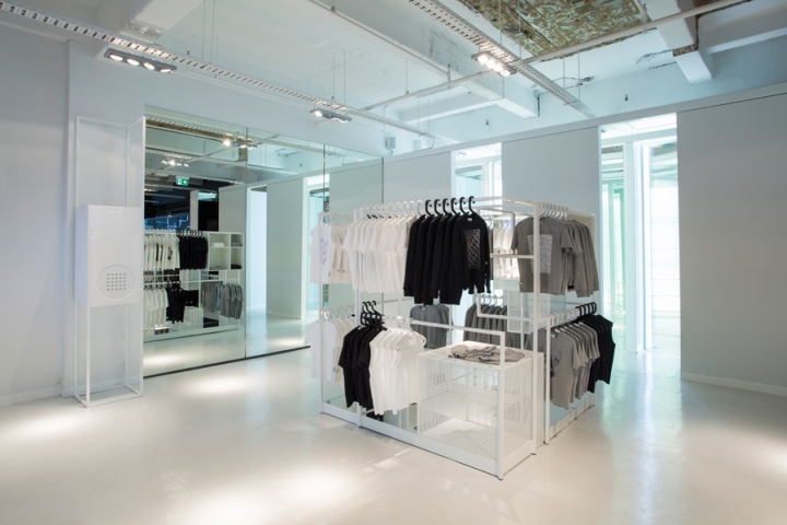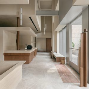

The interior architecture for this Melbourne concept label was conceived as a celebration of the senses by the design studio Sibling.

Integrating online aspects with a physical reality for concept brand Dust resulted in a store with tactile touches as a high priority, whilst maintaining a digital focus. Comments Timothy Moore of Sibling, ‘The design thinking behind Dust is to fuse the co-existence of the bricks-and mortar and online retail experience. It does this through collapsing spaces for garment production and distribution with the user experience of viewing a garment in-store.’

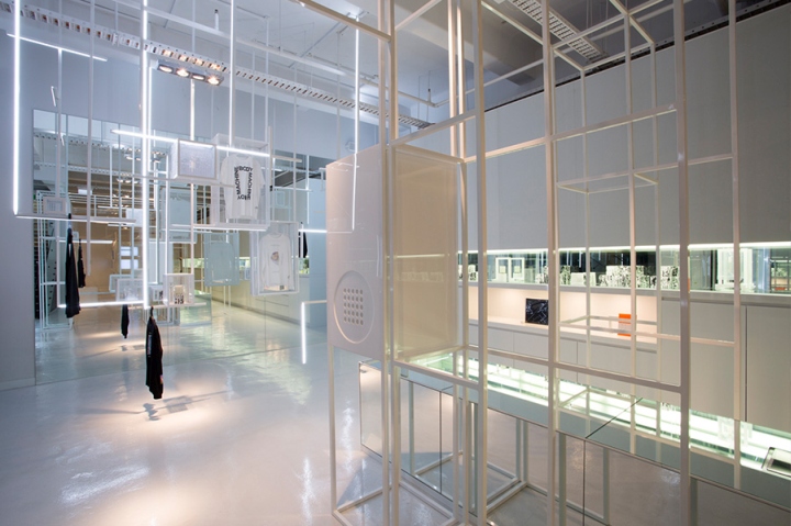
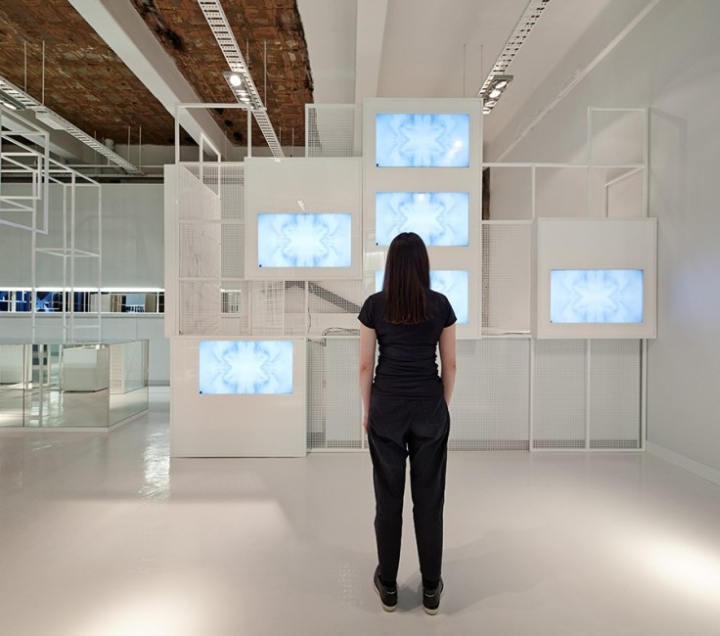
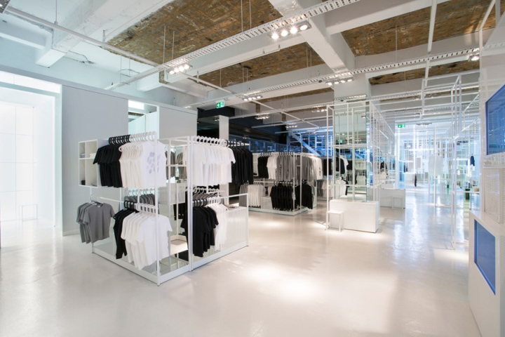
A monochromatic, matrix-type layout with white metallic frameworks form the backdrop of the space. Upon entering, customers are invited to view the products as physical objects before turning to the digital – where they then use a tablet to customise their own desired merchandise. The final step of the process is to sit-back and wait while their bespoke piece is made on-site.

The setting for this modern-day retail atelier is enhanced with sights, sounds and scents – as well as artworks and illuminated installations – making this physical-cum-digital retail experience the best of both worlds; providing the seamless flexibility of online shopping with the immediate gratification of in-store shopping.
Design: Sibling
Photography: Peter Bennetts / Tobias Titz


via Frameweb
