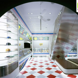

Nutrisa by Cadena Concept Design, Monterrey – Mexico
posted by retail design blog on 2018-07-28
Monterrey
Add to collection
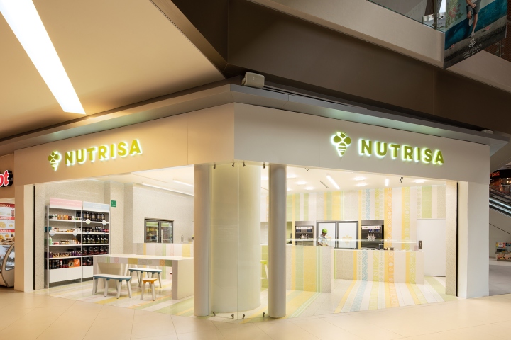

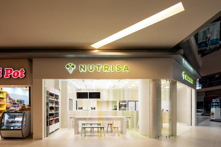
The relaunch of a 47 year old very successful brand in Mexico was no easy task, a brand that is centered in making people feel good through their natural products and amazing yogurt ice-cream. The design challenge began by constructing culture towards the brand spirit from the inside-out, making people feel part of the new journey about to begin. The bee had been their iconic symbol since the beginning and although it made perfect sense it had never connected them to their true Mexican roots. So the journey began strengthening our symbols by understanding the amazing Mexican bee (Melipona Beechei) Xunan-Cab called by the ancient Mayans. This sense of belonging is spread not only through understanding our past but also very importantly, through projecting innovation and a clear vision of the brands future.
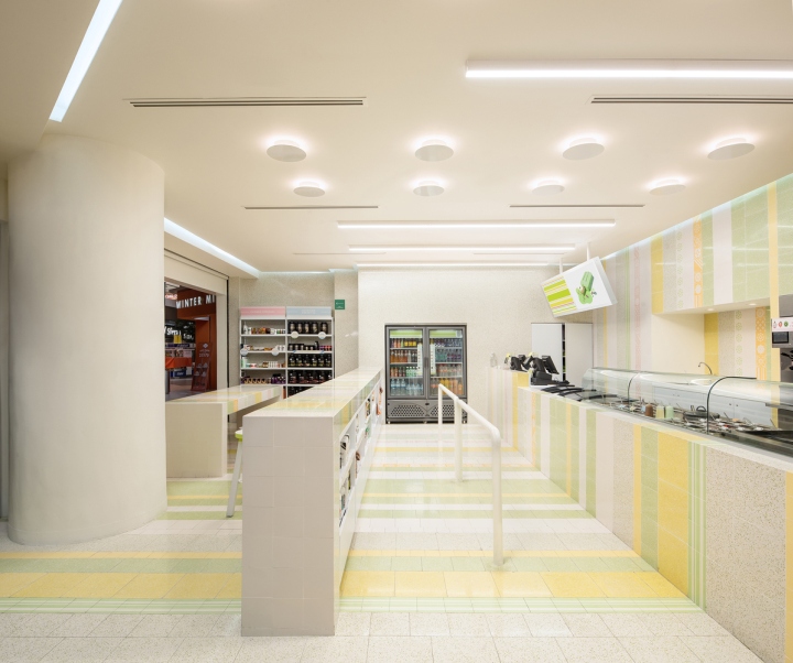
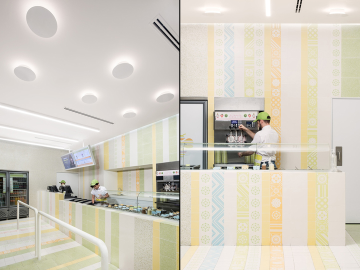
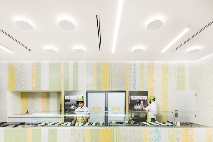
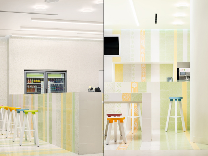
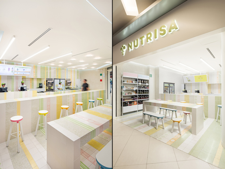
Design strategies were focused on integrating the striped condition of the bee with the ludic and polychromatic spirit of the -trompo- (Spinning Tops), multi-colored stripes made of pristine materials as mosaic and terrazzo speak of freshness, wellness, flavor, history, modernity and a true neo-mexican spirit. Re-defining the product as a natural ice-cream parlor enriched by quality and delicious products that make your life better, became the core of the project : Natural indulgence! Now, the brand will not only be successful, their mission statement will be to be promoters of wellness, conservation, quality and flavor and their basic goal… Create Smiles!
Architects: Cadena + Asociados Concept Design
Architects in charge: Ignacio Cadena
Photographs: The raws
https://www.archdaily.com/898573/nutrisa-cadena-concept-design


Add to collection