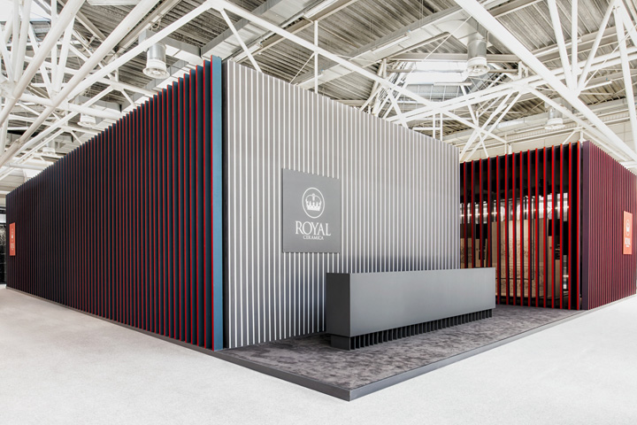

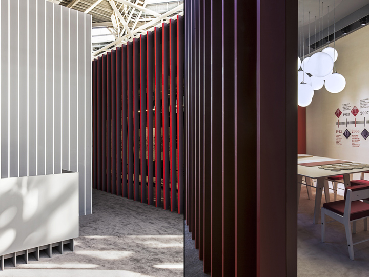
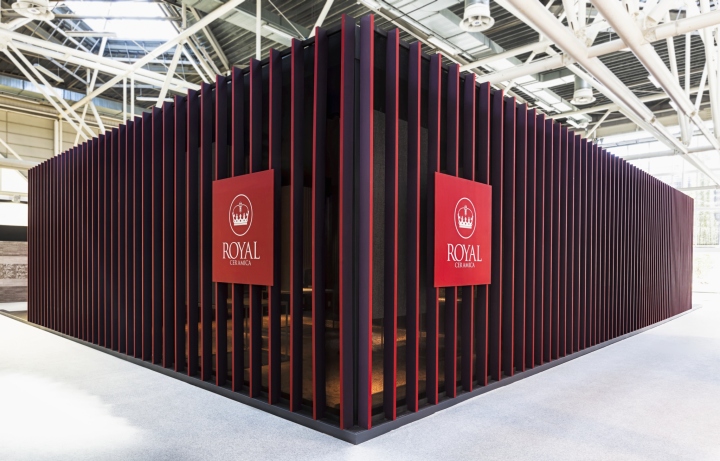
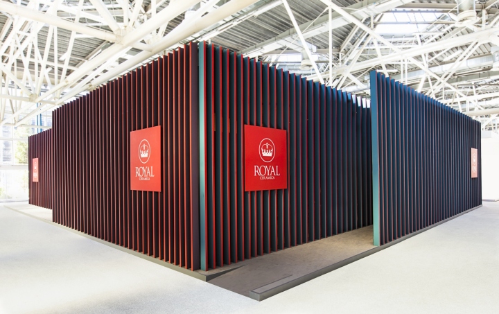
Framing is the concept. Here all the ceramic models are exhibited as singular unique pieces in three thematic rooms. And the whole interior space is framed from the outside as a compact dense
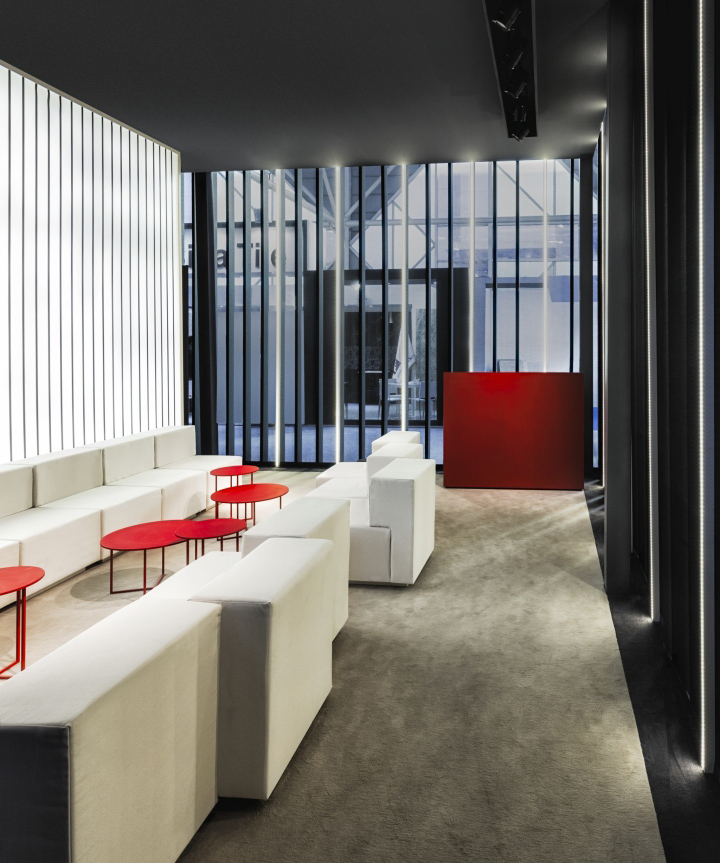
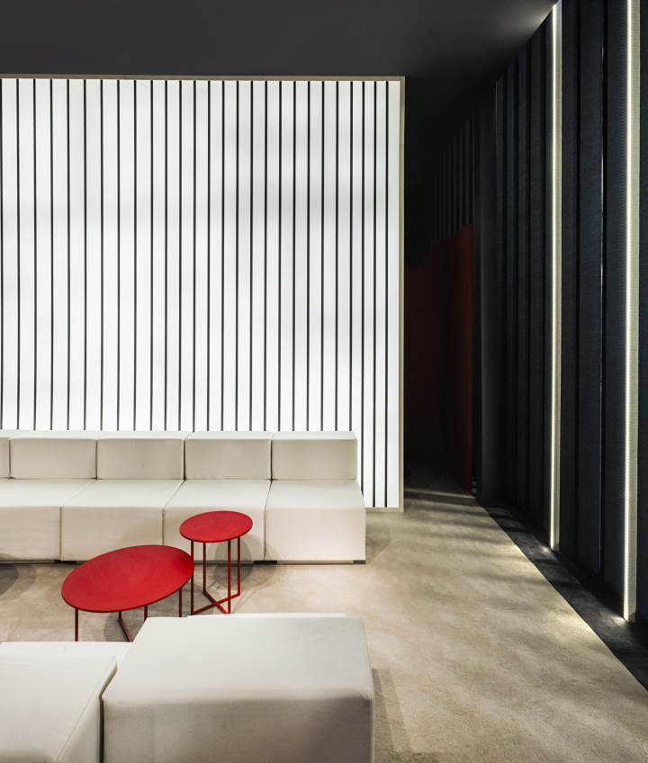
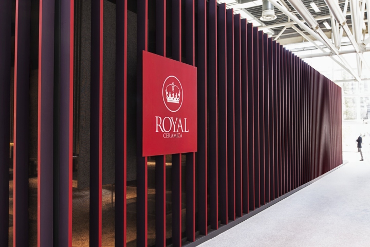
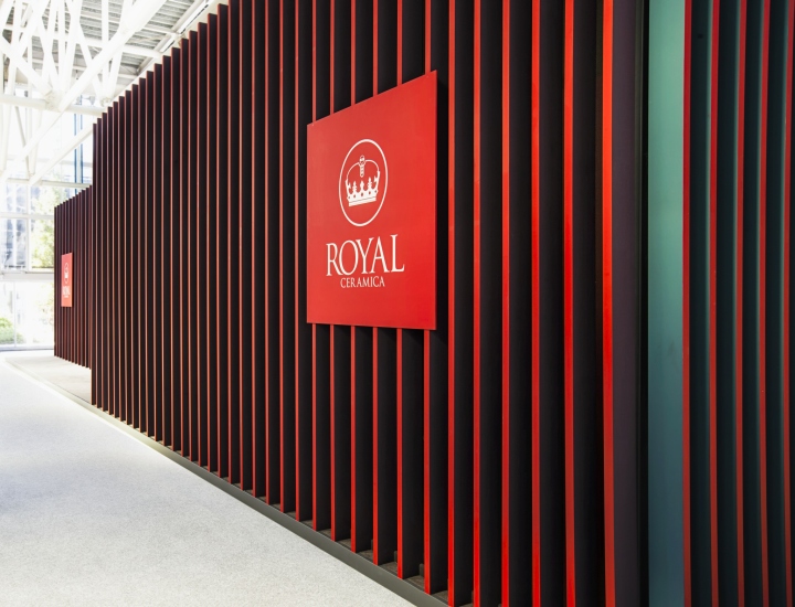
volume just leaving slight introspections. The architectonic geometry – matched with a graphic treatment of the surfaces – it’s crossed by a subtle vibration thanks to the optical effect created by the triple staining of the vertical elements. According to the side you are looking at, the pavilion outer surfaces appear as a continuum of vertical lines with a different chromatic identity. Red and purple if you look to one direction, red and grey if you look to the other.
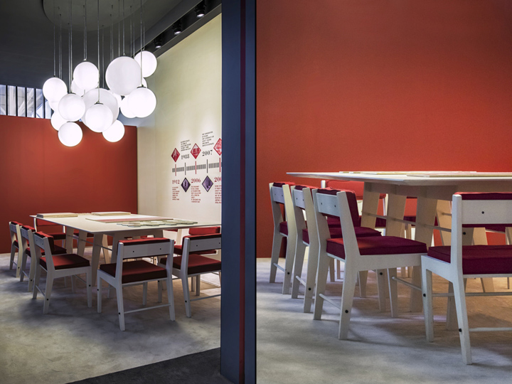
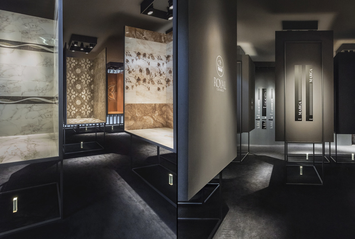
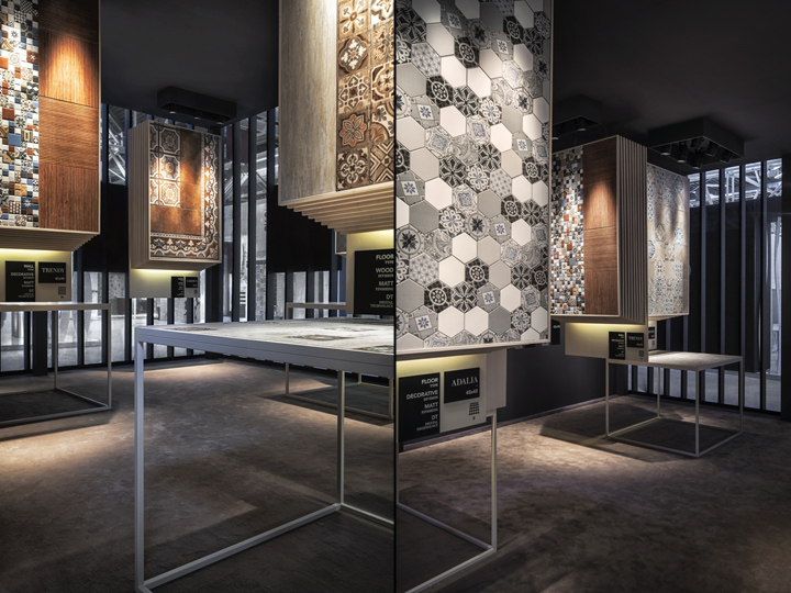
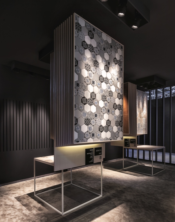
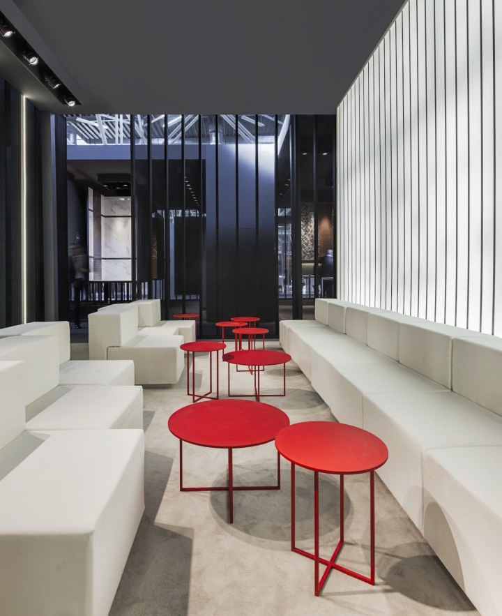
Splitting the inside from the outside – thus avoiding the shop window effect – the visitor is invited to enter in a place “other”. Inside the design of the display keeps a distance from the usual typologies – fake representations of domestic environments or dull floor/wall compositions. Here the focus is about staging the products in small and abstract theatre-like arrangements, to hang them like patterned fabrics, leave them leaning on easels as paintings spatially framed by hanging light moulds.
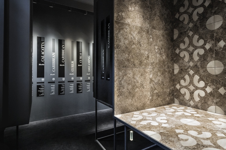
These different display modalities are underlined by a dramatic use of lighting, with a sensible play of light and shade that boosts the decorative qualities of the ceramic surfaces. Further, a signage system delivers to the visitors all the necessary info. Its design rings out the pavilion geometries made of serial repetition and mutation of linear elements.
Designed by Paolo Cesaretti
Design team: Paolo Cesaretti, Michela Pinna, Debora Palmieri, Manuela Mottareale
Visual design: Claudia Astarita
Photography by Lorenzo Pennati & Stefano Stagni


Add to collection
