Add to collection

CLIENT:
KETHINI is a New brand in footwear launched by good leather company, a manufacturer and exporter of footwear from Chennai who are expertise in the industry from last 25 years.
BRAND BRIEF:
As they are passionate about the product, client wanted to introduce range of footwear for men and women to the Indian market. They wanted to be in the premium category of footwear market. Design brief was to create a premium brand environment for the targeted customer to experience the special product manufactured with quality and detail for today’s gentlemen and ladies. The environment should encourage and engage them to buy and make the product their part of the life.
DESIGN STRATEGY:
design strategy is to keep the overall ambience of the store warm, luxurious friendly. As the product line was designed by Italian designers with latest trends in fashion & technology keeping in mind, some elements are designed getting inspired by Italian interior Architecture.
STORE DESIGN SIGNATURE:
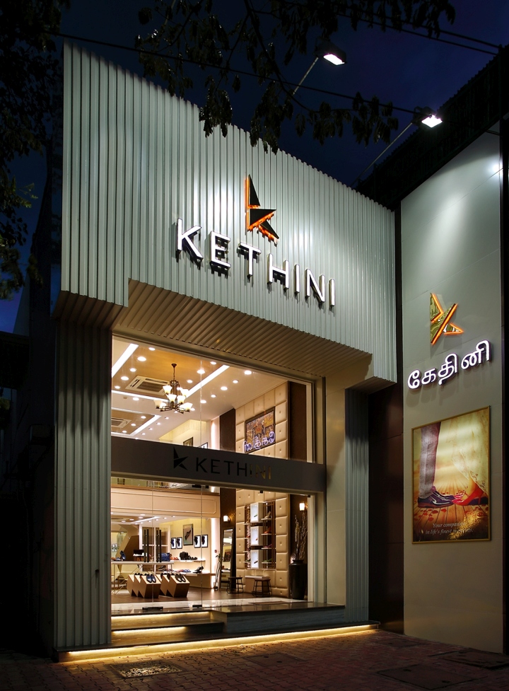
‘feel of luxury’ is the signature from interior development to furniture design to the selection of trims and props used. STORE FRONT DESIGN: As the store is in two floors, façade gets the double height. Taking the advantage façade is treated with vertical flutes developed in ACP, from floor to the top edge of the fascia. These flutes adds dynamism of the surface with automatic shadows. The color and forms adds a portal kind of a structure to the rest of the open glazing. Primary signage adores the façade with white backlit and golden edge framing.
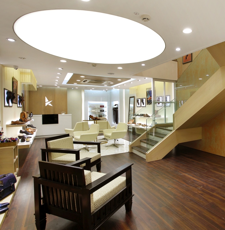
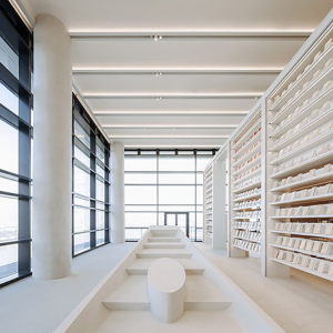
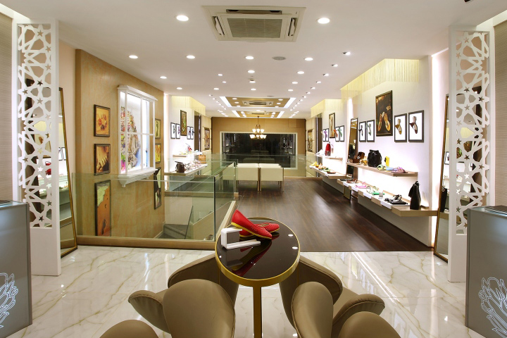
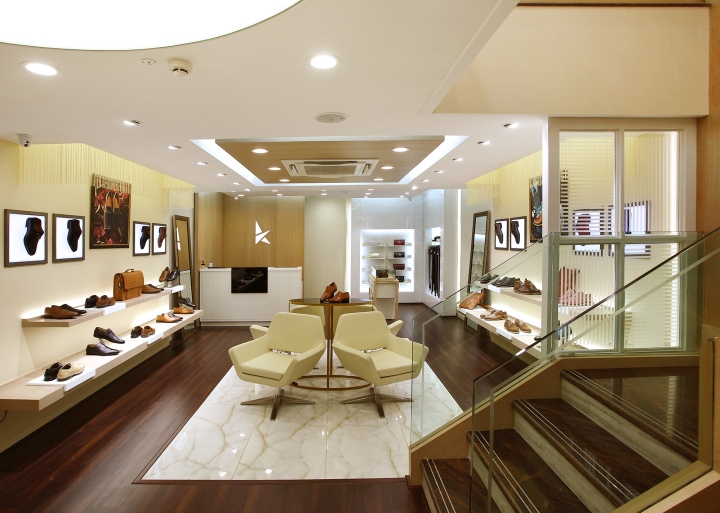
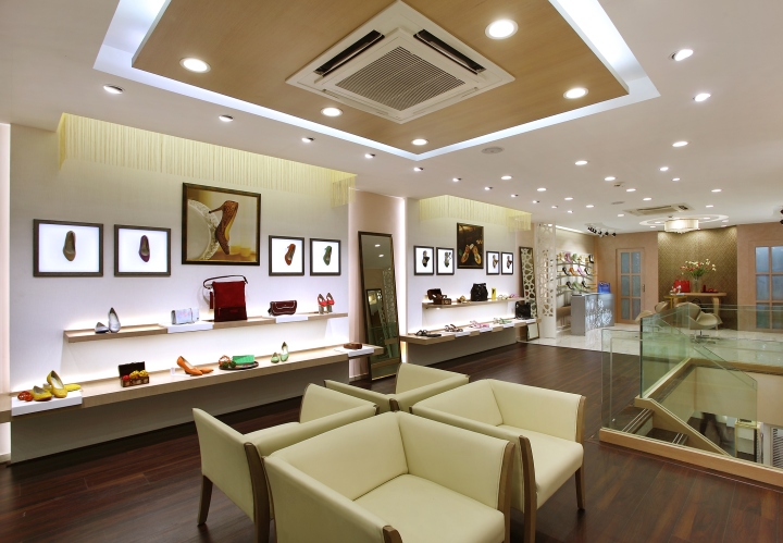
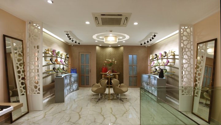
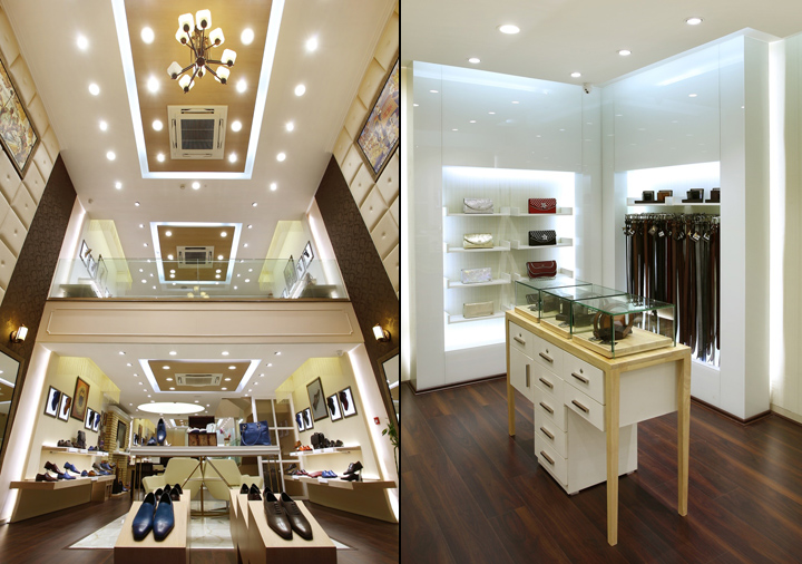
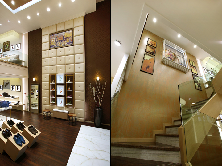
STORE INTERIOR DESIGN:
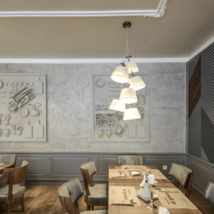
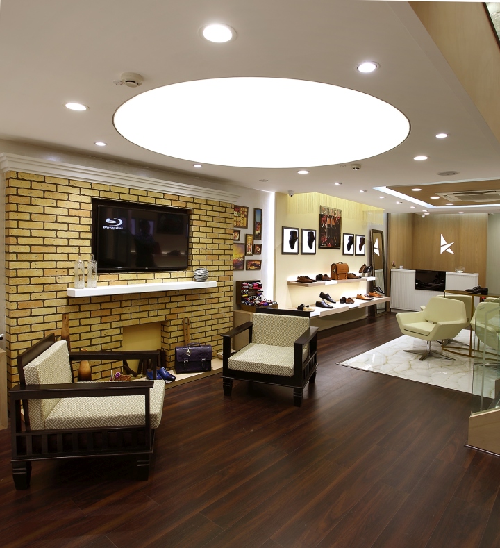
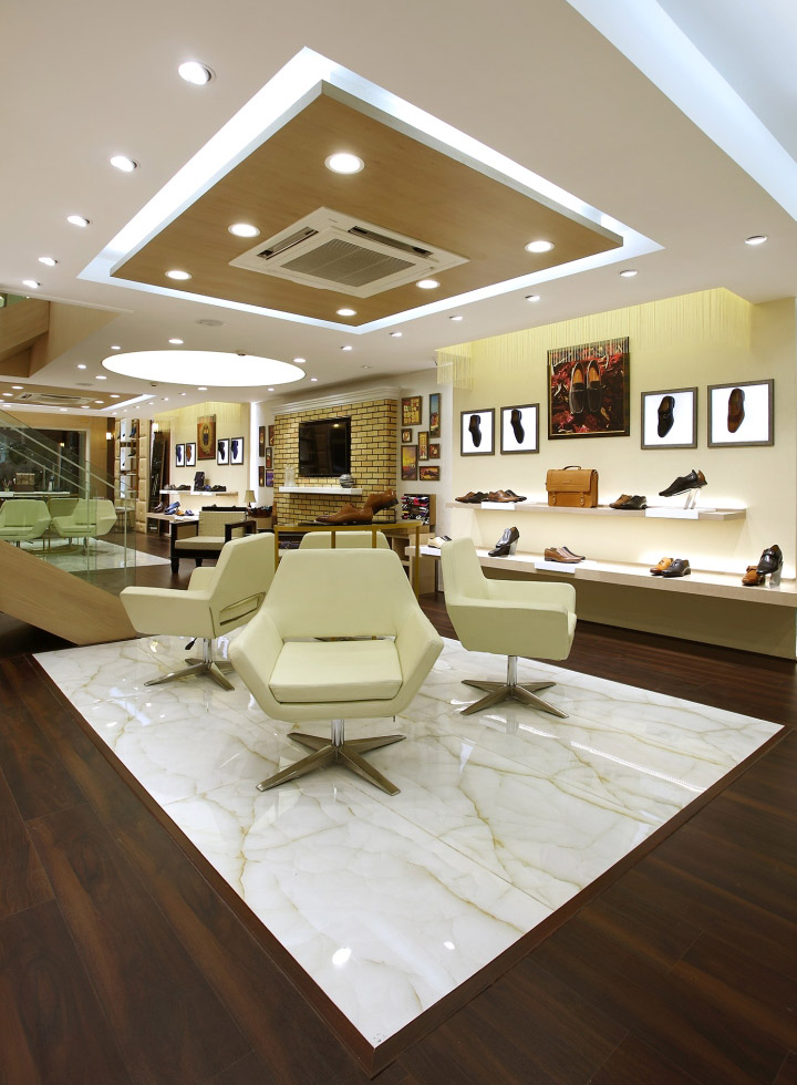
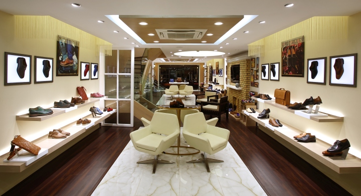
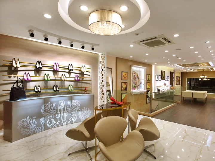
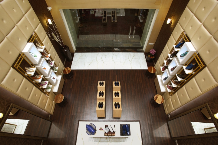
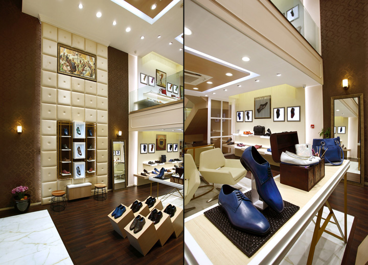
As per the strategy whole interior architecture derived of a luxurious interior architecture of a mansion. As we enter the store both the double height walls cladded with subtle beigish gold leather panels, housing concept visual comparing Italy and Indian themes. Brown cast iron lighting chandelier decorates the double height ceiling. Rest of the interior walls paneled with paintable wall papers, which carries the products. Staircase block has been developed as a break area with simulated fire place with lounge chairs and library. LED TV is housed on the brick wall to promote and showcase Kethinis product detailing, manufacturing process and brand campaigns.
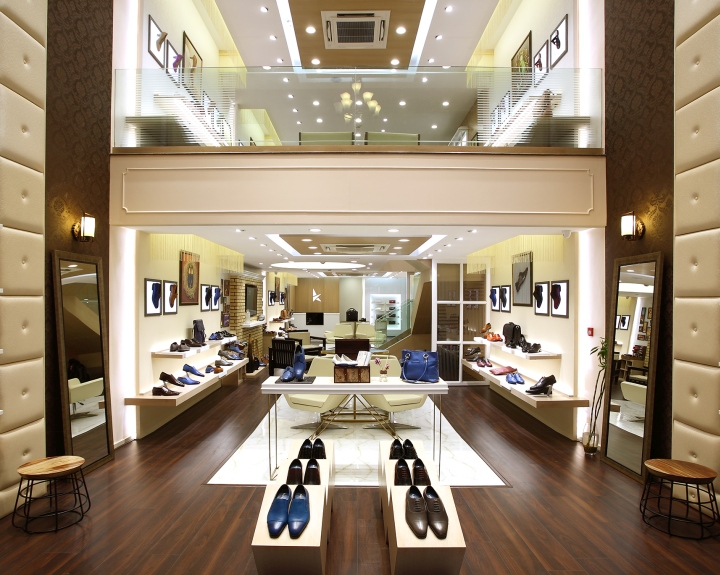
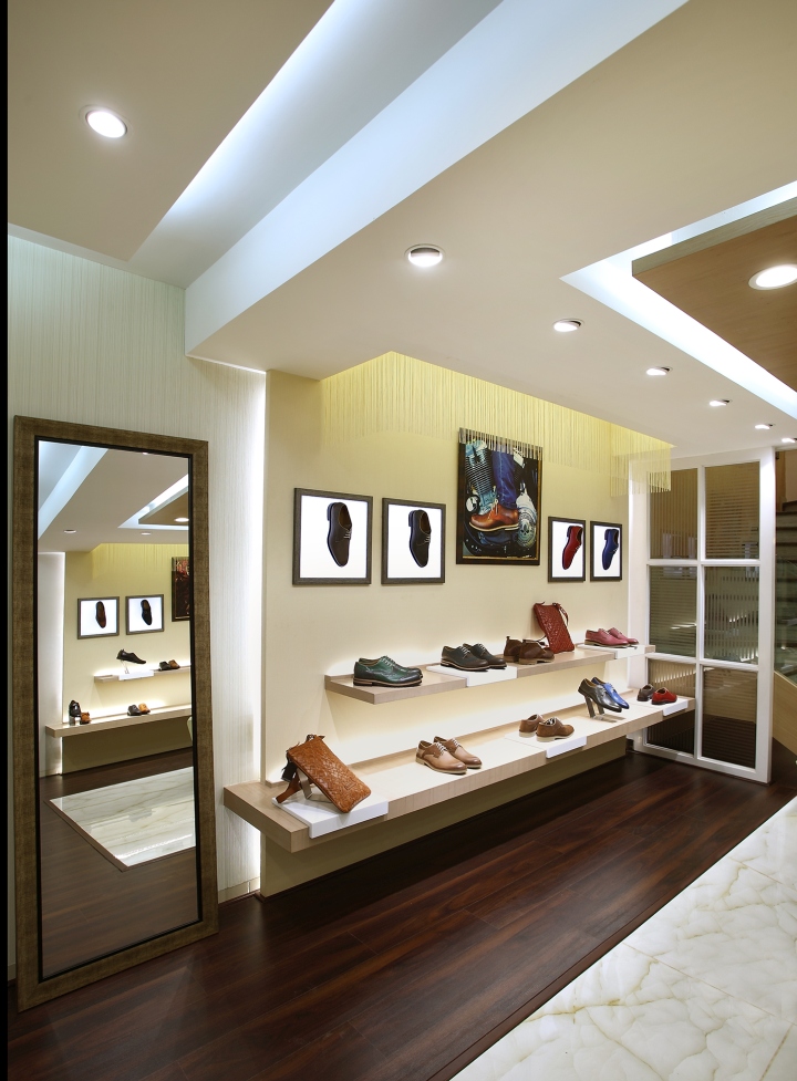
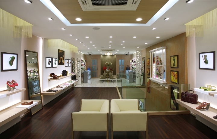
Rear part of the store has long and vertical niches for belts and accessories with halo lighting around the accessories staircase leads to the first floor with a double height side wall, with vintage texture and simulated window like overseeing the landscape outside. This window is flanked either sides with thematic visuals again with comparison from India and Italy. First floor carries the same philosophy, adding curved radial modules to bring delicate and feminity to the category and with a bouquet in clear glass with fluted vase of flowers welcoming the lady customer.
STORE ZONING & LAYOUT:
The store has been mainly divided in to men and ladies. Men being in the ground floor and ladies footwear spreads through in first floor. Men accessories bets and wallets goes next to the cash wrap in the back. Hand bags are cross merchandised along with the main product line footwear. Stock room goes in to the end part of the store. Store has a stair case link from ground floor to first floor internally to access the stocks.
LIGHTING & CEILING:
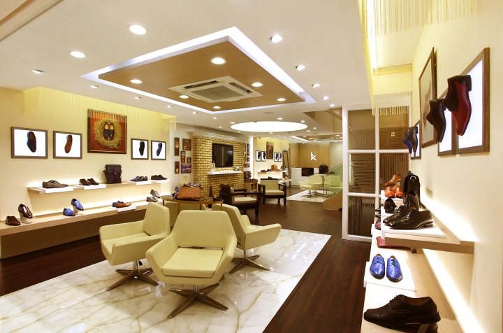
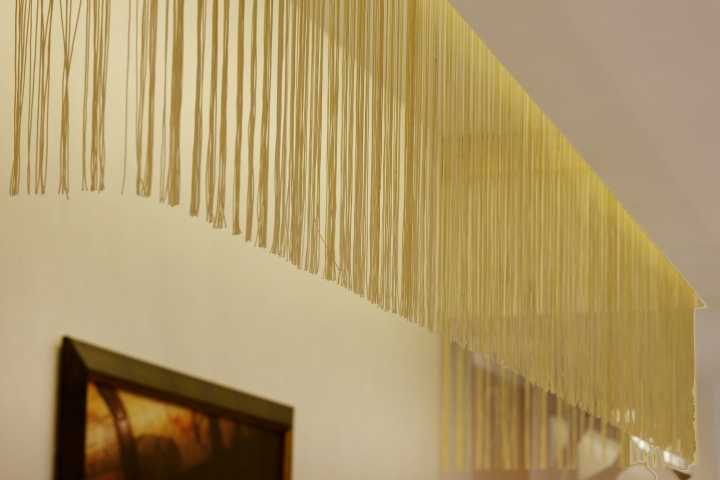
Warm white LED light fixture has been used in over all the stores, light fixture style being selected specific to the product category on display. 6 feet diameter indirect light panel with euro ceil stretched ceiling has been created above the lounge seating. Every display wall cluster has a high light cove in the ceiling with cream threads hanging in the perimeter of the each cutouts.
SHOP FITTING:
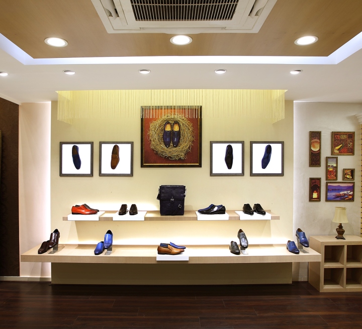
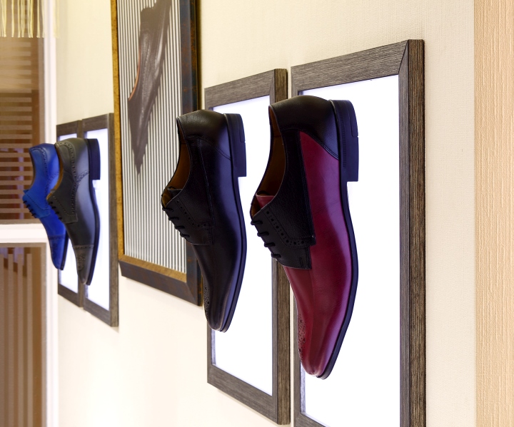
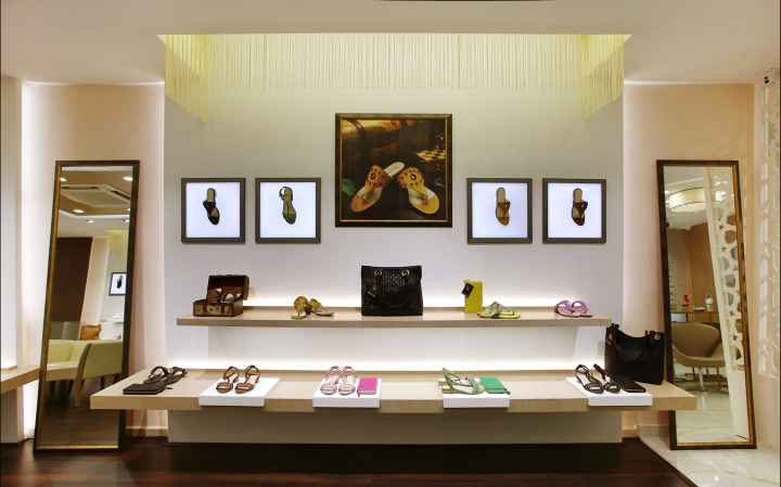
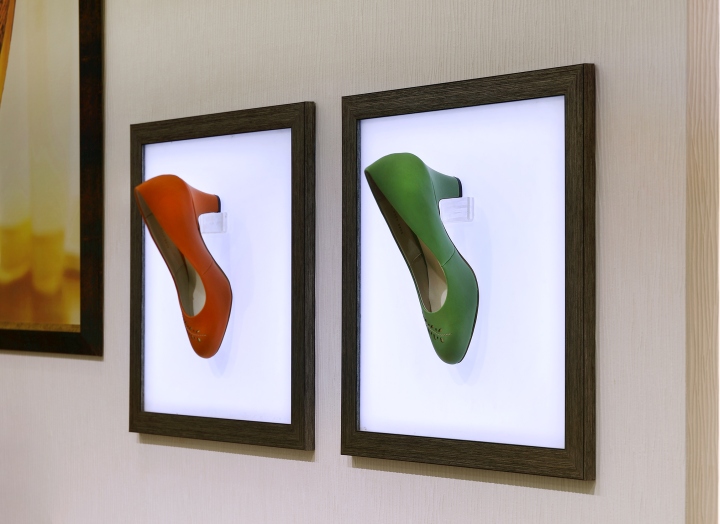
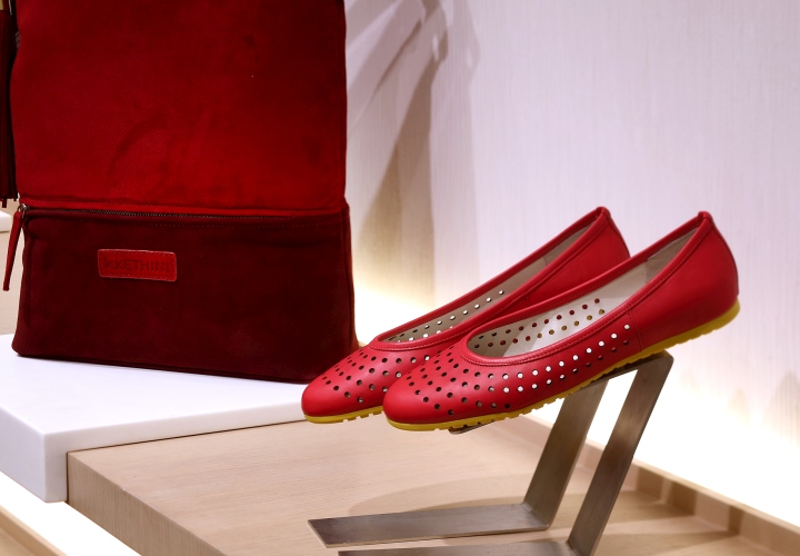
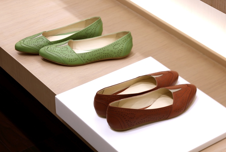
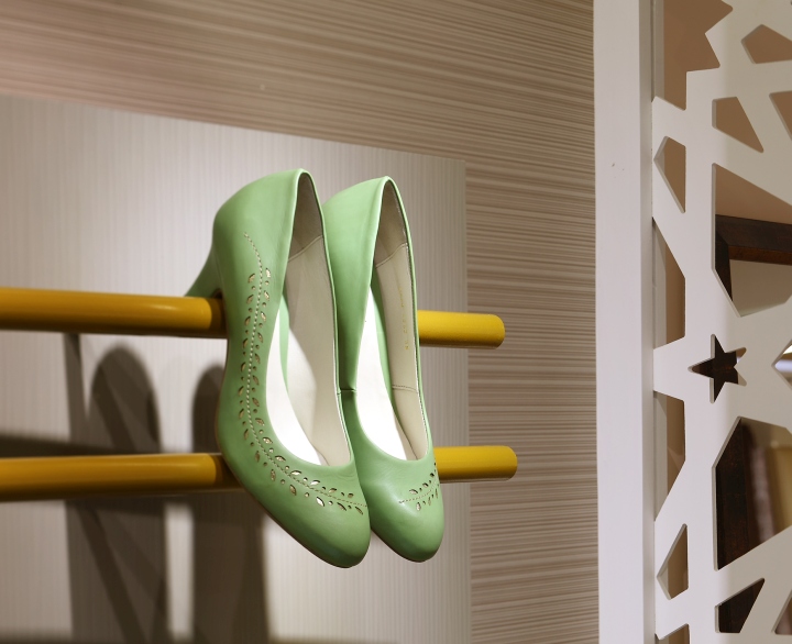
Shop fitting is integral part of the store interior architecture. As the environment dictates the ambience, store fittings for the product display has to blend in. Each display module has two levels with inbuilt lighting systems. Solid acrylic trays have been developed to display and high light the products. Many lifestyle elements have been incorporated as a part of display to create interest in the arrangement. Loose furniture’s has the brushed gold with glossy black and half white surfaces to take the product. Comfortable seating as a cluster with life size mirror standing on the wall adds to glorify the celebration. ladies section feature area product display has brush dull gold curved pipes to carry the merchandise, with front table which is lit and has lit graphic pattern on front
VM & DISPLAY:
Visual merchandising elements were care fully chosen to blend and bring the story of the product in an elegant way. Whether visual photography styling, framing of the visuals, and interesting way of displaying the products…whole thought encompasses the philosophy of design. Indian and Italian culture, heritage, product story. Has been subtly communicated through graphics throughout store to keep the right mood.
INNOVATIVE USE OF MATERIAL & FINISHES:
Different textures and material finishes brought in to get the right balance with merchandise on display and ambience. Leather cladded panels, dark brown floral wall papers, painted wall papers, textured paints, hanging pleats, white marble with wooden laminate flooring, solid acrylic trays, ceramic painted glasses, weathered bricks, warm oak matt finished veneers……. Choreographed to bring the celebration of the merchandise marvel.
Design: 4D


Add to collection