

Spanish creative consultancy Masquespacio refreshes educational platform Acadèmia Altimira’s brand and spatial identity with a calibrated, youthful design.

The Valencia-based studio was commissioned to renovate the interiors and communication strategy for the English language academy in order to celebrate its 15th anniversary. Grounded in their client-oriented approach – in the school’s case, its approach to ‘construct’ its pupils through learning – Masquespacio gives a sense of freshness and vitality to Acadèmia Altimira. For her first project in Barcelona, Masquespacio’s creative director Ana Milena Hernández adapts bold lines and shapes to the 120m2 building’s function. Punctuated in fresh colours, the tailormade interior focuses on attracting a wide age-range including kids, teenagers and young adults to the school with spaces which mirror the concept of learning.

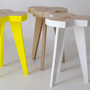
With natural light, brightness is introduced alongside vivid colours, creating a coherent aesthetic which continues into the furniture and packaging. A separation of spaces is obtained without physical isolation thanks to sliding doors made of wooden slats, organizing the division of classrooms and study areas without blocking the passage of daylight. A consistent palette of vibrantly dyed wood details, elements and furniture contribute to the coherence of the school’s interior.


via Frameweb


Add to collection
