

Objective:
To create a consumer experience and inspiration center to be commensurate with the linen quality and customer expectations of the brand.
Background and Context: India still offers retailing of textiles and fabrics where customers look for tailored garments of their choice. Traditional retailing methods of fabrics have existed since last couple of centuries or more with little intervention in terms of design of stores. Linen Club provided an opportunity to relook this phenomena as it exists today and with a design intervention arrive at a solution which befits the brand and its customer and positions Linen Club as a distinctly different retail store amongst its peer.
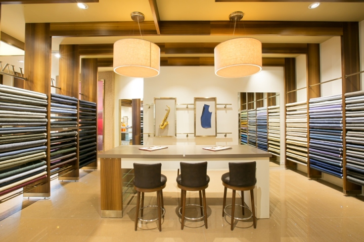
How Objective Was Accomplished:
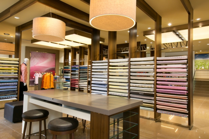
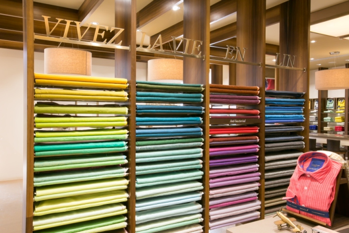
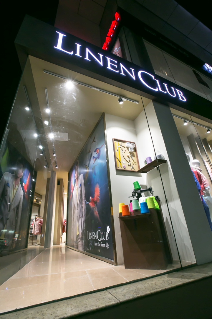
The Linen Club’s new pilot Bangalore flagship store provides an experience that is both impressive and intimate for India’s largest linen manufacturer and retailer. From the extensive glass façade allowing a view into the store, a profusion of natural light and high-visibility for visual merchandising, brand imagery and lifestyle photography; its clean simple lines are a comfortable parallel with the crisp and refined nature of the linen itself. Within the space, a welcome area shares the history, attributes and appreciation of linen from a perspective of history, culture and the world’s leading fashion designers – who appreciate the unique quality, versatility and longevity of linen through history, as well as serving as the fabric for today’s active and dynamic entrepreneur. The proprietary merchandising displays of the linen bolts and bales, the store’s custom design lighting and the unique floor plan and presentation, all create a Linen Club experience for the guest, unique to retail in general, and specifically to Linen Club.
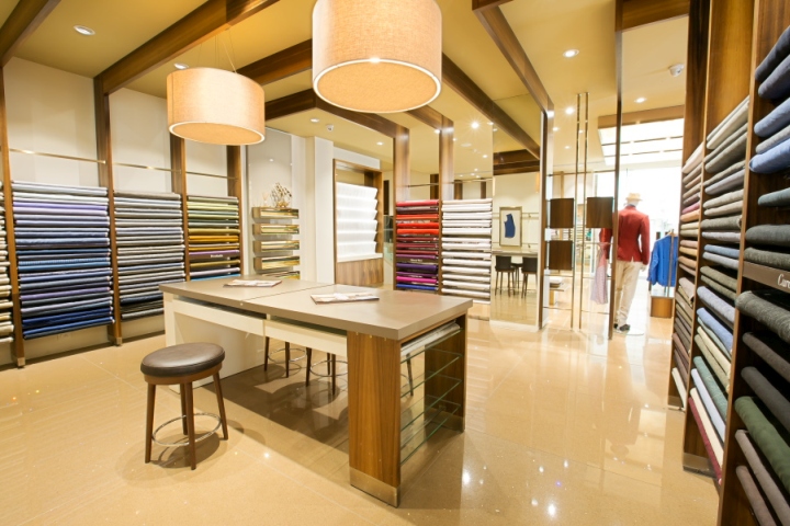
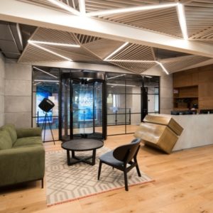
Unique Project Characteristics: The deep toned wood of the “pergola” structures that create the prime consulting studios are framed both vertically and horizontally, which in a composition of ribs and planes create a lowered ceiling, a more intimate and defined consulting space, surrounded by the store’s extensive array of linen choices — visible to both the guest within the consulting zone, as well as to the consumer shopping on the outside of the pergola space.
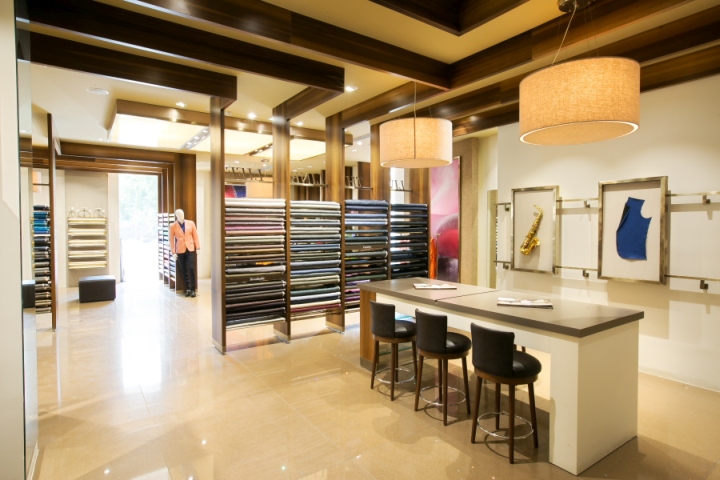
Within the consulting space, a large studio-like table provides ample display and selling space surrounded by imagery for the consumer to select samples of style and fabrication details, cuffs, collars, etc. to help inspire the consumer as to both the simplicity of the fabric and the potential personalization and unique style of the garment outcome while making their choices. Bespoke furniture, unique lighting elements (also fabricated exhibiting the versatility of linen) highlight the selling zones as well.
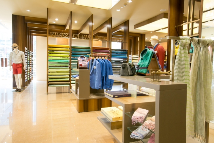
Within the common space between the store’s two main consulting studios are a series of retail fixtures, focusing on ready-made garments, as well as complementary fabrics from custom made and associated products. They are supplemented by a series of perimeter “ballet bar” fixtures featuring hung garments including jackets, pants, shirts, and as well, accessory items made of linen such as stoles, kerchiefs, etc. This combination of studios and open sell areas provide a degree of “stickiness” to the shopping experience that addresses both the bespoke and the ready-made aspect of the store’s assortment. Customized fitting spaces, a guest lounge, and a large overscaled three-way fitting zone exist on a slightly elevated level within the store, which is open and visible to the balance of the space, and yet through the vertical separation feels set apart.
Large overscaled graphics take the consumer into the world of linen growing, the European source (French and Belgium) of the linen, and as well, highlighting the fabric as a wholly natural product, ecofriendly and timeless.
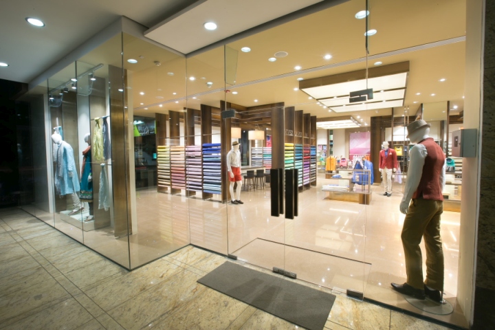
Special Colors/Materials: The façade, framed out in patina bronze panels, contrast the exterior from the adjacent building architecture and focuses the eye on key elements of the interior pergola structure, branding and unique details — such as custom-made door handles serving as an entry touchpoint. The warm overtones of the ceiling are echoed within the flooring material, whose competition is enhanced through a series of polish and reflective metal and mirror inclusions that shimmer as the store’s visitor moves across the floor plan.


Add to collection
