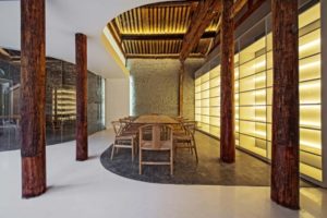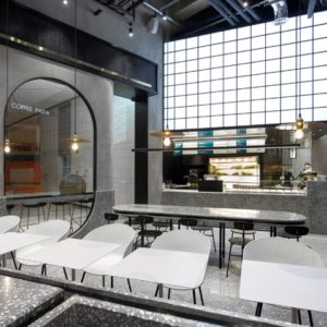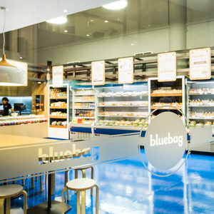

Turn a 50m2 established neighborhood boutique into a 250m2 flagship fashion outlet while maintaining the personal private like feel the regular clientele longs for from the old place. The old shop had a lot of heart but lacked it visually. It was our job to raise this long overdue adolescent and graduate it into young active adulthood.

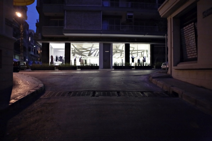
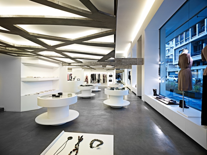
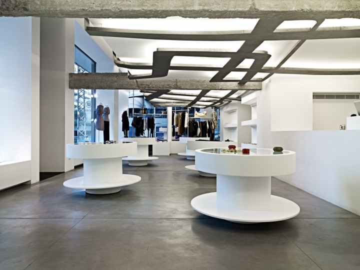
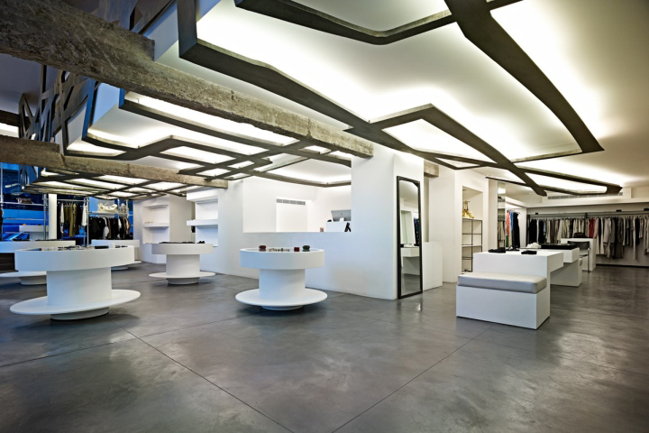
Aside from finely resolving the functional aspects of the retail outlet, we decided early on to have a single powerful element pump life into this collection of rather fragmented low clearance height spaces that constitute the new outlet. The image of the “web” stemmed from that concept. Doubling as light source and as a womb for the mezzanine (functioning as a multi use space: office, bar, men’s collection, voyeur section..), the laser cut steel ribs unite the shop both visually and physically, much like veins circulating blood into a human body. The outlet is organized around white central massive core housing: the counter/reception desk, the built in shelves, the mezzanine and its staircase, the three changing rooms, and the store room.

Every element in the shop was custom designed and built, nothing or very little was bought from the market. Consistence pushed us to complete this modern organic image so we drew up a couple of white, custom manufactured loose furniture, much like white cells floating around. The movable circular displays double as bar tables as they can be raised (70 to 110cm), and the long elements have hidden storage compartments, extendable drawers and seating. Therefore, we liberated the rest of the shop which spread out around the core and conveniently opened up onto six jumbo sized store fronts. This gives the window shoppers a very transparent and clear view deep into the end of every corner of the shop, allowing a feeling of accessibility.

And should they decide to walk in, a purposefully rough, solid and dented metallic door blocks their view, somehow to remind them of the invasive nature of their next movement and that is to push the door and step inside. That specific moment is imprinted on the surface of the steel door as it is left untreated and will rust with time reflecting the multiple intrusions it will have witnessed.
Design: Batimat Architects / Mohamad M. Arayissi
Photography: Carlos Ghossoub
