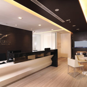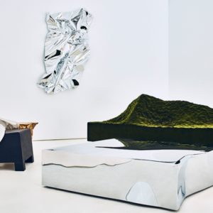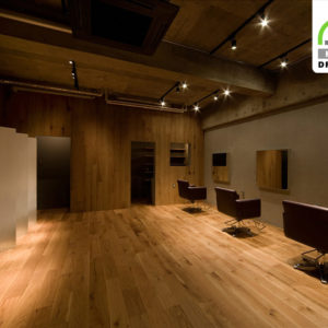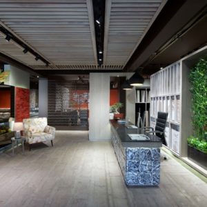
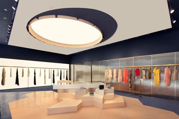

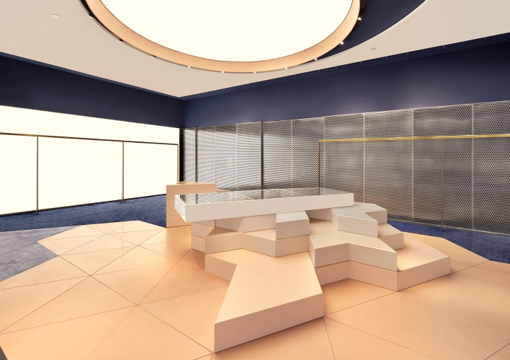
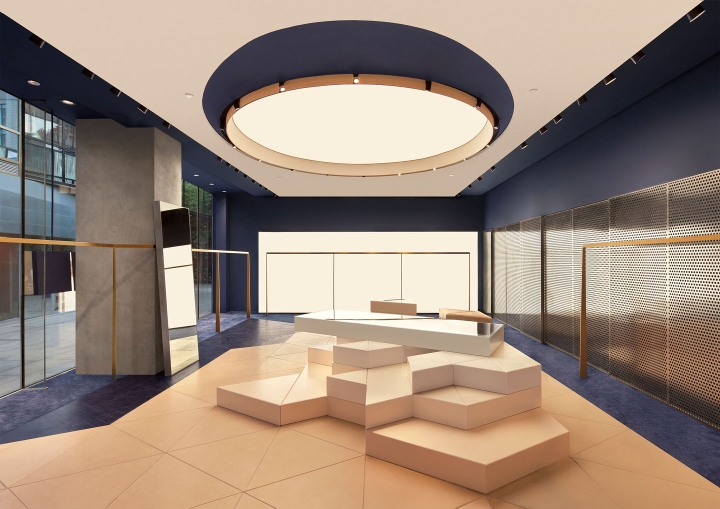
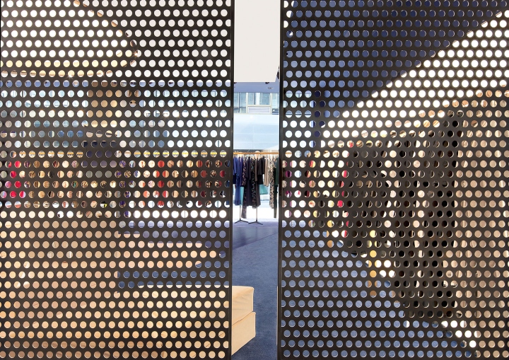
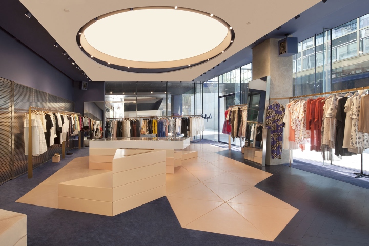
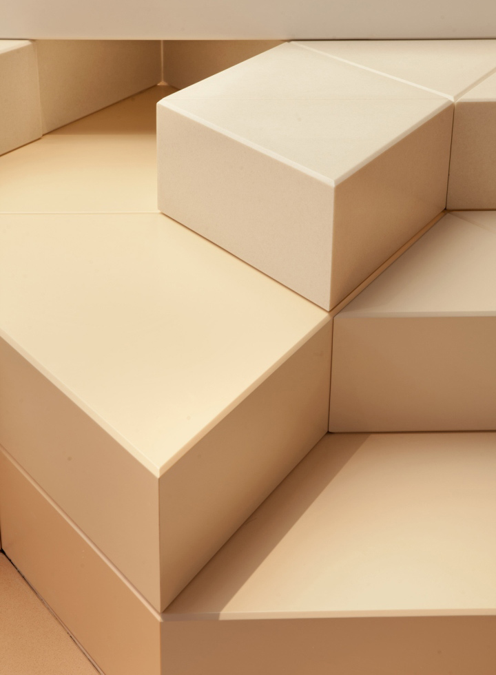
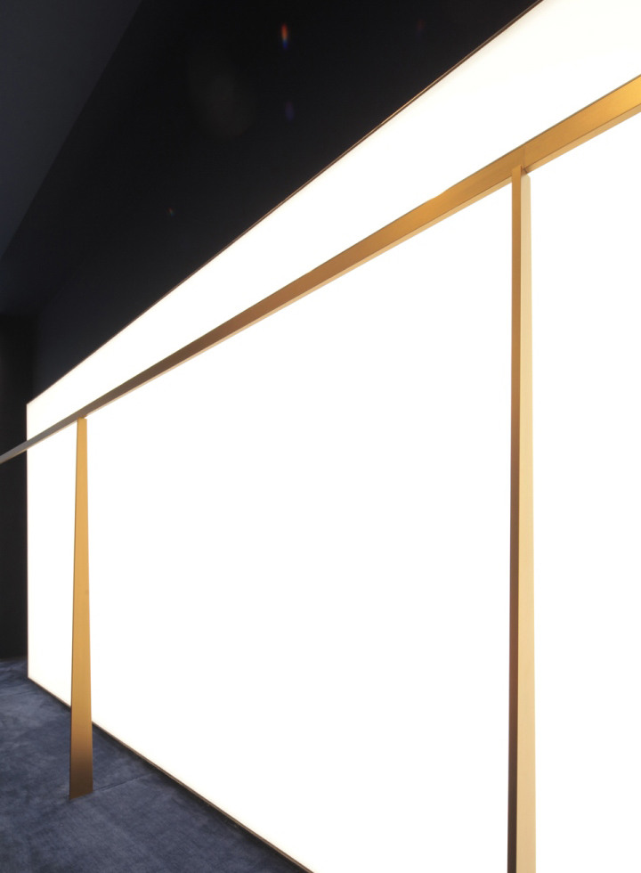
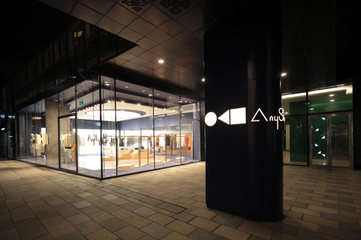
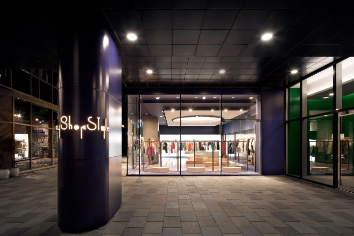
Fashion can be inclusive? How can it reduce distances with its followers? To create inclusiveness we removed boundaries for visitors including the façade making it very open and transparent. Basic geometric shapes compose the branding for the store and these basic elements assemble to create the store. The triangle (Ground), the Circle (Sky) and Square (Framing the View). Loose connotations with an island landscape can be drawn from the plan arrangement. The circular barrisol creating a light well, a central peach plinth sprawls onto triangulated floor tiles, isolated from the surrounding walls through a boundary of carpet. Removing from the space obstacles and hindrances from plane sight and assembling each component in an ad-hoc manner imparts a feeling of permanence or an arrangement of belonging to antiquity.
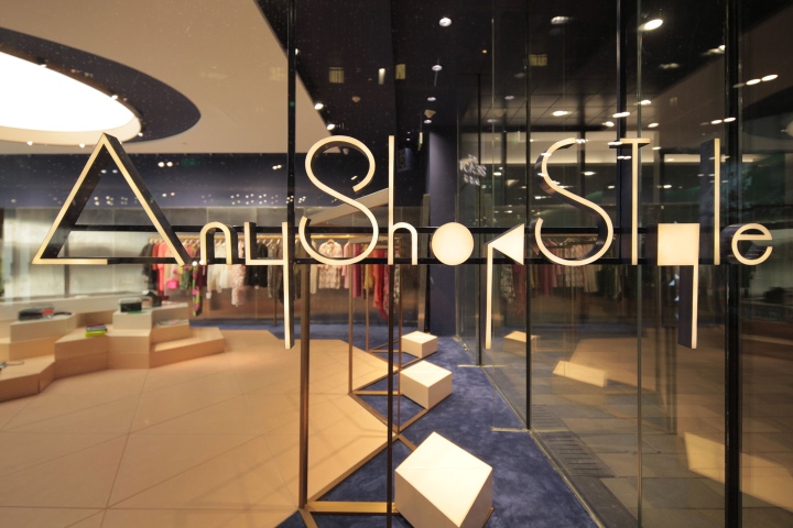
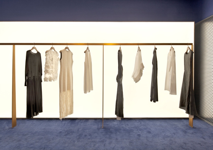
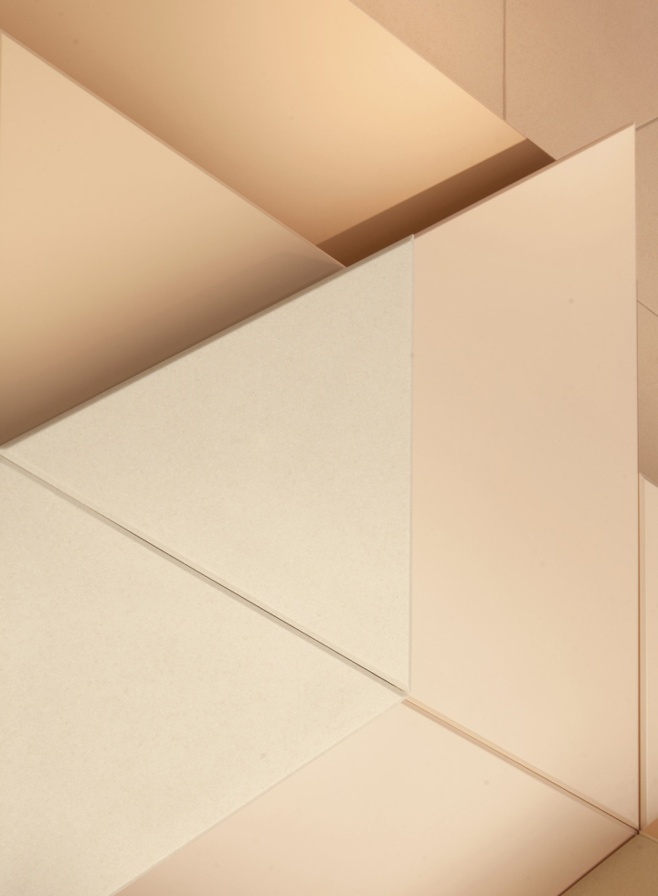
A holistic approach was further enhanced with the companies Brand and VI (visual identity) which creates an engaging coherent user experience throughout the store. AnyShopStyle.com being an online platform with more than 300 potential designers on display (on rotation) required a democratic space. AnyShopStyle.com also required its brand to be strong, so a balance had to be made between an in-store democracy and the wider perception of the store as a marketable entity. In our use of colour we took inspiration from the Belgian Artist Pieter Vermeersch specifically work titled Untitled (50°54’37” N, 4°24’26” E) 9, 2012, Oil on canvas. When finding solutions to branding with the chosen pantones of 2147 U and 475 U wit a textured pattern inspired by the Materials we used for the triangle flooring. Interestingly these colours although bright do not hinder clothes display and appear sterile and competitive vein store, this allows each display all with their own identities

via WAA | We Achitech Anonymus


Add to collection
