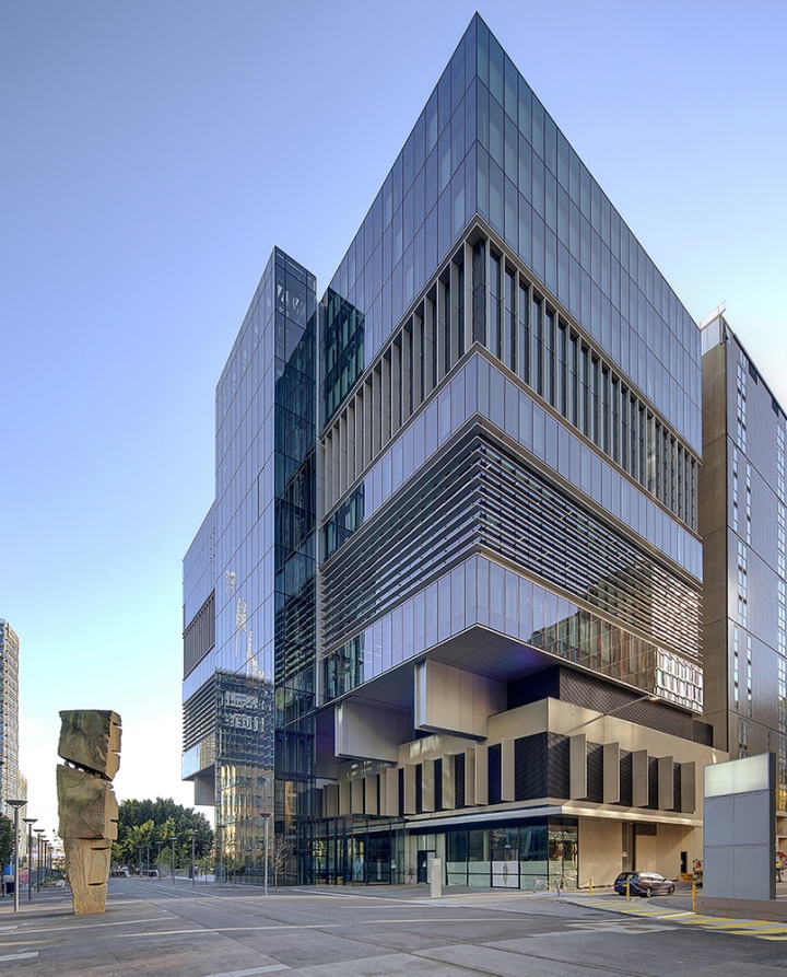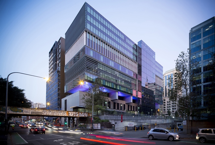


After many years and numerous attempts by other architects Bates Smart’s innovative design unlocked the potential to build over an existing structure. The central lift core was relocated to the perimeter of the building creating an open flexible floor plate. A series of steel trusses allow the building to cantilever over the existing structure and transfer loads.

Expressed as a set of random stacked boxes with contrasting shading strategies this building boldly interprets its diverse context and has created a unique environmental aesthetic. The original sub-structure included a structural grid and lift core to allow for the future construction of a commercial office building above. No internal modifications could be made. This had several unfortunate consequences. The centrally located lift shaft bisected the floor; and the floor area and structural grid were small by current workplace standards.

Bates Smart’s City of Sydney competition winning design is based on three key innovations to resolve these issues:
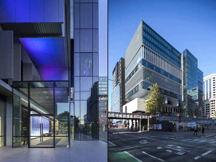
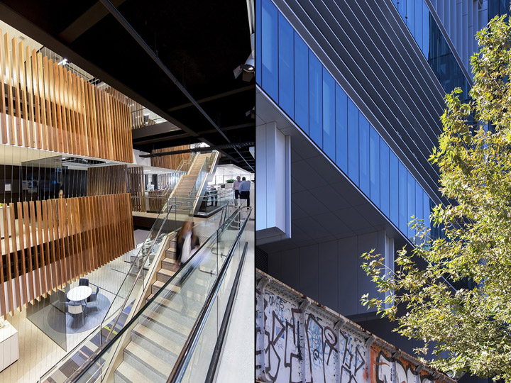
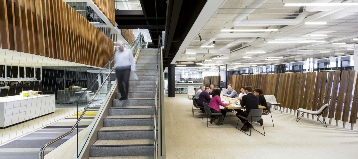
1- Relocating the lifts to the exterior of the building opened up the floor plate to create an open, flexible and connected workplace. The new glazed exterior lifts created a spectacular experience when entering the building.
2- Locating steel trusses on the roof of the sub-structure allowed the office structure above to have longer spans. Further it created the opportunity for the building to cantilever beyond the original sub-structure, effectively increasing the floor area.
3- Using lightweight steel frame construction reduced the floor to floor height by incorporating the chilled beam ducts within the structural depth and created the opportunity to accommodate the load of an additional floor.

These design innovations are clearly expressed in the building. The buildings orientation meant horizontal or vertical shading had equal effectiveness. Playfully the building alternates these shading strategies creating the impression of a series of stacked boxes to reduce its scale in the context. The sub-structure was re-clad in precast panels to give it a solid appearance to visually support the new structure over.

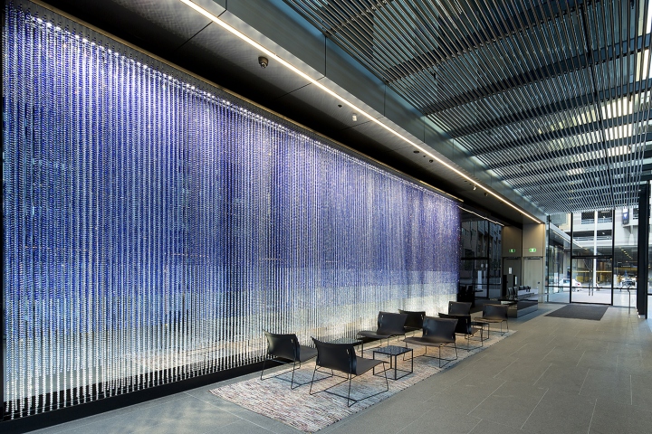
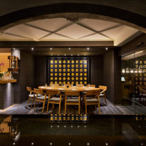
The lobby is a glazed box beneath the cantilevered portico. It contains a stunning interpretive artwork by Lucas Grogan consisting of 140,000 glass beads hung in layers. The base building has achieved Australian Green Building Council accreditations: 5 Star Green Stars for the architecture and the fitout achieved an ‘as built’ 6 Star Green Star Rating.


http://www.archdaily.com/770092/transgrid-headquarters-bates-smart
