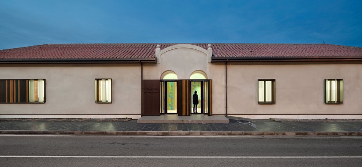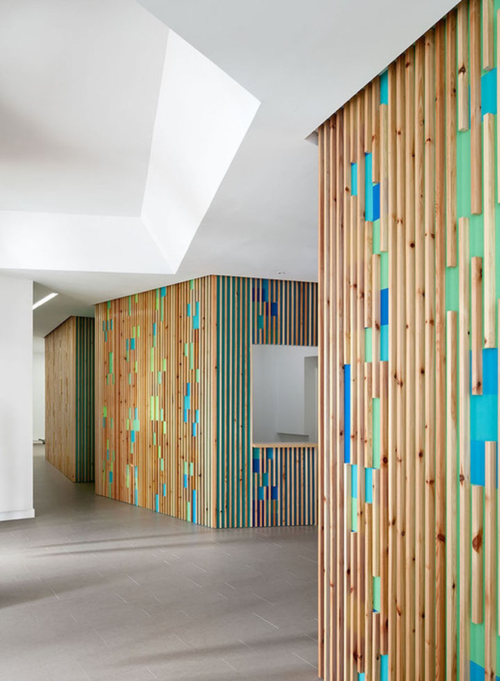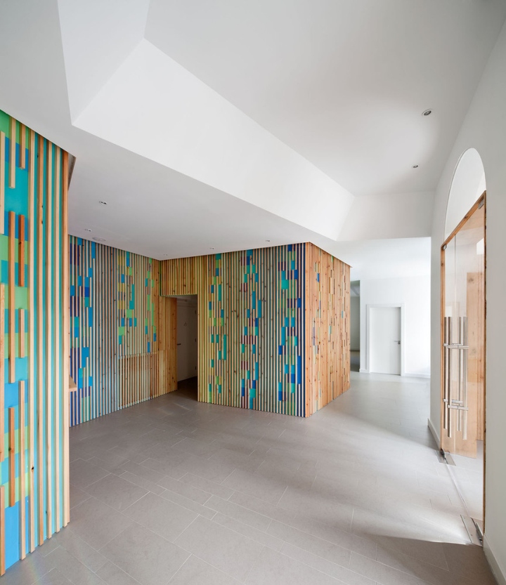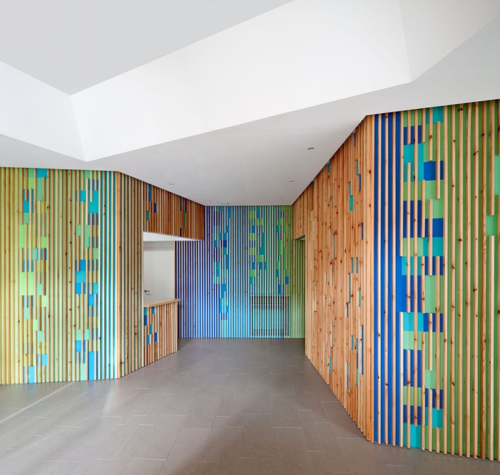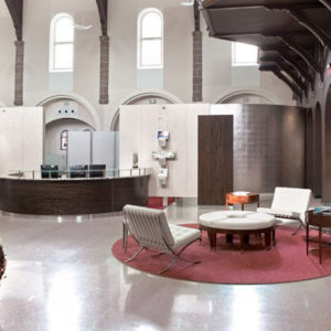

The project arises from the need to renovate the old medical office-library of the town, a single floor, long and narrow building, 33.50 m x 8 m, which focuses its main facade south. Half of the building is not in use with the transfer of the library to the new House of Culture; this coupled with the demand of a growing population, enables the entire building to be used for medical purposes, increasing the number of consultations, including extraction and pediatrics.

The goal we set ourselves from the start was to create a warm space which accommodated the patient, where the shape, color, material and light make his stay more enjoyable. To this end we first design a parallel front circulation where all offices would be placed facing south, thus improving their conditions of ventilation and sunlight.

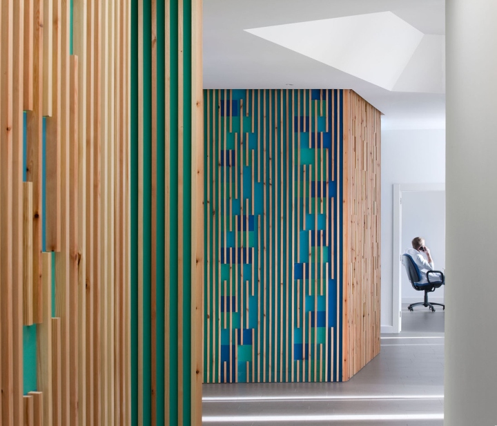
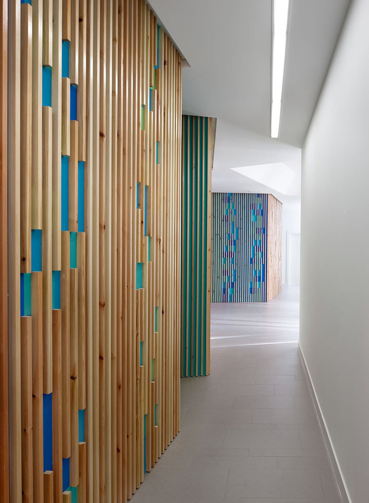
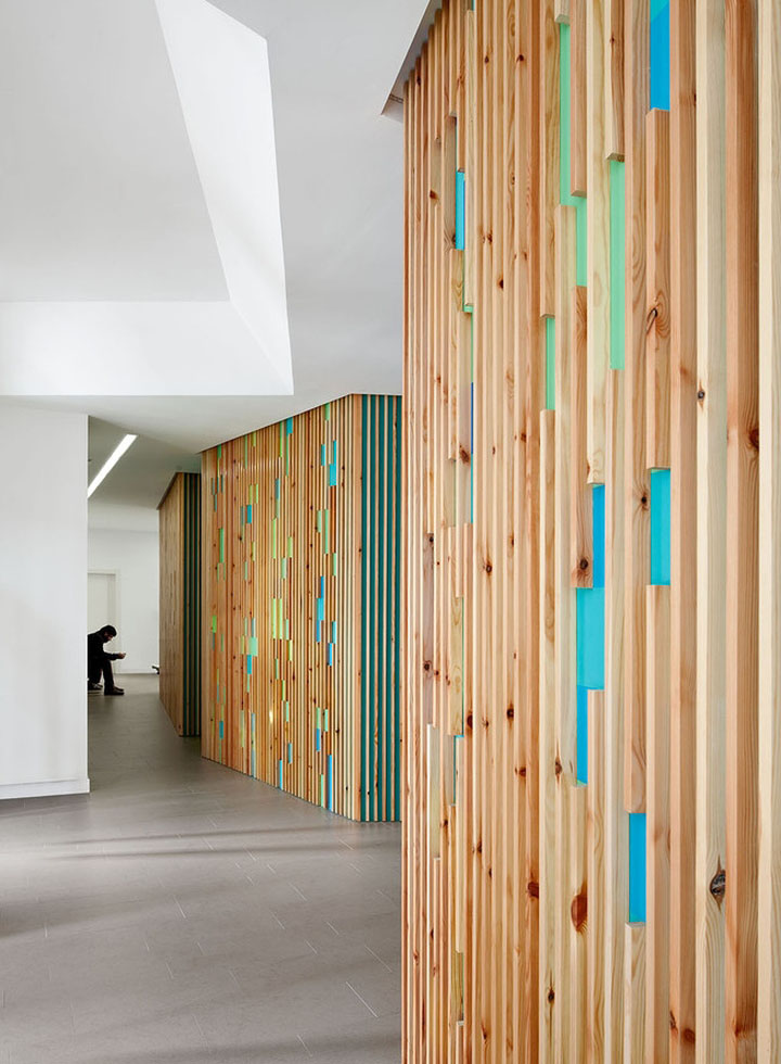
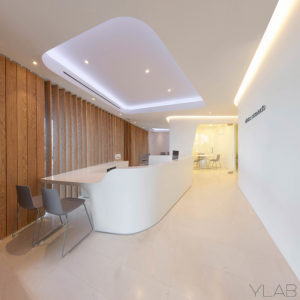
An orderly strip resulting in rectangular offices with comfortable proportions with a customer service area (table and chairs) and one exploration area. Faced with this orderly and quiet circulation we create another continuous, fluid and dynamic that travels longitudinally through the center. This space is generated from a single gesture: a broken line which unites within its folds the access and waiting areas, a paneled wall of wooden slats between which vibrates a gradation of five shades of color, from blue to green. This element becomes the star of the project, gives warmth to the space and lets us set behind it the secondary uses of toilets, staff room, administration and warehouse.

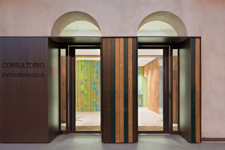
Outside we play with the roundness of the volume preserving its holes and double archway, erasing the superfluous, the decorative overlay. White plastic paint is replaced with a lime plaster favoring the breathability of the walls. The color chosen, a sand tone, is in dialogue with the new House of Culture and evokes the warm tones of the sandstone from the nearby church and the old villages of the area.

We use the steel sheet to enhance the access, the window openings and the horizontality of the building. The symmetry of the openings is broken in the southeast corner, which receives visitors and where the project extends the sidewalk and organizes the existing urban elements. The steel sheet unites the openings on the two facades in the corner and some of the vertical rhythm of the interior wood is echoed in the paneling of wooden slats and in the sequence of screen printed glass windows, where color again has a presence.
Design: Carmen Pérez Díaz / Ana Ruiz de Apodaca Johansson
Photography: Josema Cutillas


via Archdaily
