Add to collection
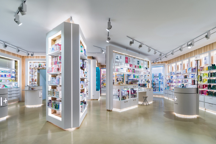

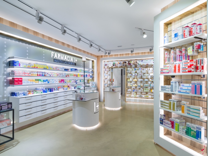
I+ Pharmacy concept is based in a very simple brand idea: Union makes you stronger. Each pharmacy it is represented by a single cross. We have create the first pharmacy chain for the Spanish market with a very clear and clever image, we want to become “The Apple” of the pharmacy stores. I+ pharmacy store it is designed with a “Lego” concept a retail design that could work and fit for a 30m2 pharmacy store or up to 300m2 one.

Layout it is designed based on the main health product categories, taking in account different types of clients and moments of purchase. A layout with freedom of movement that invites you to enjoy the shop experience based on quality and specialization on health products and services.. Where the client can find in the same place medical services, beauty, wellness, nutrition and natural medicine.
Led lights trace the customer journey by illuminating inside furniture to bright the product. Always with warm white color light to make customer feel good.
The product and walls are illuminated using movable spotlights which provide extra impact thanks to a combination of halogens and halides and Led. Depending of the product category.
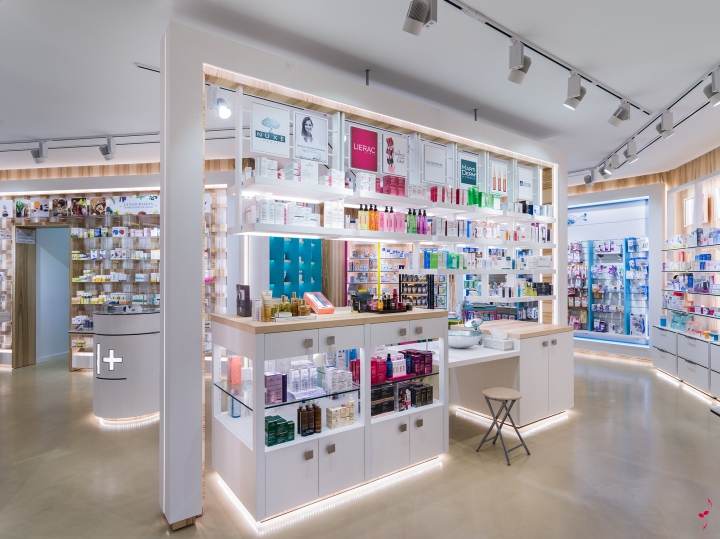
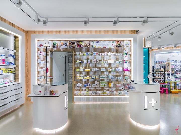
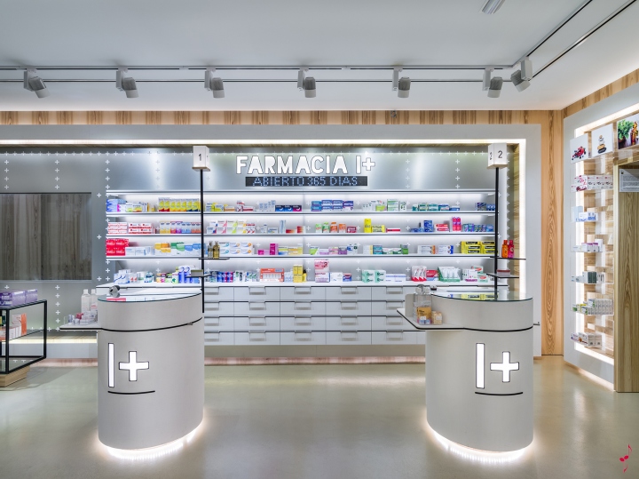
The materials have been selected to give the impression of being in a “modern – warm- natural & professional” pharmacy. Dibon brushed it is used at the storefront and for the medicaments wall to give a modern and futuristic image for the brand. The floor made by cement sends a freedom of movement for the customer journey. Furniture is made of “Olive Fresno” a natural wood that comes from the south of Spain helps to have a natural and local shop experience. White shelves to keep the professionalism and pharmaceutical image.
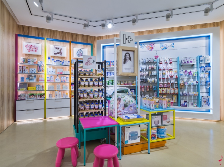
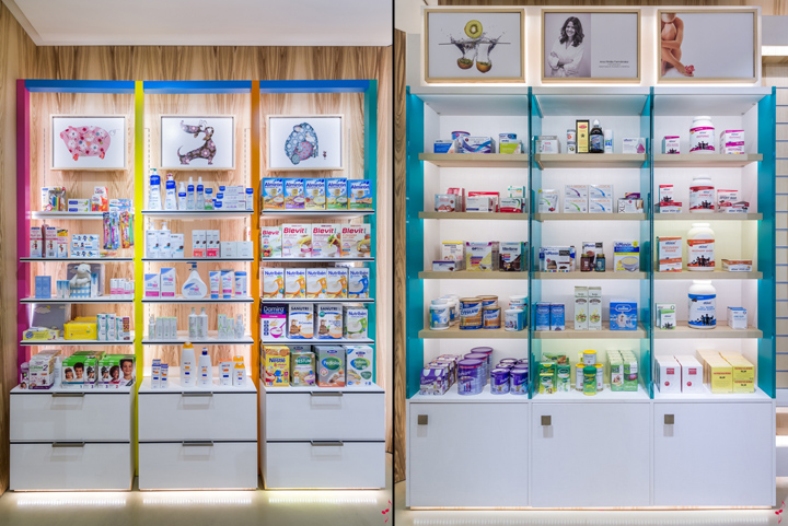
Each product category it is represented by different visuals. In cosmetics, where the laboratories are key for driven the purchase, it is used their brand images. Nutrition, natural medicine and wellness with conceptual images with a neutral feeling. For the child area we have used a known Spanish illustrator to make a personalized illustrations based in animals with a human touch. Also for reinforced the human service of the pharmacy chain the pharmacist and staff has been photographed.

Following with the brand concept I+ Pharmacy of adding value, the visual merchandising concept it is based on adding different product presentations depending of product categories:
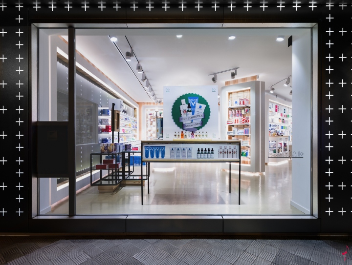
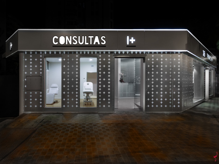
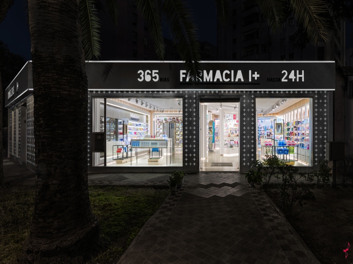
Storefront made by “+” pattern makes the brand stand alone, and invites you to get in to the pharmacy of the future.
Wellness wall: Placed on the right side. Dedicated to body and hair care, for him, for her, for seniors.
The Cosmetic Island: Placed at the heart of the pharmacy, turns the dermo cosmetics in a social and health destiny. Multi brand place specialized in beauty treatments. The client can enjoy the beauty advise at the “beauty bar”, get her hands and face washed with running water.
Medicine Wall: Placed at the left of the sales area, the coldest place of the pharmacy store. Made with the same design and material of the storefront. Dedicated for seasonal medicines. Sends a modern, a futuristic pharmacy image to the clients.
Natural Medicine Wall: Placed just between the Medicine wall and the Nutrition Closet. For natural healthy products. It has the door to go to the medicines storage. Made of a pattern with cross shapes of natural wood “olive Fresno”. We wanted to send the message to clients that we care of the origin of medicines, the nature. Product presentation in transparent acrylic boxes.
Nutrition Closet: Here you will find nutrition treatments and product to loose weight. Inspired in the supermarket food corners.
1st Place in the pharmacy category of the 45th International Store Design Awards.
Designed by marketing-jazz, creative retail design
Marketing-Jazz team:
Carlos Aires: Creativity, design and overall supervision
Elena de Andrés: Ilustration and sketches
Natalia Aires: Corporate Identity
Lucia Esteban: Technical Design
Silvia Teijeiro: 3D design
Ines Moreno: Chilhood ilustrations
Ikuo Maruyama: Photography


Add to collection