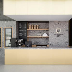
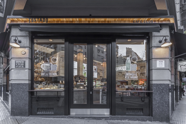
Tostado Cafe Club by Hitzig Militello Arquitectos, Buenos Aires – Argentina
posted by retail design blog on 2015-10-30
Add to collection
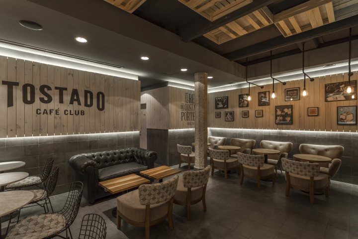

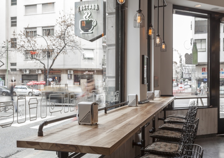
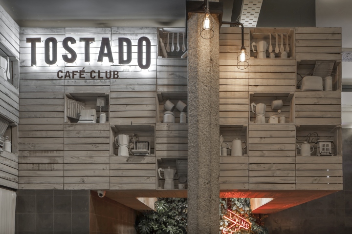
Starting off from the idea of recreating the spirit of the traditional Buenos Aires groceries without resorting to cliches, we worked with the materiality of what to us best reflects this kind of store: the wooden box for groceries. The sheer simplicity of this single element can generate spatiality both by addition and subtraction. The result attempts to describe this spirit, which was built by the abstraction of these elements. In short: constructing the decoration without decorating the construction.
As a part of the project since the creation of the general concept of the brand, the architectonic search ubiquitously attempts a comprehensive reflection of the essence of the product. A clear concept taken as a starting point allows for a narrowing of the gap between image and branding and between architecture and interiorism.
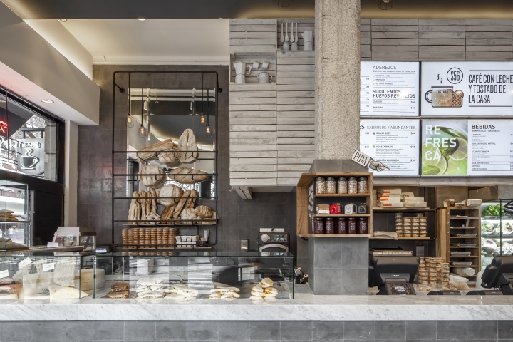
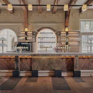
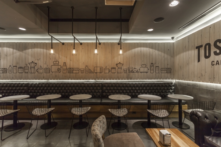
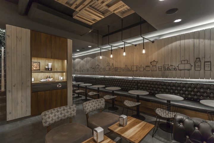
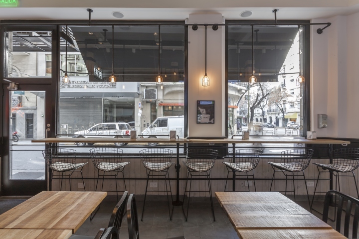
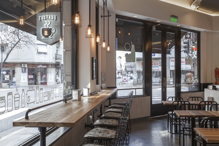
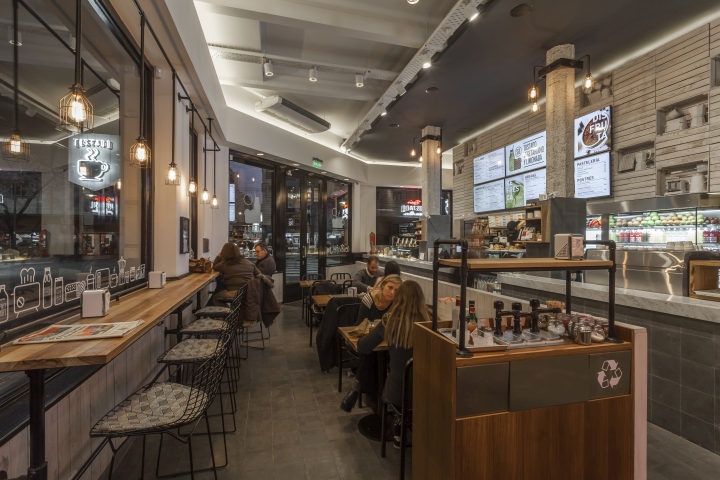
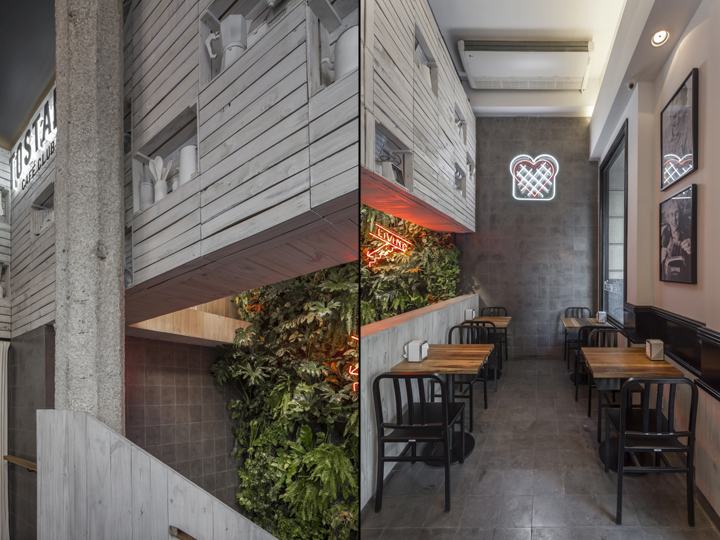
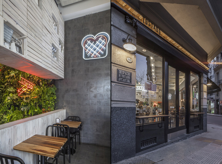
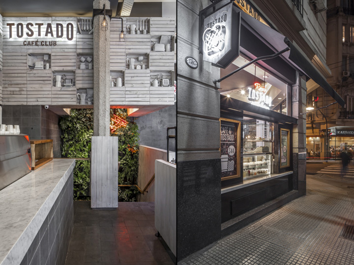
Spatiality and materiality go in the same direction when attempting to vehemently express the general idea for the project: a single-material container (floors and walls in graphite gray calcarean tiles) counters with a single-material volumetric piece that crowns the space and circumscribes situations (the old wooden grocery box).
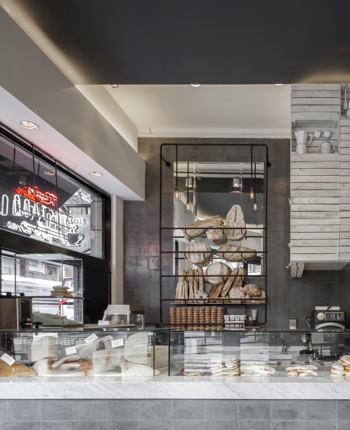
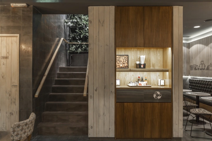
Both these elements are in time also intervened on. Hollows are made on the upper volume built entirely with grocery boxes. Such cavities contain objects related to the developed concept: antique toasters, coffee makers/pots and some utensils.
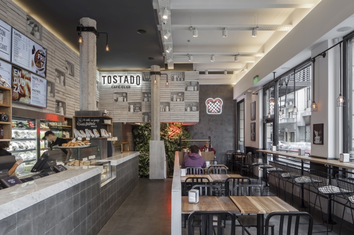
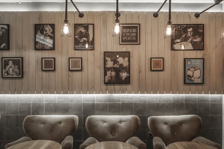
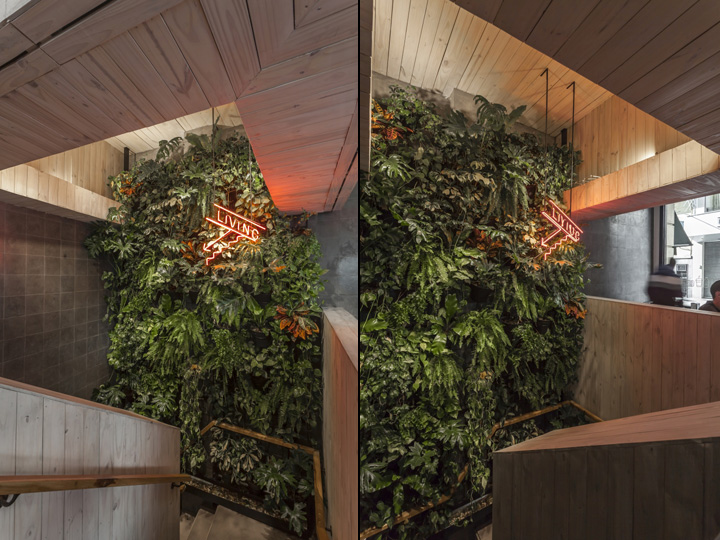
Light monochromatism: Both the grocery boxes and the objects are treated so as to achieve a unique and subtle monochromatic texture. Dark monochromatism: The surface of the graphite gray tiles was polished so as to enhance the intrinsic qualities of the material. The vertical garden located at the stairs not only calls for a descent into the basement but also signifies a departure from the monochromatic game between grays and whites that predominates in the overall space.
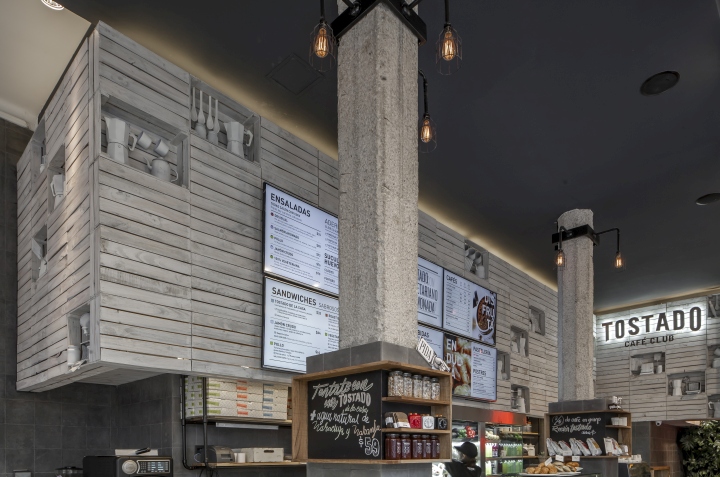
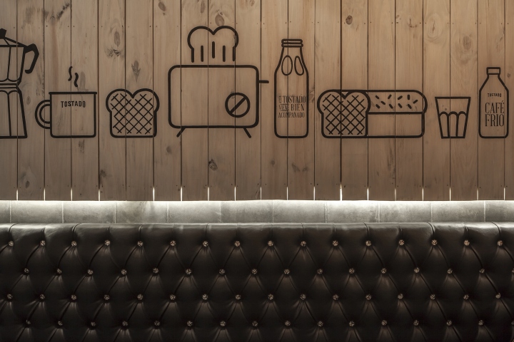
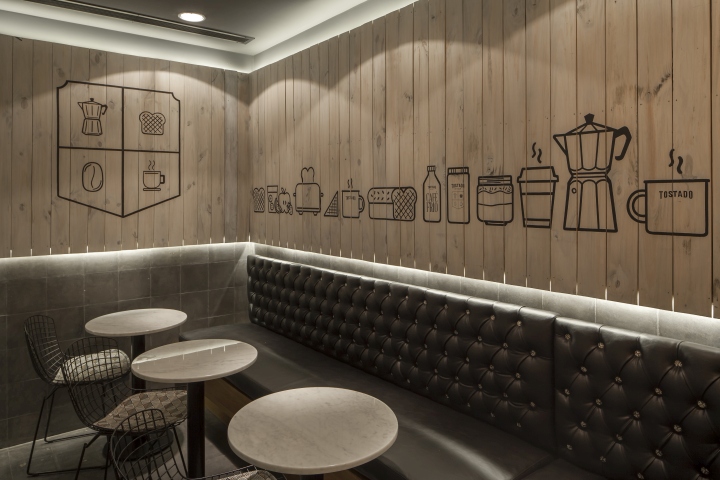
Furniture and lighting equipment not only add warmth and comfort to the space but are also a part of the brand graphics on its tapestries.
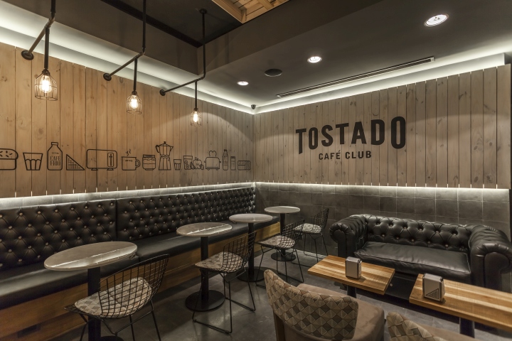
The space thus manages to show off with the aid of very few elements, allowing for a more prominent role of the retail products: a good coffee and a delicious toasty.
Design: Hitzig Militello Arquitectos
Branding: The Brand Bean
Photography: Federico Kulekdjian


Add to collection