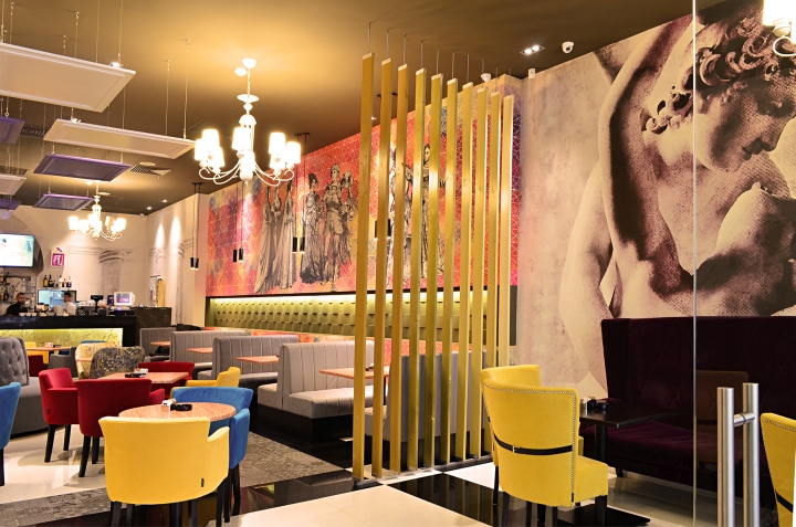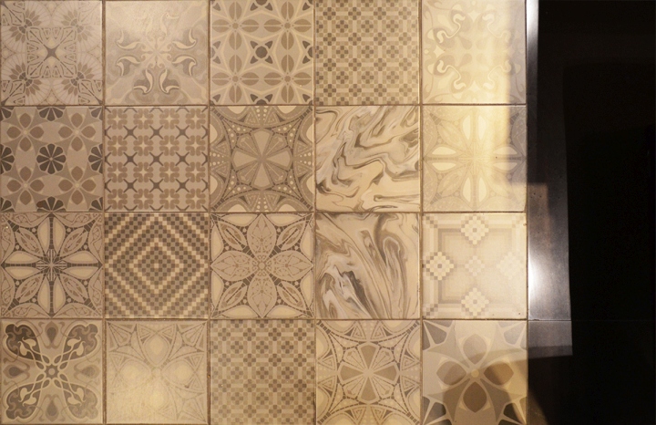


The story of the design began from the name of the location – Lollypop (“lollipop” – EN. Lollipop). We knew from the start that the future project will look colorful and very attractive. That is why we decide using a contemporary style with a touch of glamour and retro. The challenge of the concept was how to convert the idea of the lollipops into a discreet but interlaced way?And then we came up with the idea to create a photo-wallpaper around the perimeter of the walls, but to outline each area separately.

Thus, in the bar area we used a neutral wallpaper, which represents greek columns,then continues with central dining area, where we created a modern graphical geometrical monochrome tones come with classic characters that hold lollipops in hands,a funny idea that comes in contrast with their sober nature. The lounge area at the entrance is treated with graphics that mimic classic paintings and sculptures, spatially separated from the rest by decorative walls of vertical wooden slats.

To differentiate ourselves, we used to customize the entire lollypop brand: the logo, graphics to customize the furniture,or the menu. We sought technical and creative solutions for each element, which makes us proud of our executive team. Therefore, the arrangement which started with an idea, was transformed into a 3D project and built according to the proposed project.
Design: Creativ Interior Studio

