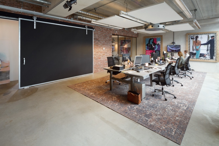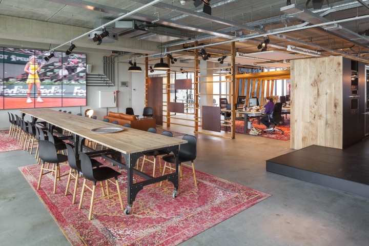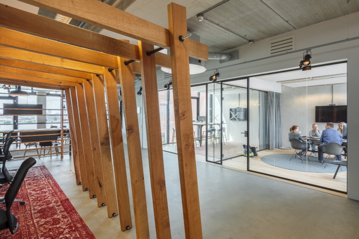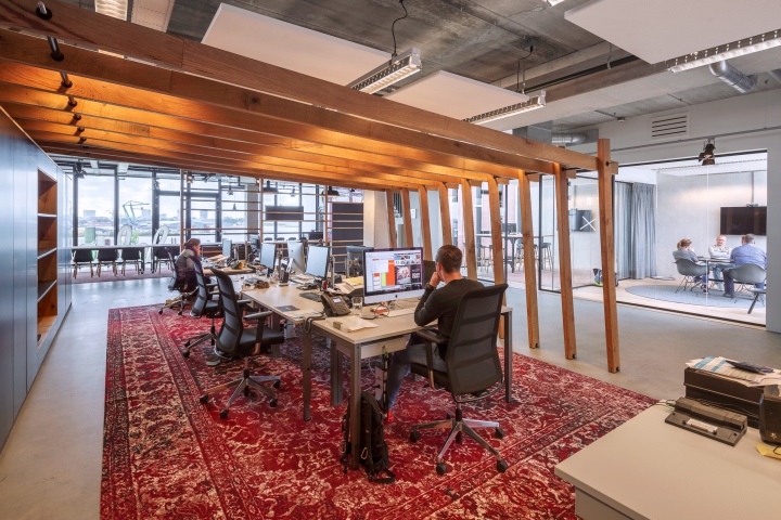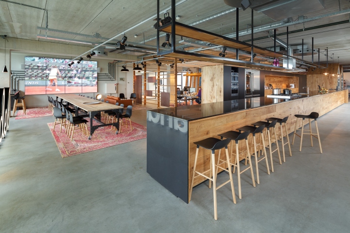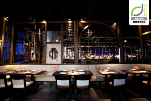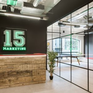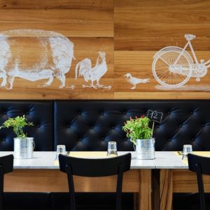


For BrandDeli I turned an old warehouse into a place ‘nicer than at home’. The challenge was to turn a dark warehouse with only a few big windows at the front façade and at a patio into a place where the users felt more than at home, a place to work, eat and meet.

On the first floor he big dark places in the middle of the building where only a few streaks of light could enter are designed as area’s that facilitate work such as meeting rooms, repro areas, bar etc. etc. These areas are clustered and placed on a raised floor this allowed the boardroom to have a nice porch on one side and a bar on the other side. Cabinets are cleverly used as a division between bar / kitchen and the repro areas. The ‘houses’ are in fact hones away from home and provide shelter for those who are in desperate need of a private phone call or want to concentrate on working. Most of the workstations are in opens space, there are just a handful of offices which are kept transparent with glass partitions so light can flow freely. The brick wall gives the concrete environment character and strengthens the industrial look and feel.

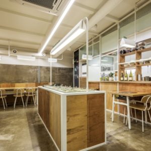
The more lighter 2nd floor was used for a big kitchen / reception desk / bar which immediately strikes you when you enter the floor. This long element connects the light front of the building with the big windows to the more dark back side. The kitchen seamlessly transforms into a reception where the guests and employees receive there well deserved coffee and can wait / lounge or work around a modern fireplace which is also designed as a divider between waiting area and a library. Fresh soup and lunch is served every day from the kitchen and the smell of fresh food helps you to feel ‘more than at home’.
Design: DZAP / Jeff van der Wees
Photography: Stijn Poelstra
