

Add to collection
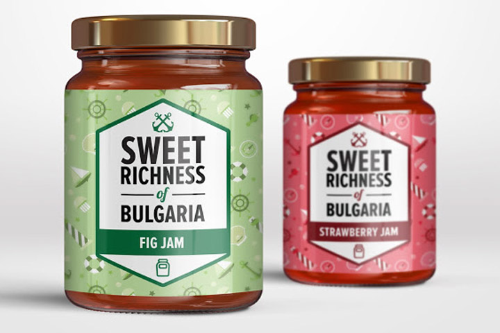

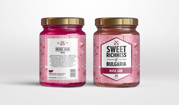
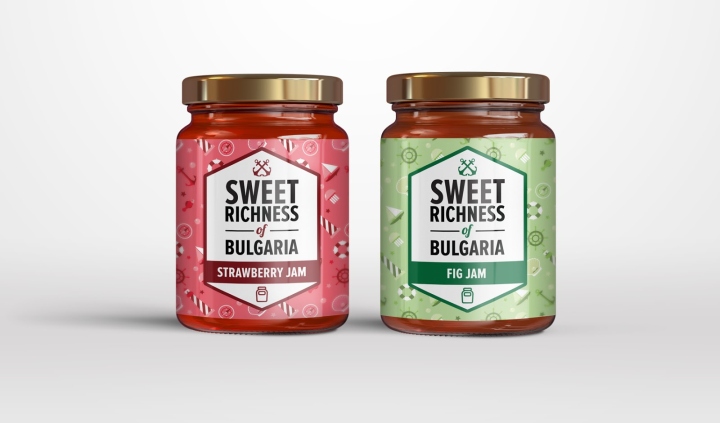
Sweet Richness of Bulgaria is a small company/tourist trap/ located in the small coastal town of Balchik that sells a range of sweet products – from jams to turkish delights. It doesn’t just sell sweets – it sells memories. That was the main idea behind the pattern of nautical symbols – to remind the tourists of their stay in Balchik. The colours are eye cathing, light and sweet – reminiscent of those of a candy cane. The badge continues the nautical theme – it’s bold and rugged, just like a sailor.
Design: ZENITH / Teodor Dimitrov


Add to collection