
Whether it’s grabbing a healthy snack or undertaking a full personal training plan, people are serious about their health. Protein Haus has exploded onto the London health and fitness scene offering personal training and juice plans as well as selling low carb ready-to-go meals and protein shakes. The branding, creative direction and website were designed by The Yard Creative, an award winning design studio based in south London.

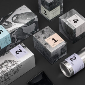
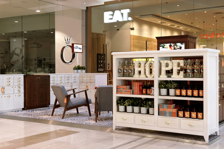
The simplicity of the logo allowed the secondary graphics to be bold, playful and expressive but also changeable in the future whilst keeping the core element of the brand consistent. The packaging design for the food offering is vibrant, just like the entrepreneur behind Protein Haus, Carli Wheatly. Working hand in hand with the brand strategy, the website tells the story of Protein Haus; communicating the brand messages and engaging with the target market. The next phase of the project is designing a physical environment for the brand that gives it an explosive start from the blocks. The brand will be applied to internal kiosk in the exclusive Canary Wharf Shopping Mall, opening at the end of November 2015.
Design: The Yard Creative
Photography: Andrew Ward

