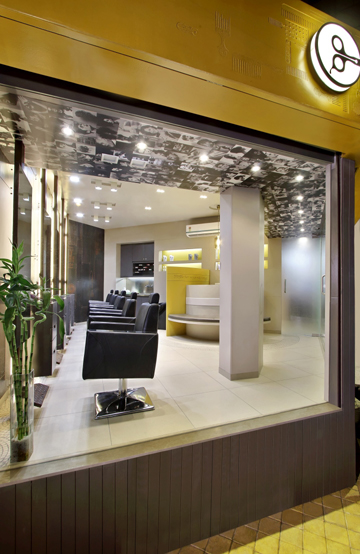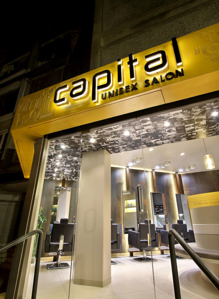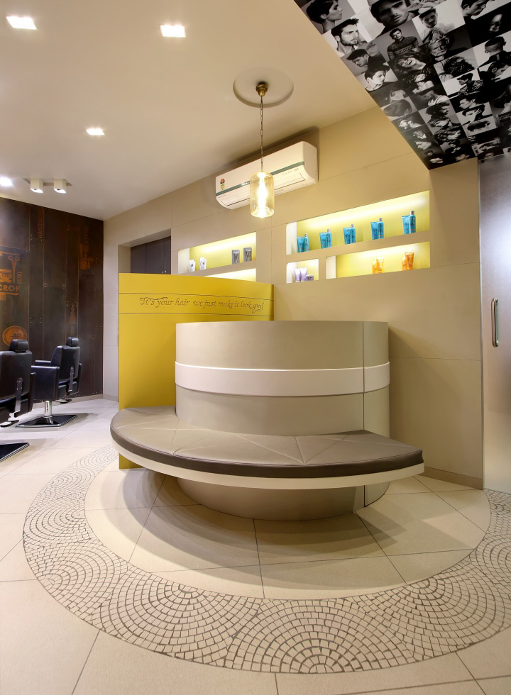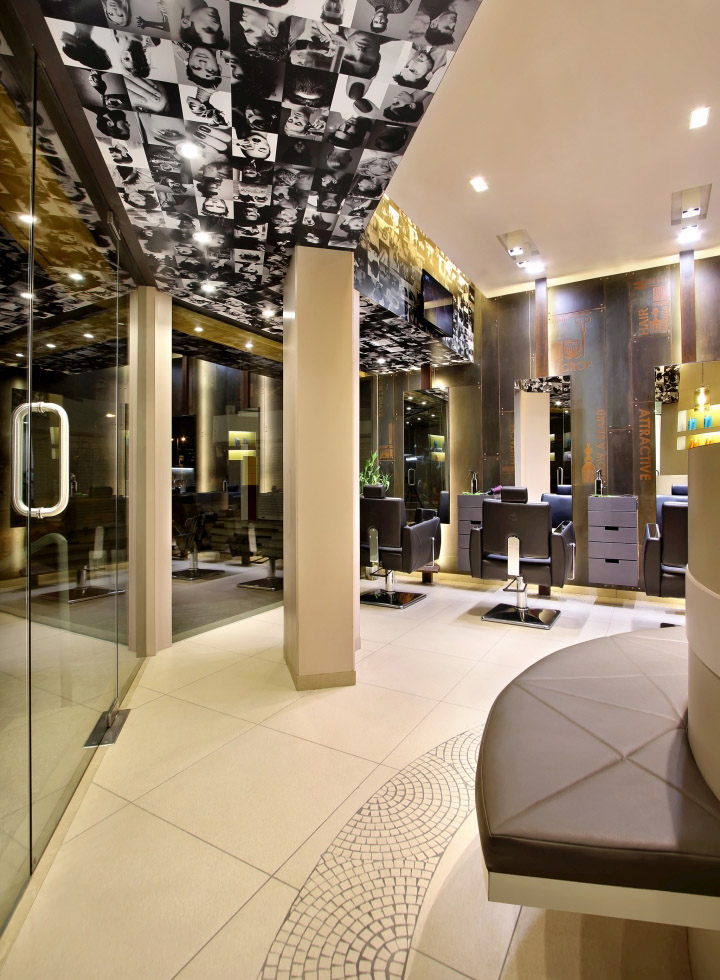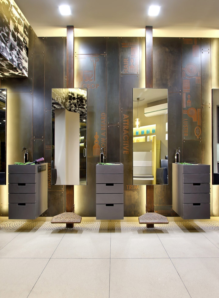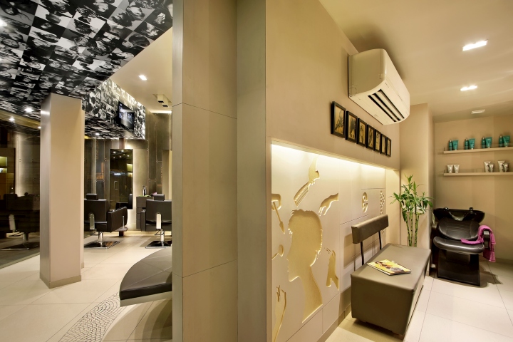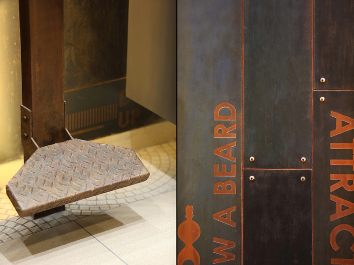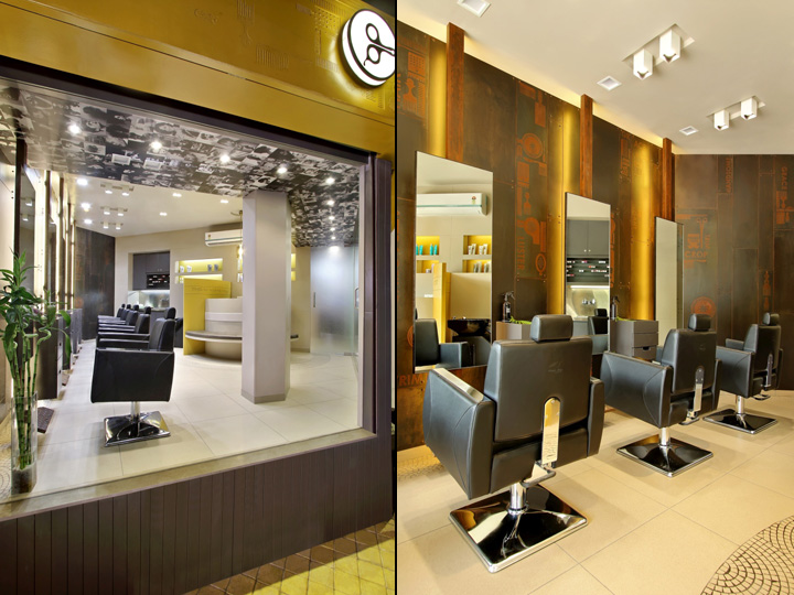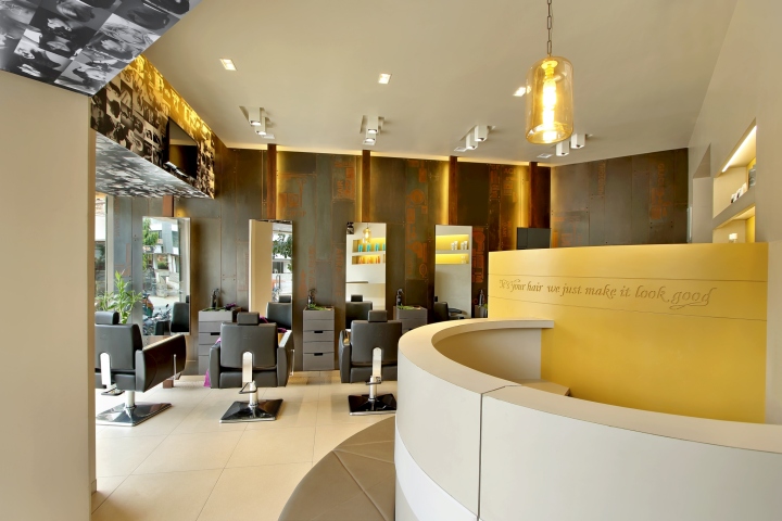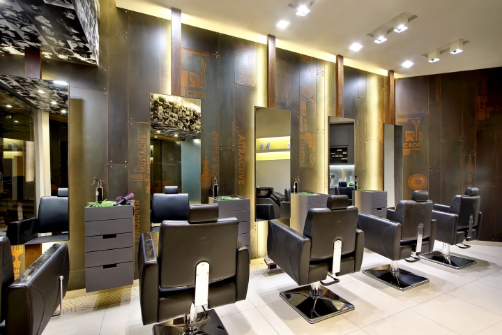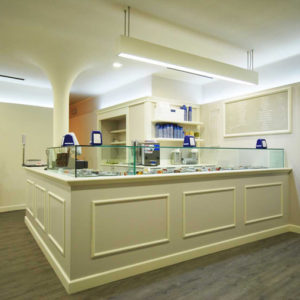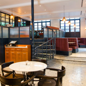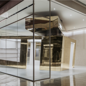
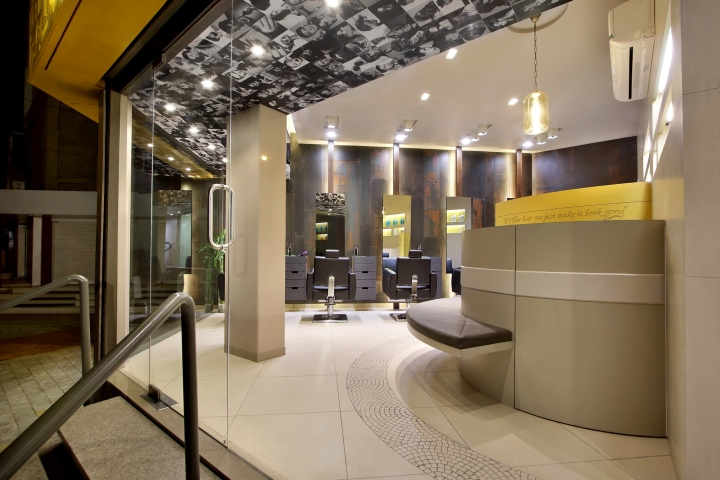

The concept evolved from the ancient history of afro combs, typography and bold elements and colors of today’s era, which together shows the combination of ancient and modern era. A diagonal, horizontal and vertical line, forms a basic triangular shape which was the existing layout. The overall space is unmistakably imposing yet understated. The artificial lighting was done in accordance with the basic theme of the design. “Lighting is always an extension of the theme that is being followed”. The color palette included oyster grey, ochre yellow and dark bold elements.

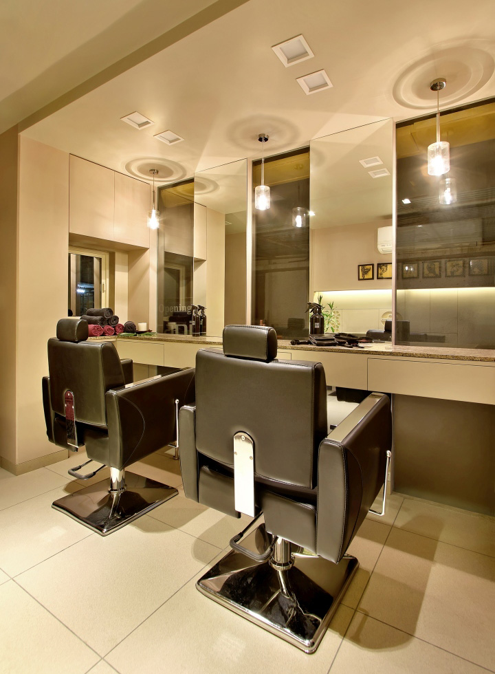
The salon has a unique urbane quality with the right quotient of functionality fashion and design with a modern and bold twist. The small space within has been divided through a ply partition, the bold elements like metal manifest male zone where as the subtle colors convey the feminine zone. The aim was to create fluid space while maintaining a sense of wonder. The curiosity of the mind should be activated when moving through the spaces, as one cannot overview them all in once. Therefore, one would be triggered to explore the space.To keep the look uncluttered, niches are created where possible.

A far cry from the dingy space that it was once, this light-filled, capacious salon is another feather in the already burgeoning cap of the client. We discovered our potentials in creating wonderments within confined spaces. There is no claustrophobic or clogged feeling in spite of many things happening at one junction.
Design: Archis Patel & Tanvi Rajpurohit
Photography: Tejas Shah
