
Add to collection
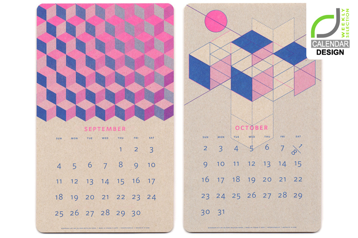

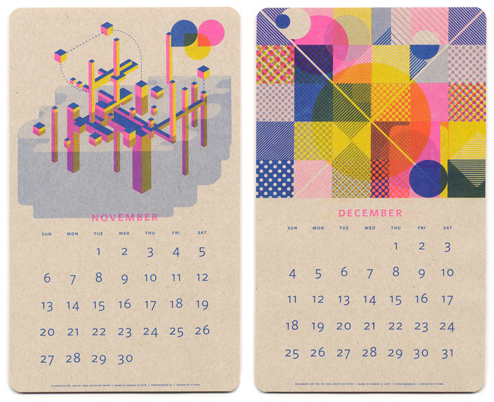
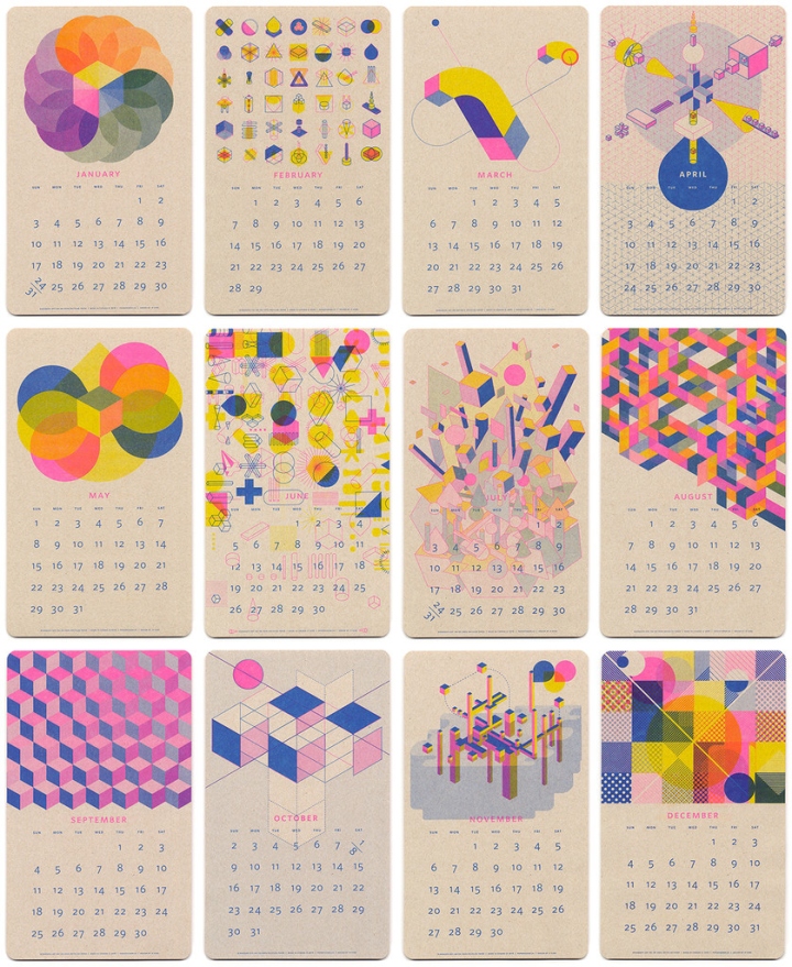
These calendars stand out in any home, office, or studio with their perfect combination of Fluorescent Pink, Blue, and Yellow soy-based inks, and printed on a 100% recycled Oatmeal-Kraft paper with a tactile vellum finish.

This calendar showcases Risograph printing through an exploration of overprinting, halftones, and fluorescent inks on craft paper. Jp King designed the mid-century-esque, utopian geometric graphics with two goals in mind: imagined depth on a two dimensional surface and accentuate the inherently retro feel of risography. The finished piece is a fine sample of what can be achieved with this printing method.
Designed by Jp King


Add to collection