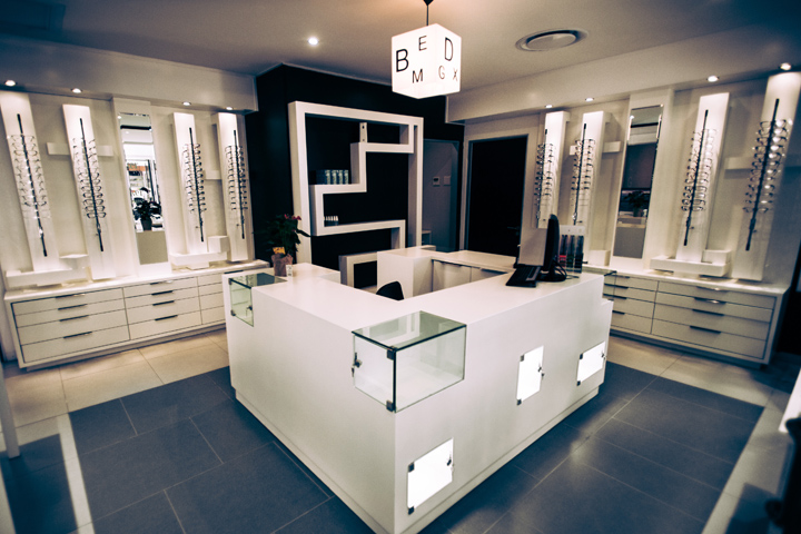

The brief was to design a world class, optometry store that is both practical and reflective of the bold design-centric Becker and Becker brand positioning. The client wanted an interior with distinct and memorable design values. As such, Creative Shop Retail Shopfitting had the freedom to take some interior design risks with some unusual custom shelving and display fittings to achieve the objective of creating “not just another optometry store”.
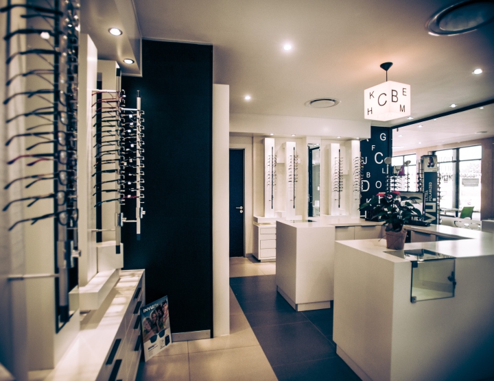
Own terms of the actual store layout, the main priority was functionality. The client wanted to ensure clear organisation and the separation of the different functions within the store; specifically between the retail section of the store and the optometry service itself.
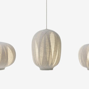
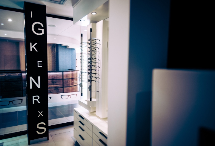
Creative Shop achieved these twin objectives with a clever play on the brand’s bold black and white colour palette. Iterations of the traditional optometrist’s eye chart are integrated throughout the store design. The eye chart motif can be seen in the shopfitting in the unique wallpaper design and is also carried through to the custom-made pendant light features through the shop, while the use of invert of colours create dynamism and add interest to the monochrome scheme.
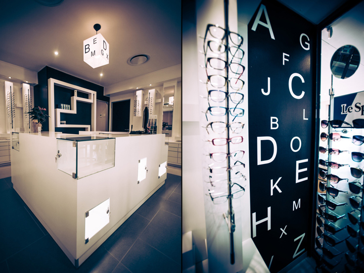
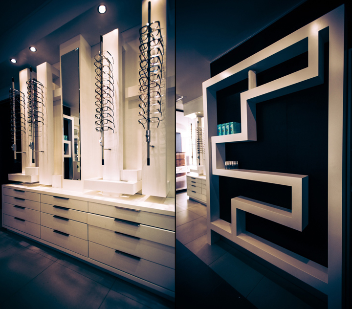
The dramatic black maze-shaped geometric display shelf and the white cubic cut-out check out counter in front of it create a dramatic focal point and draw attention to the quality and detail of the joinery and shopfitting in the custom made display systems. Overall, the store interior has a contemporary, dramatic feel.
Designed by Snejana Ivanova and Brandon Williams from Creative Shop Retail Shopfitting
Photographer: Jay Jansma


Add to collection
