
Add to collection
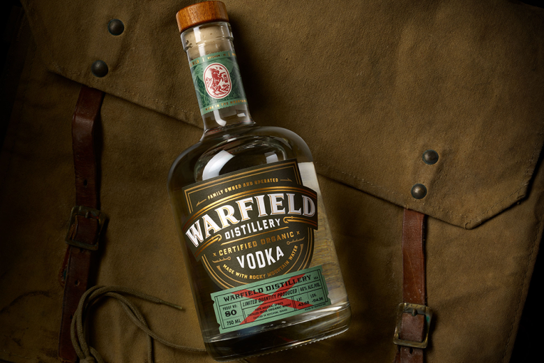
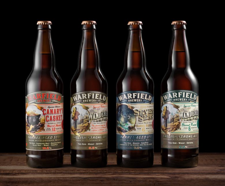
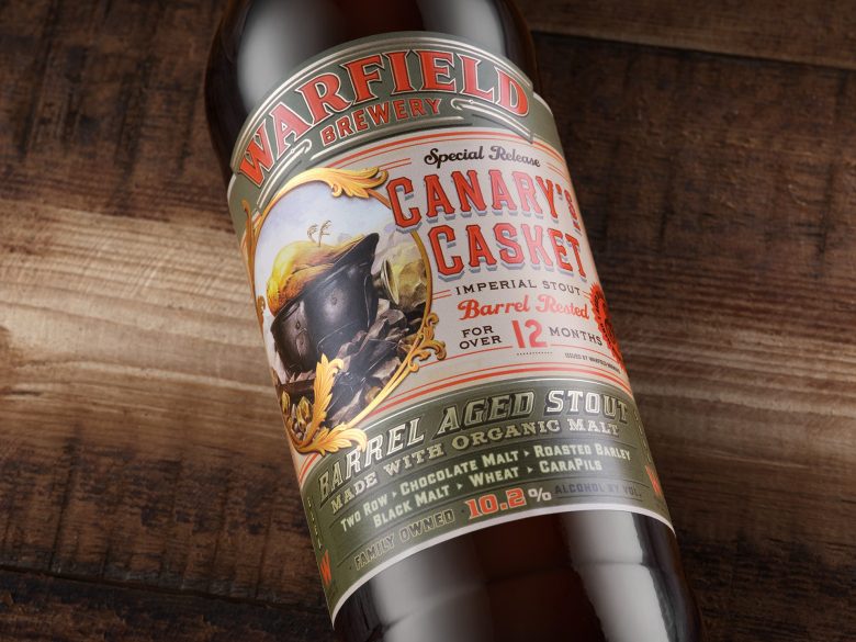
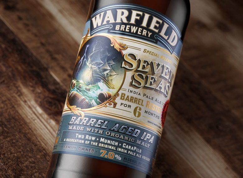
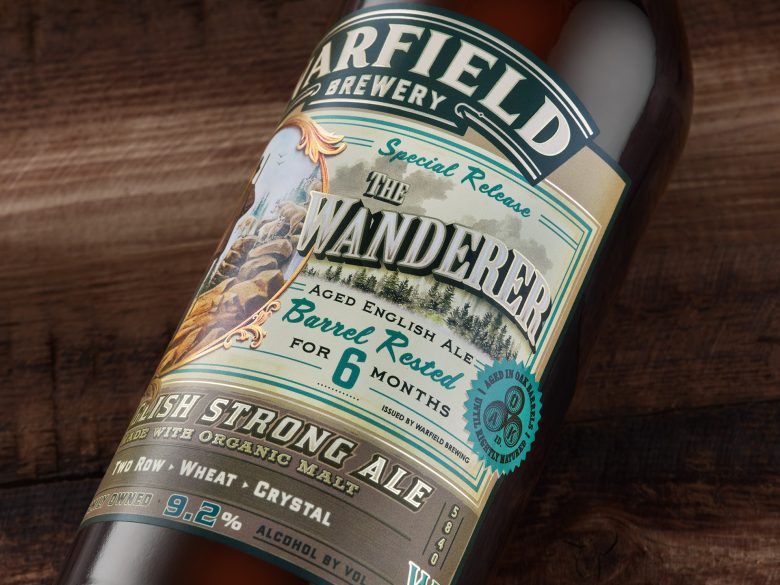
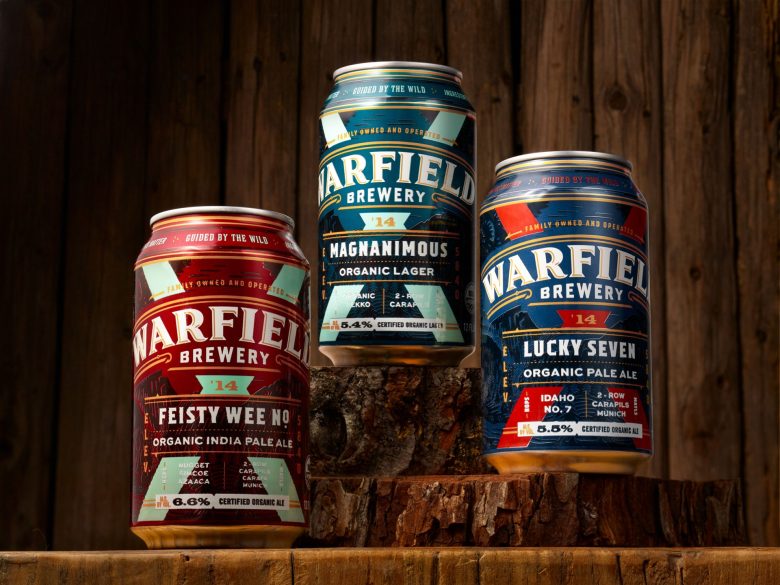
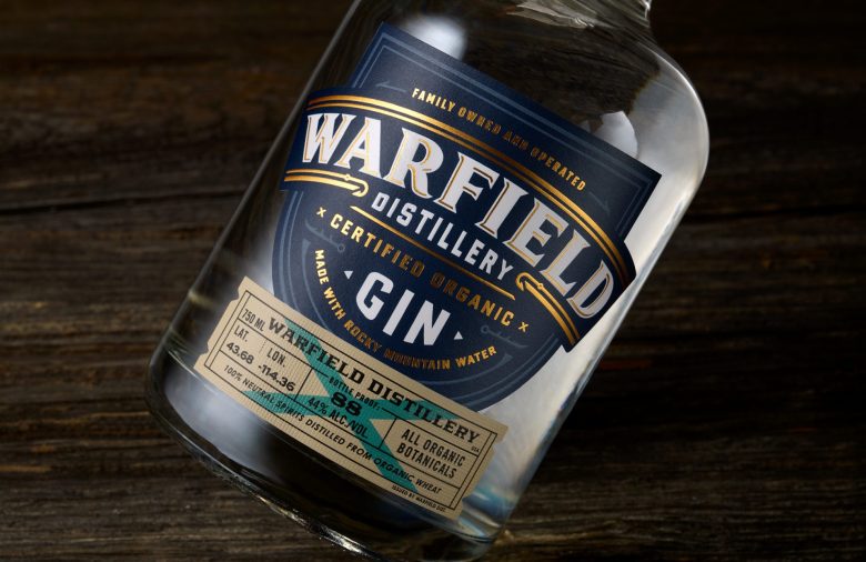
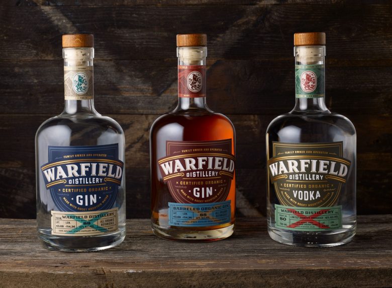
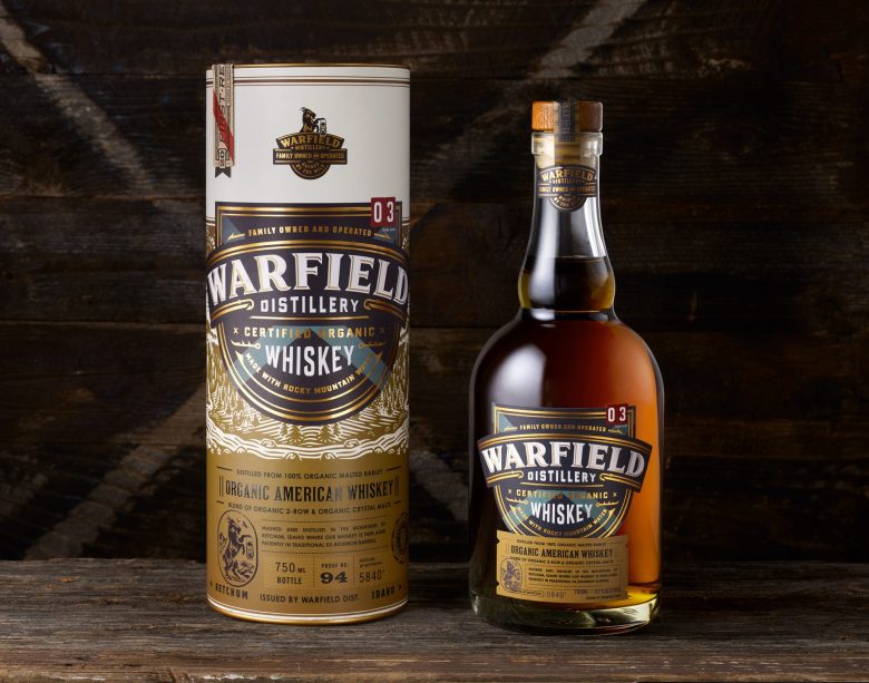
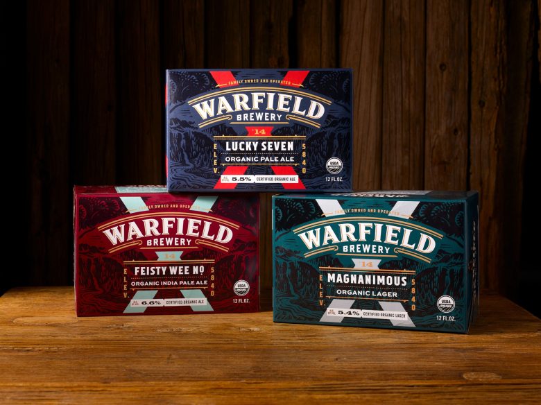
Warfield Distillery and Brewery approached Chad Michael Studio for a complete rebrand of their on-site distillery, a redesign of their existing beers, and to create their first range of spirits. During one of our initial calls, we told the client that the rebrand should be “wild and burly”. That statement pointed the way for the entire project. Sometimes a single word or phrase can drive the entire direction of a design.
Warfield, nestled in the mountains of Ketchum, Idaho, became the embodiment of the great outdoors. They are the spirit of wild adventure. They are “guided by the wild”.
From the strategic direction pitched to the client:
“Warfield is the mountainous, fire-fueled, supreme master of all that is feral. The goal is to develop an iconic range, from crown to cork, that personifies this. The design will be masculine, wrought with the colors and textures that exude the wilderness and the items we use to explore it.”
All aspects of the brand and packaging were inspired by items, materials, and textures connected to the great outdoors. The spirits core label design features a “badge” much like a park ranger or boy scout would proudly wear. Tiny details throughout the foiling gives a nod to fish hooks and paddles. The aim with every design, for every client, always being to design with purpose. Everything down to the texture of the paper stock has to be done with reason.
Designed by chadmichaelstudio
Add to collection