

Vers Passage
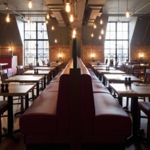
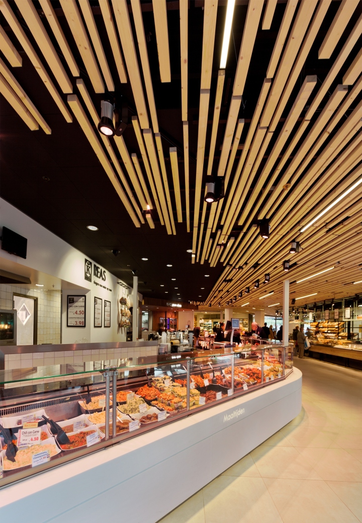
Meat, bread, cheese and fish. Beautiful traditional products which strengthen each other when they are combined in one single space. This was the challenge for the new Vers Passage in Zoetermeer. Traditionally on this location there already were some of these crafts, only the dark dead-end situation took out all the dynamics in the shopping sensation. The redevelopment of the shopping mall gave an opportunity to create a new concept, where these traditional products come together in a dynamic coherence.

From two sides
By making an expansion, there was an area created of approximately 840 square meters where we could play with different settings. AR created a concept where, in close contact with the entrepreneurs, the right meters are divided and could be shaped to the final new passage. The idea was to create a double entrance to make a dynamic way for customers, where they are able to move along the shops and to give entrepreneurs a wider field of vision and maximize their space.
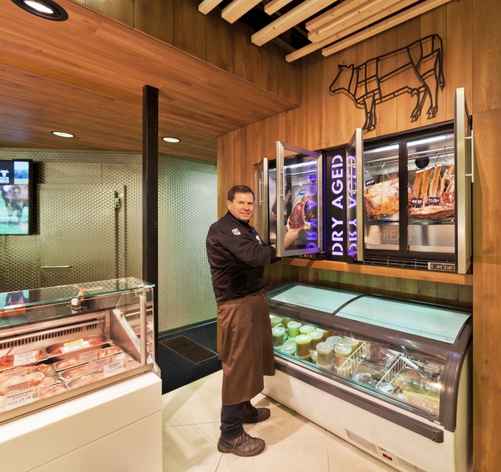
For AR it was important to creates cohesion between the entrepreneurs during the elaboration. For this we designed a ceiling with tiles and applied with a slat structure, which connect and gives direction to the customers. Within the indicated frameworks the entrepreneurs have implemented their shops. AR developed this interpretation further with a renewed identity for the butcher’s shop.

Butcherstore Reas
Every strong entrepreneur has to tell its own unique story to his customers. For this butcher’s family this is no different.
“Butchers from father to son”, a new generation has emerged, and it was therefore time to give the shop its own identity. An identity that suits this unique butcher’s family and their views on practicing this craft.

AR Architects developed a concept, which has been implemented till the new logo on, in the overall design. By a newly customized lay-out there was more workable space added and by the use of a variety of materials, there is more focus on the product and the craftsman. With the new corners for fresh sandwiches and pure meat we have created a clear beginning and end.

Ultimately, this was a very personal and complex task, partly because of the connection with the new Fresh Passage, which AR has also developed with the main idea to create a dynamic clean passage with attention to the shops. Every store that AR architects designs, has its own identity. Something that is often reflected in several areas and is based on the personal story of the client. This creates the final character of the store, entirely unique in the Netherlands.
Designed by Arjen Reas
Photography by Kees Hageman




Add to collection
