
When software company Venafi sought to relocate from its suburban cubicle farm into a new space that would attract international talent to Salt Lake City, the ‘Silicon Slopes’ town whose urban core is experiencing a vibrant resurgence, we worked closely with the CEO to determine how architecture could help establish and broadcast a new vision for the culture of the company.
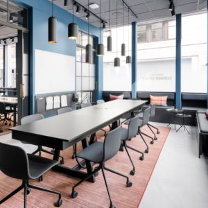
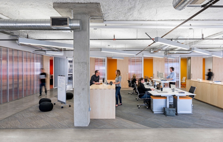
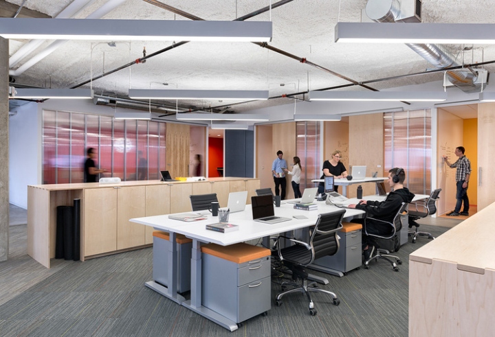
After our new building design was squelched in design development due to an indecisive land owner, we found an existing space downtown, on mass transit, with abundant natural light and verdant views of Washington Square. Here we sought to define new values of health, horizontality, and community, where the entire office would share the same open work space and infinitely reconfigurable sit-stand desks.

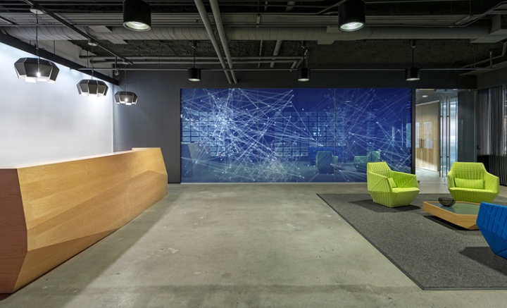
Despite its fortunate location and unusually vast 36,000 square foot floor plates, this 1980’s-era building offered little in the way of natural charm, and faced with a sprawling and undifferentiated span of drywall and oppressively low ceiling tile we wondered whether this dated post-tensioned concrete building had some useful middle-aged bones hidden beneath. After stripping away the layers of beige and replacing all HVAC and lighting with new and efficient systems, little of our $46/sf budget remained for architectural work. Accordingly, our design sought to use humble materials in innovative ways, using geometry and texture to infuse them with content.

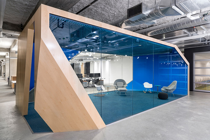
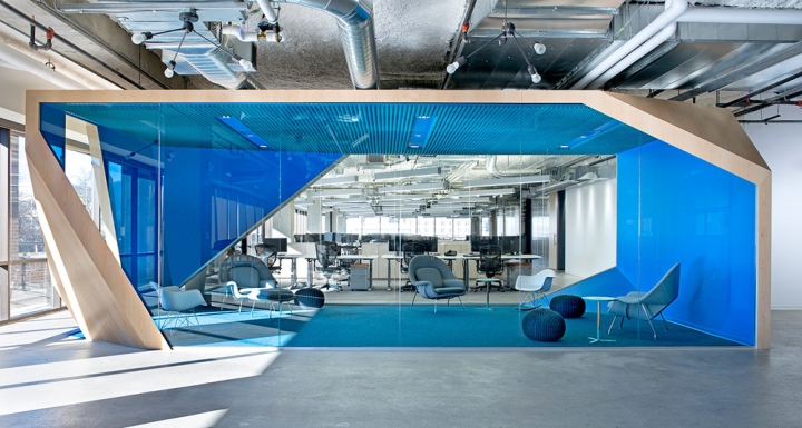
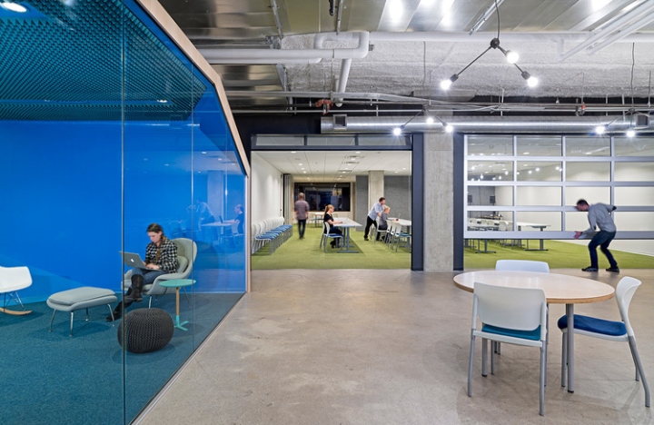
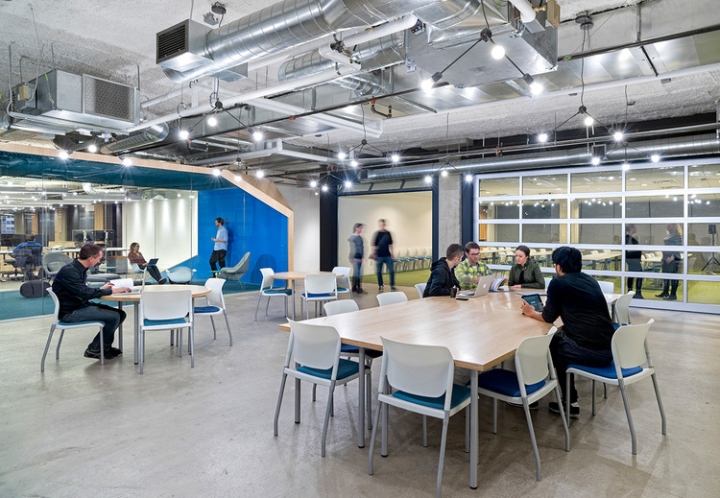
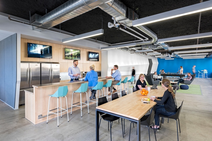
Venafi’s vision for a radically open work space with no private offices or systems furniture made us wonder how we might establish a gradient of privacy, from phone booth to party space and everything in-between. Our approach was to separate individual and collaborative work zones with blocks of inhabitable poché. A thick folded wall that defines the kitchen/lounge area houses small booths for phone calls or private work; on its reverse side polycarbonate panels over metal studs inexpensively admit light and views. A transformable space at the heart of the project (large enough to house the entire global staff when fully expanded) is separated from adjacent work areas by a block of diner-style meeting booths on one side, and by a giant furniture-like pavilion on the other. This semi-autonomous space invader was dubbed ‘The Cloud’ by staff in reference to the company’s new focus.
DESIGN: Steven Christensen Architecture
TEAM: Steven Christensen, Devon Montminy, Cori Gunderson, Andrew Kim
PHOTOGRAPHY: Jasper Sanidad




Add to collection
