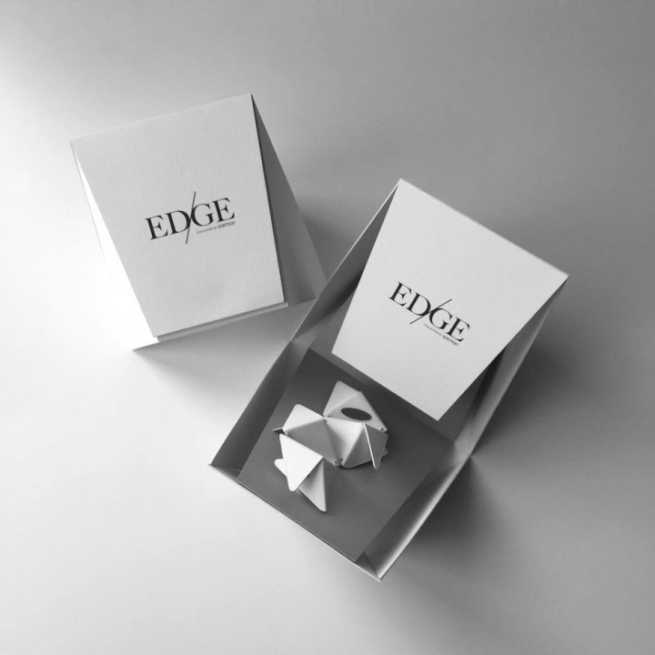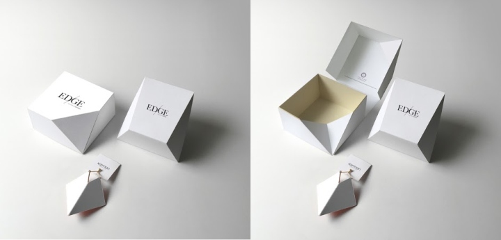
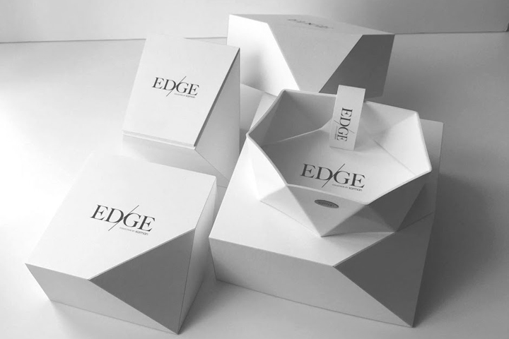

The use of strictly geometric shapes simplified to the extreme gives the collections minimalist packaging an exciting, spatial composition that reflect on the jewellery line. The straight lines of bent edges both link and define the pieces of the jewellery and the packaging. The material used for the packaging, allow for a rhythmic flow from triangle to rhombus. Harsh edges and angles intermix with planes is an exciting spatial sequence. In keeping with the exclusivity of Karman Jewelry, Edge pieces are available in a special packaging fitting the design of the jewellery collection.

Karman Jewelry’s latest collection is a perfect example of the invigorative and experimental style characteristic of this brand. The Edge Collection is based on geometric uniformity and symmetric beauty. The juxtaposition of hard and soft is present in both the material and colors used in the collection. For instance the designer further softens the use of white plastic with a softer pastel layer. In addition to adding a visually dramatic effect it makes certain pieces, such as bracelets and necklaces, more comfortable to wear.
Design Agency: Edinas paper installations
Jewelry designer: Orsolya Kármán (KARMAN jewelry)
Campaign Photographs: Pejkó Gergő


http://www.packagingoftheworld.com/2016/05/karman-jewelrys-edge-collection.html
