
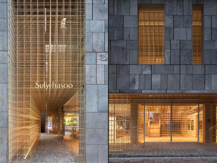
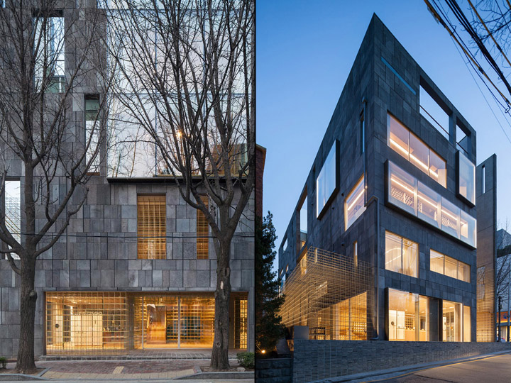
The literal and mythological meaning of the lantern is highly significant throughout Asian history—it leads you through the dark, showing you the way and indicating the beginning and end of a journey. Neri&Hu’s radical transformation of an existing five storey building in Seoul, South Korea, into a grand flagship store for leading Asian skincare brand Sulwhasoo is inspired by these notions of the lantern.
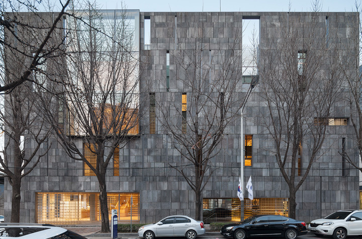
The building was designed by Korean architect IROJE and built in 2003. Celebrating the roots of the brand, Neri&Hu wanted to develop a concept with strong connections to Asian culture and traditions, ultimately allowing customers to discover the wealth of Asian wisdom that underpins the Sulwhasoz ethos.
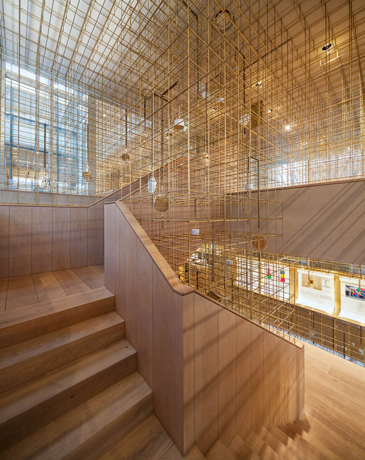
The concept originates from three key points that were defined at the very start of the project – Identity, Journey and Memory. Neri&Hu aspired to create a space that appeals to all the senses, that captures the customer immediately as they approach the building, creates an experience that continues to unfold during the journey through the store, and leaves a strong impression with visitors long after they have left.
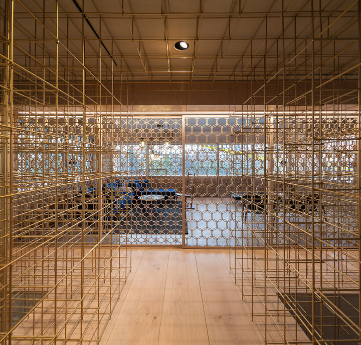
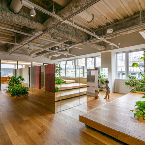
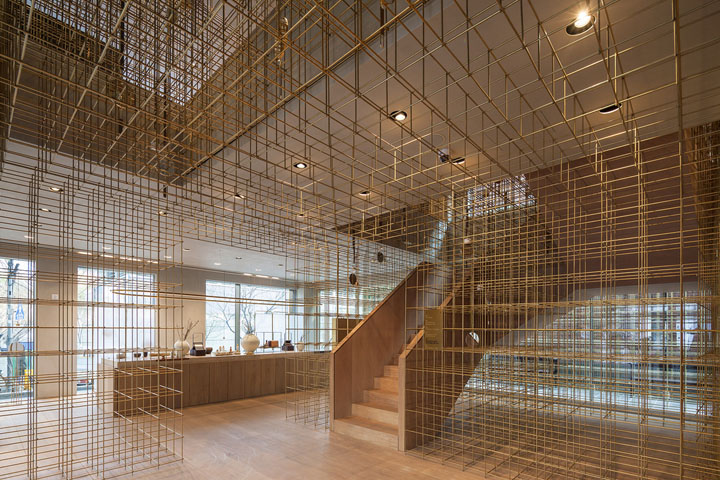
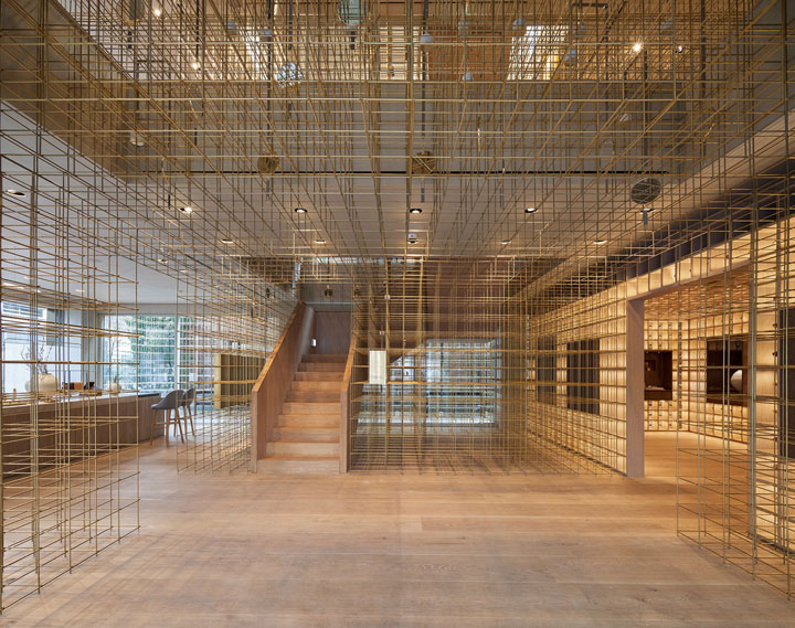
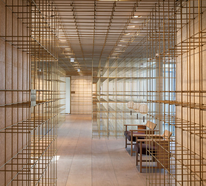
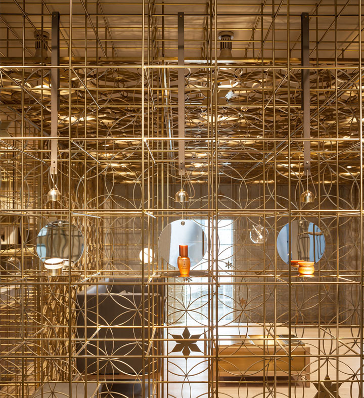
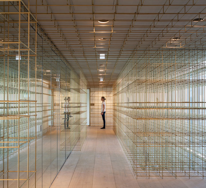
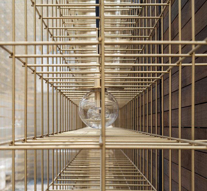
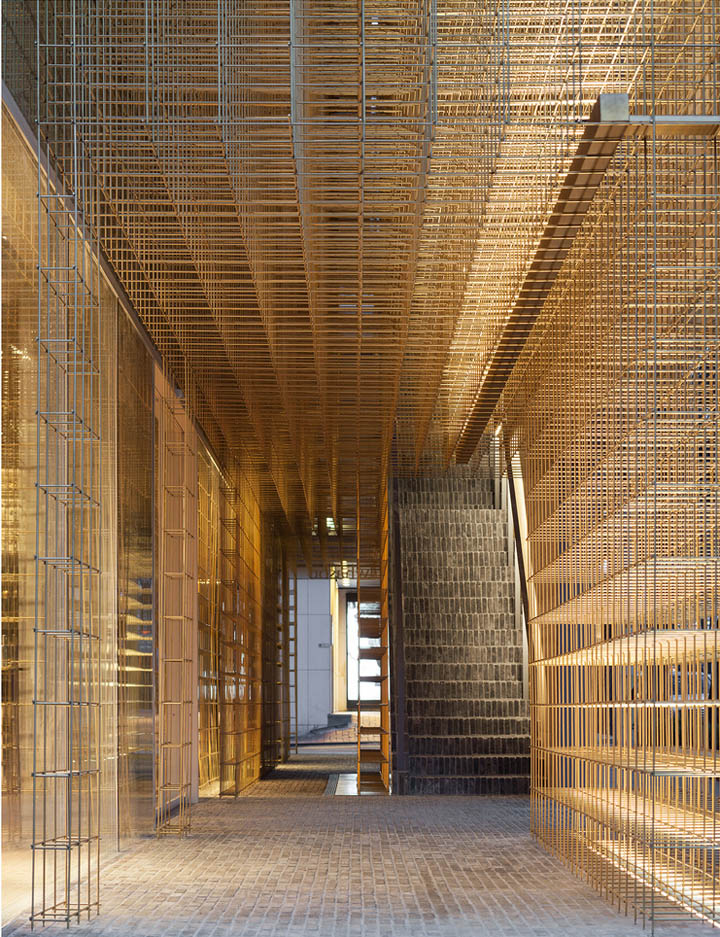
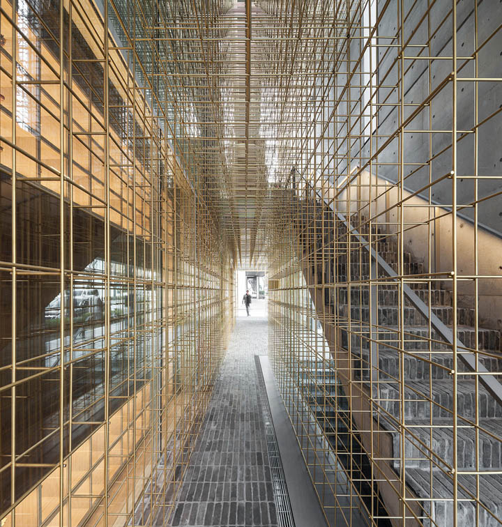
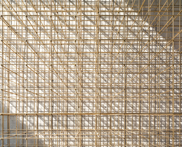
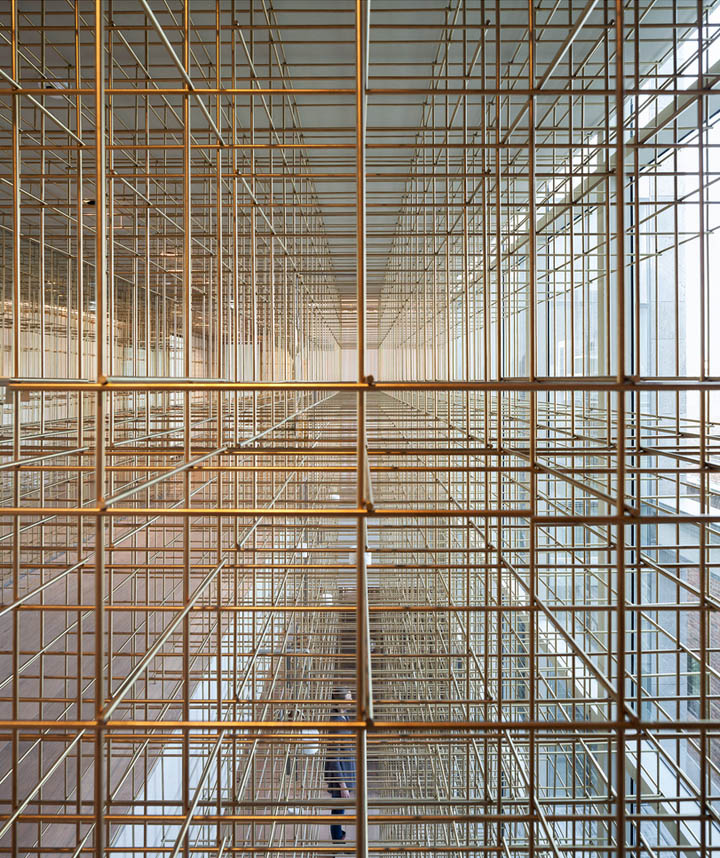
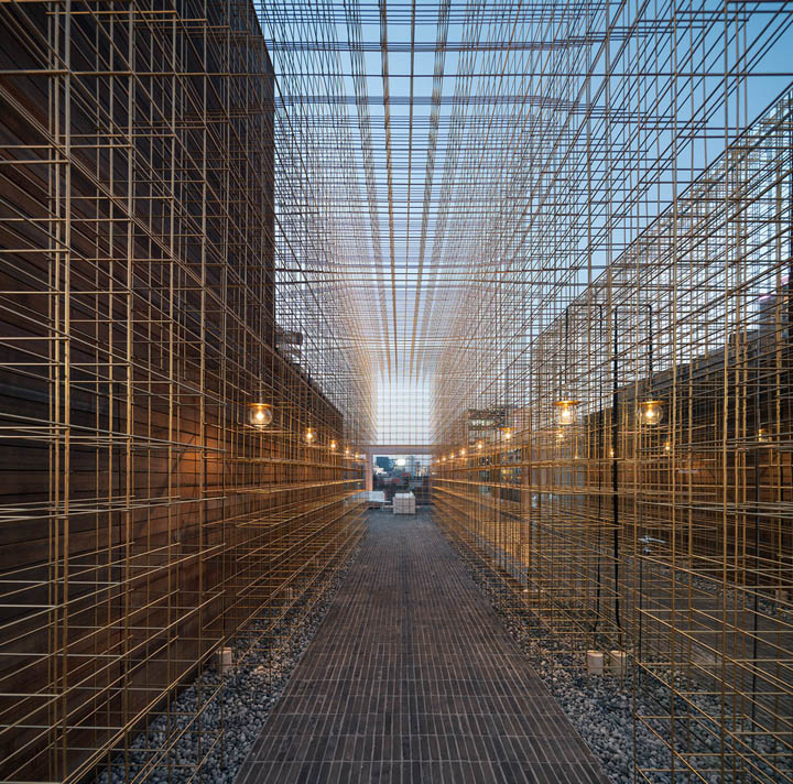
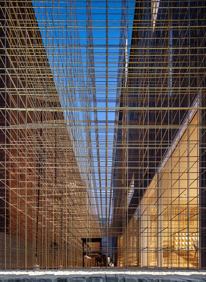
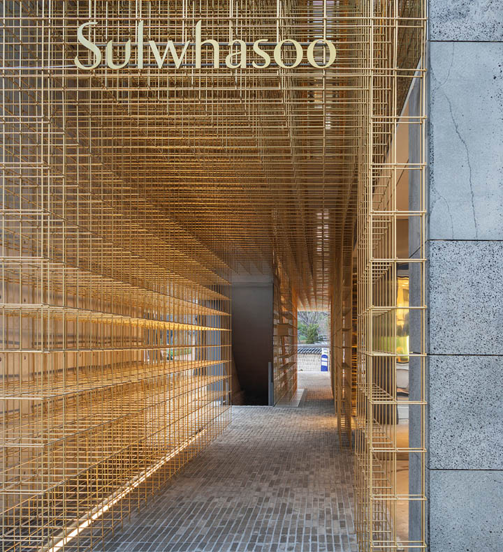
This is what led to the lantern concept, where a continuous brass structure is the element ties the whole store together, guiding customers while they explore the full extent of the space. In creating a series of voids and openings in the building, visitors fully experience the structure as it moves through the space and envelops the different programs. Mirror volumes are inserted into a wooden landscape to reflect and amplify the seemingly endless structure.
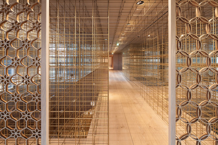
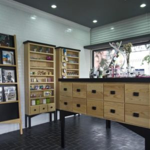
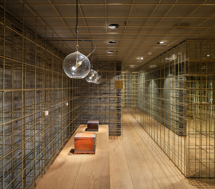
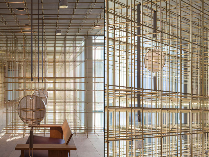
The delicate structure rests upon a solid ground of wide timber floor boards that occasionally rises up to form wooden counters with inserted solid stone blocks, on top of which Sulwhasoo’s products are displayed as precious objects. While it is primarily a guiding mechanism, the lantern structure is also a source of light—hanging within it are custom light fixtures that turn the structure into the main attribute to frame and highlight the products on display.
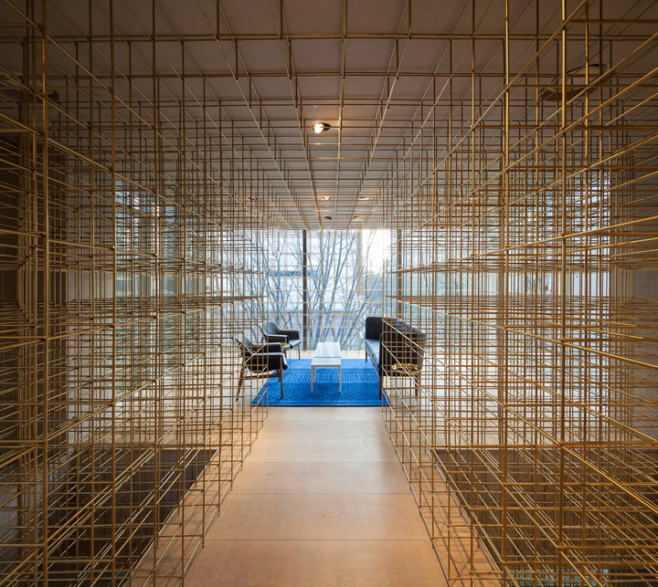
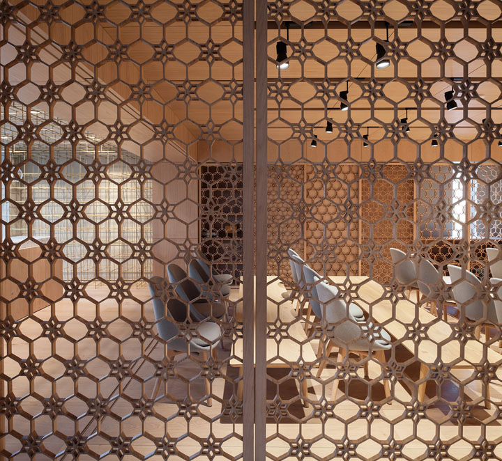
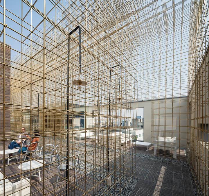
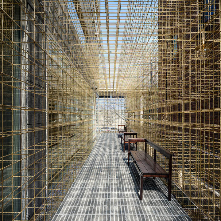
Navigating through the five storeys, customers experience changes in atmosphere. The basement spa with its dark brick walls, earthy grey stone treatment rooms and warm crafted wood floors has a sense of intimacy and shelter for visitors. Moving up the building, the material palette becomes lighter and more open, inviting visitors to interact with the space, culminating finally in a roof terrace with its free-flowing brass structure canopy that frames vast views of the surrounding city.
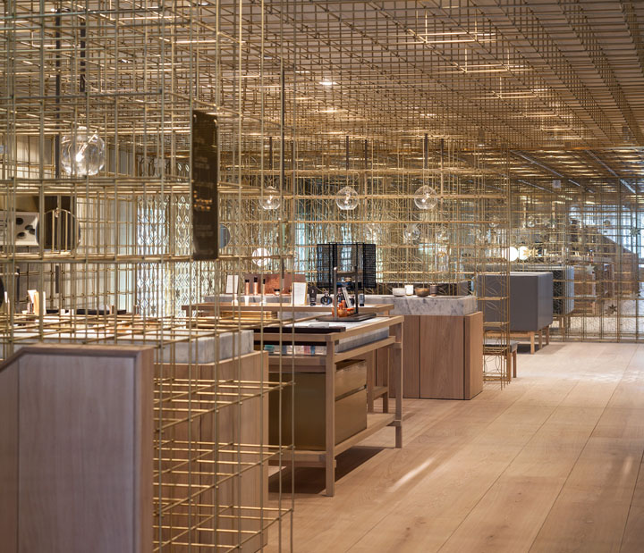
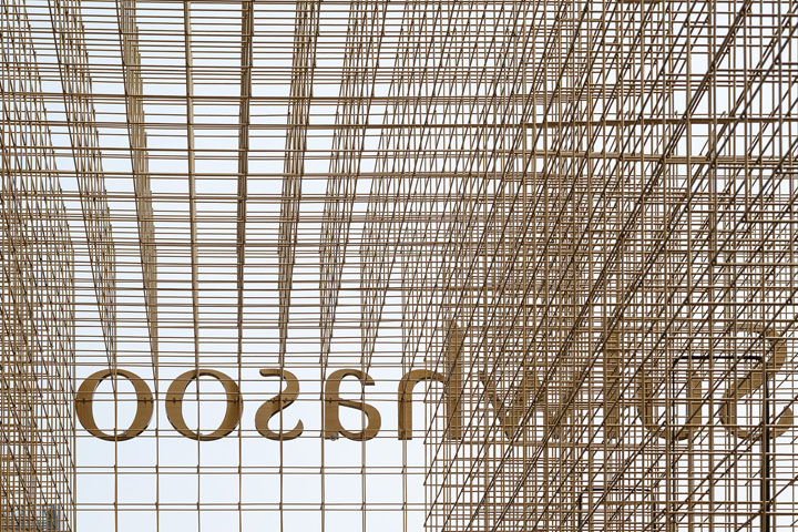
The journey is a constant contradiction between two counterparts: enclosed to open, dark to light, delicate to massive.The holistic approach to the lantern concept—from space-making to lighting to display to signage—gives visitors a sense of endless intrigue and urges them to explore the spaces and products with passion and delight.
Architects: Neri&Hu Design and Research Office
Principals in Charge: Lyndon Neri & Rossana Hu
Associate in Charge: Anne-Charlotte Wiklander
Photographs: Pedro Pegenaute


Add to collection

