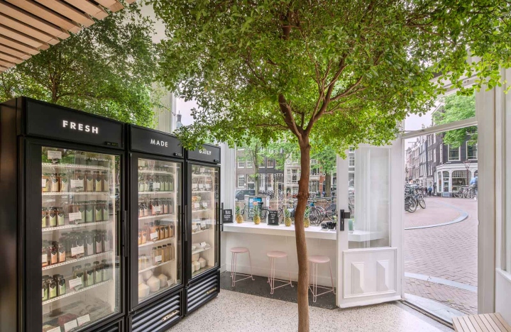


After the completion of the first design for the Cold Press Juicery at the Willemsparkweg, Standard Studio got asked to create their second store at their new location. On the corner of the Herengracht and Gasthuismolensteeg, amongst the bustling Nine Streets, this small 23m2 corner shop is in a prime location with a view onto the Amsterdam canals.

The combination of the beautiful canals, with the architecture, culture and history create an almost fairy tale setting. But many people don’t know that behind these majestic buildings are huge indoor gardens, sometimes even bigger that the houses themselves (just look on google maps!). Only a few lucky ones get to enjoy it, giving Standard Studio a good motive to bring this green ‘outside’.

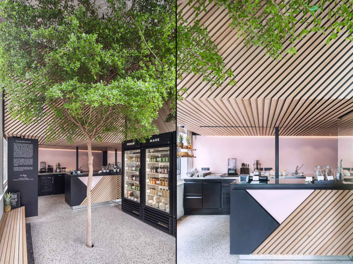
The focus of the design is the living tree located in the middle of the store, providing a calm environment from the hectic pace of the city. The tree is a symbol of nature and a reference to the daily fresh ingredients used to produce the juices. An ‘urban retreat’, a place to come and unwind under the tree with a refreshing drink. For the thousands of tourists who walk by the shop every day, they’ll find a pleasant surprise among all the exuberance of retail and high-tech solutions from the bigger brands.

For their graphic identity and branding, The Cold Press Juicery recruited Build in Amsterdam to conceptualise a new identity. Standard Studio then took this blueprint and translated it into the space, giving the store a fresh and modern look.

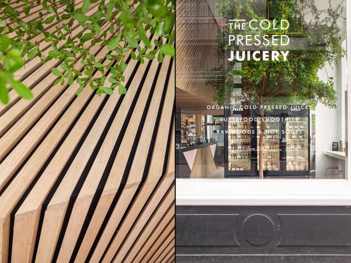
The background and the diagonal lines of the design have been translated into the material with black and pink powder coated steel and wooden slats. The slanted lines are recurring, they are used to accentuate the wall and the ceiling above the counter adding warmth to the design. The wall is finished in the same pink as the counter, and underneath it are all the refrigerators, finished with black coated steel.

Customers can get their own juices from the refrigerators placed at the front of the store. They have been set into the wall which has been covered with mirrors to create the illusion of a bigger space. In order to keep the real tree alive, the architects have created a big bucket in the basement with fertile soil and irrigation to allow the tree a healthy life. The end result is a refreshing shop, with a green concept, situated in the centre of Amsterdam. A place where people with healthy juices and a smile on their face, go out again into the busy city life.

