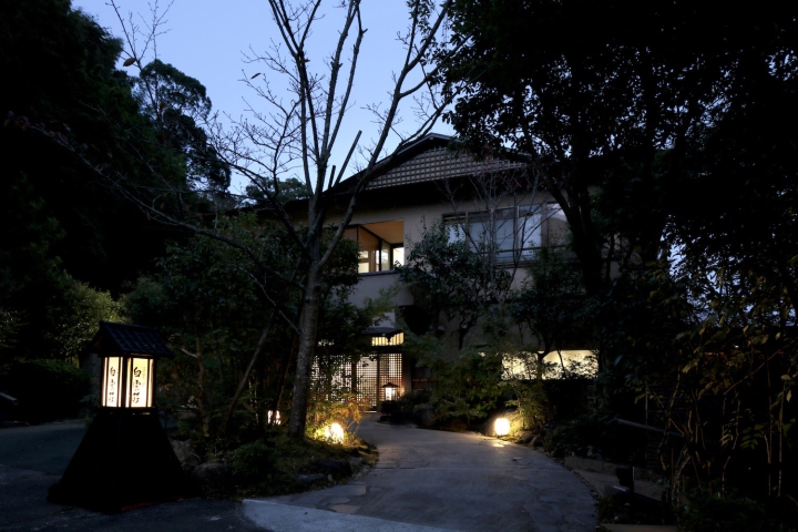

In converting this Ryokan (traditional Japanese Inn), in the mountainous holiday retreat area of Yugawara, outside Tokyo, we were inspired by the beautiful surrounding landscape of forest and rivers, and the esteemed traditions of Japanese crafts. We sought to combine richly textured natural materials with traditional Japanese crafts and patterning, to create a fusion and layering of these two elements, and form a beautiful contrast.

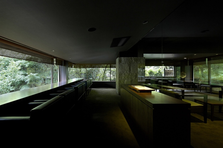
The brief called for a complete renovation of the Ryokan’s first floor spaces, including entrance lobby, seating area, restaurant space, and dessert bar. To start, we removed much of the internal walls, to redefine the space as a series of zones, characterized by their use of different materials and crafts. We decided on using the famous Japanese Asanoha pattern as a recurring motif throughout the different spaces. As a geometric representation of overlapping hemp leaves, we felt this nature inspired pattern would sit comfortably in front of the beautiful surrounding landscape.

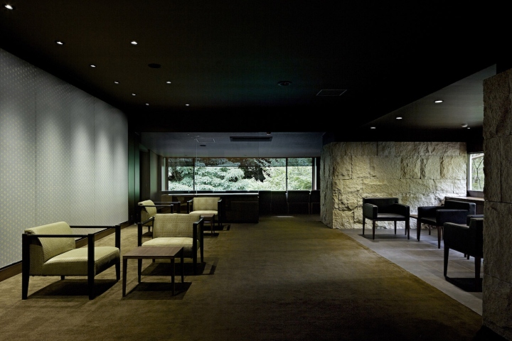
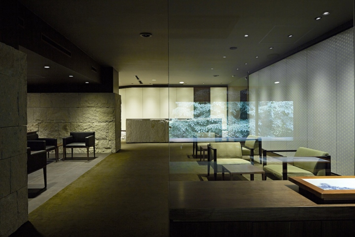
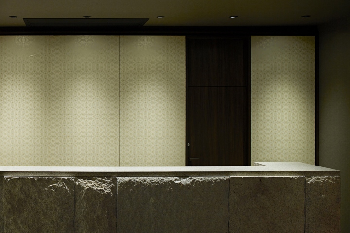
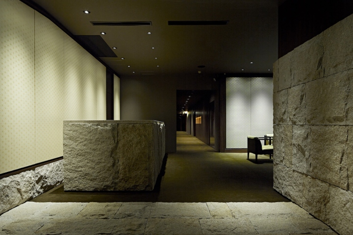
As you enter the Inn, rugged and rough-cut stone covers the floor, right-side wall, and a specialty built reception counter. We wanted to emphasize this connection to natural elements through touch: feeling the rough stone underfoot, and with your hands as you wait at the reception counter. To contrast this rough and heavy material, we placed a series of wallpapered panels on the wall behind the counter.

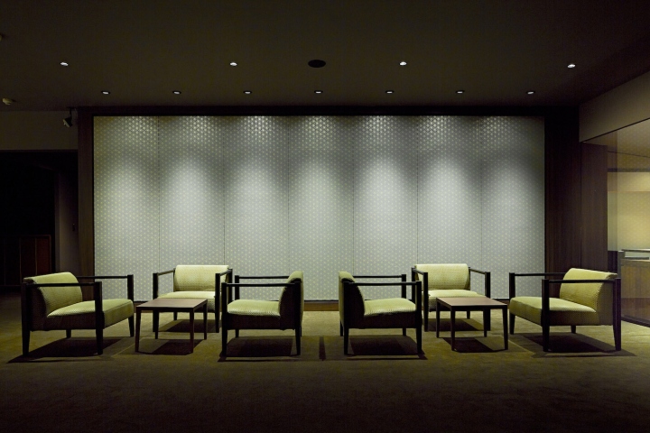
By using a traditional wood block printing technique called Karakami, we stamped a soft and delicate golden Asanoha pattern on the wallpaper. The lighting system was then carefully positioned to highlight the features of the space: the rough texture of the stone paneling is revealed, and the soft flecked-gold paint of the wallpaper changes color depending on the angle of view.

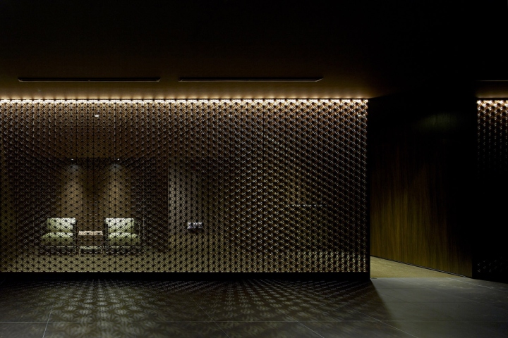
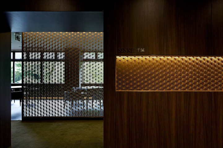
We reintroduced this Asanoha pattern as a marker to the entrance of the restaurant. This time we utilized the technique of Kumiko-Zaiku, where thin and delicate pieces of wood are assembled into a large wood screen, without the use of nails. We used a long thin strip of Kumiko panel, set into a wall of dark walnut paneling, and lit from behind.

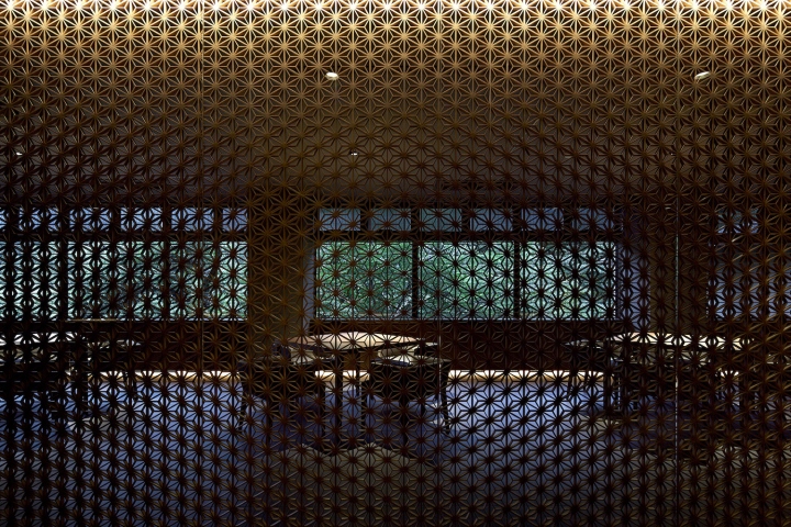
As you enter the restaurant, a full height Kumiko panel sits behind a glass wall, acting as a space divider between the waiting room, and the dining space. The choice of glass wall allows both the dining space and the lush green forest outside to be seen in a layered effect. Lit from above by strip lighting, the Kumiko panel softly glows in the evening, where a play of light and shadow gives the panel depth and intrigue.

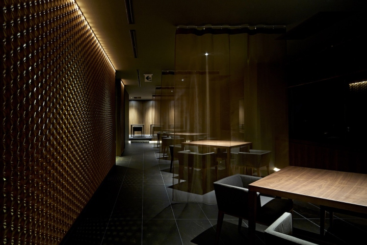
Translucent hanging curtains gently divide the large restaurant space. Dark brown stone tiles make a contrast to the rough cut stone of the entrance area, and emphasize the different atmosphere of the spaces. Minimal down lighting illuminates just the restaurant tables, but keeps the focus of the space on the gorgeous Kumiko panel, and the views to the forest and river outside. Custom designed furniture and joinery are made from rich walnut. The dark wood was chosen to compliment the dimly lit atmosphere of the spaces.
Designed by Makoto Yamaguchi Design Inc.
Design team: Makoto Yamaguchi, Peter Hamori, Ayumi Mitoma, Scott Beer
Photography by Koichi Torimura
